TEIL DEIN GLÜCK
year
2014
client
Teil Dein Glück
industry
Not-for-Profit
services
Poster, Poster Design Organization
scope
Ideation, Concept, Typography, Production
CLIENT
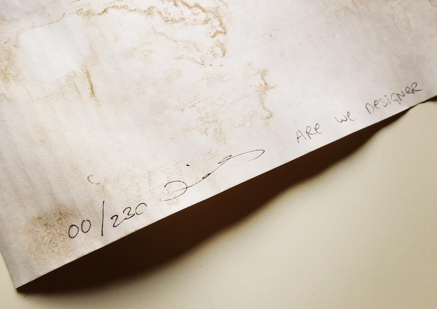
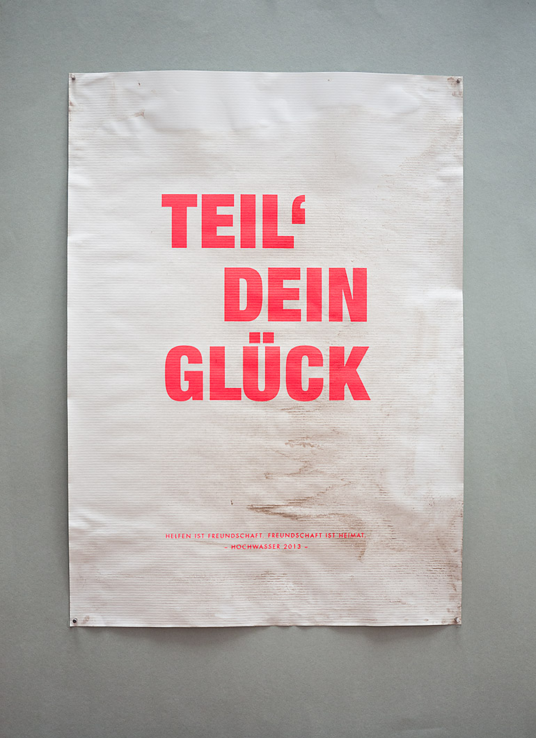
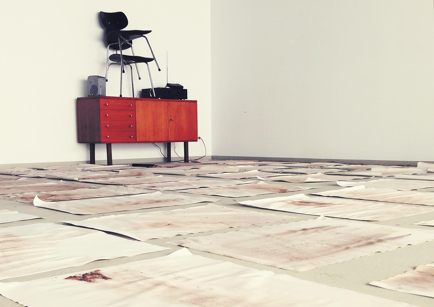
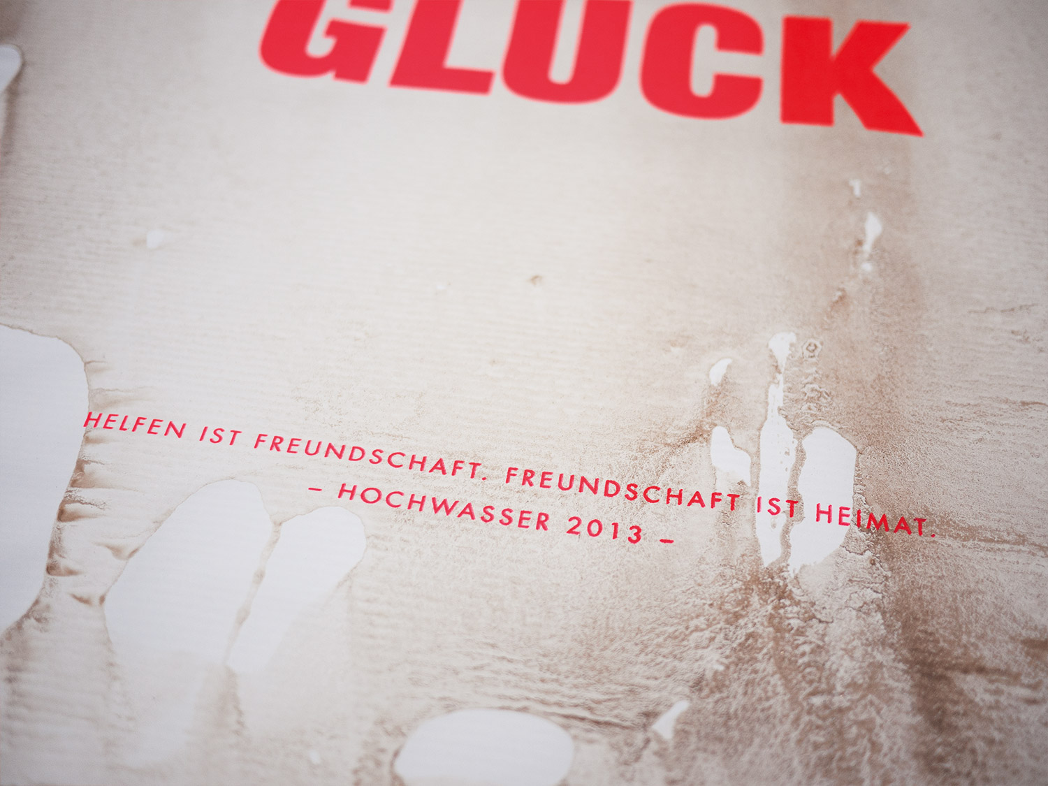
In 2013 parts of Germany were hit hard by massive flooding. Flood damage was estimated at some 8 billion euros. Our hometown was left unharmed. We didn’t do anything better than our northern or eastern neighbours. We were simply lucky. So we invented this relief project to share our privileged situation. We made a series of 200 copies by hand.
RECOGNITION
Our Poster was accepted as beneficence by the “House of History” in Bonn, Germany and will be considered as contemporary document for future exhibitions. Even Federal President Joachim Gauck accepted the beneficence.

APPROACH
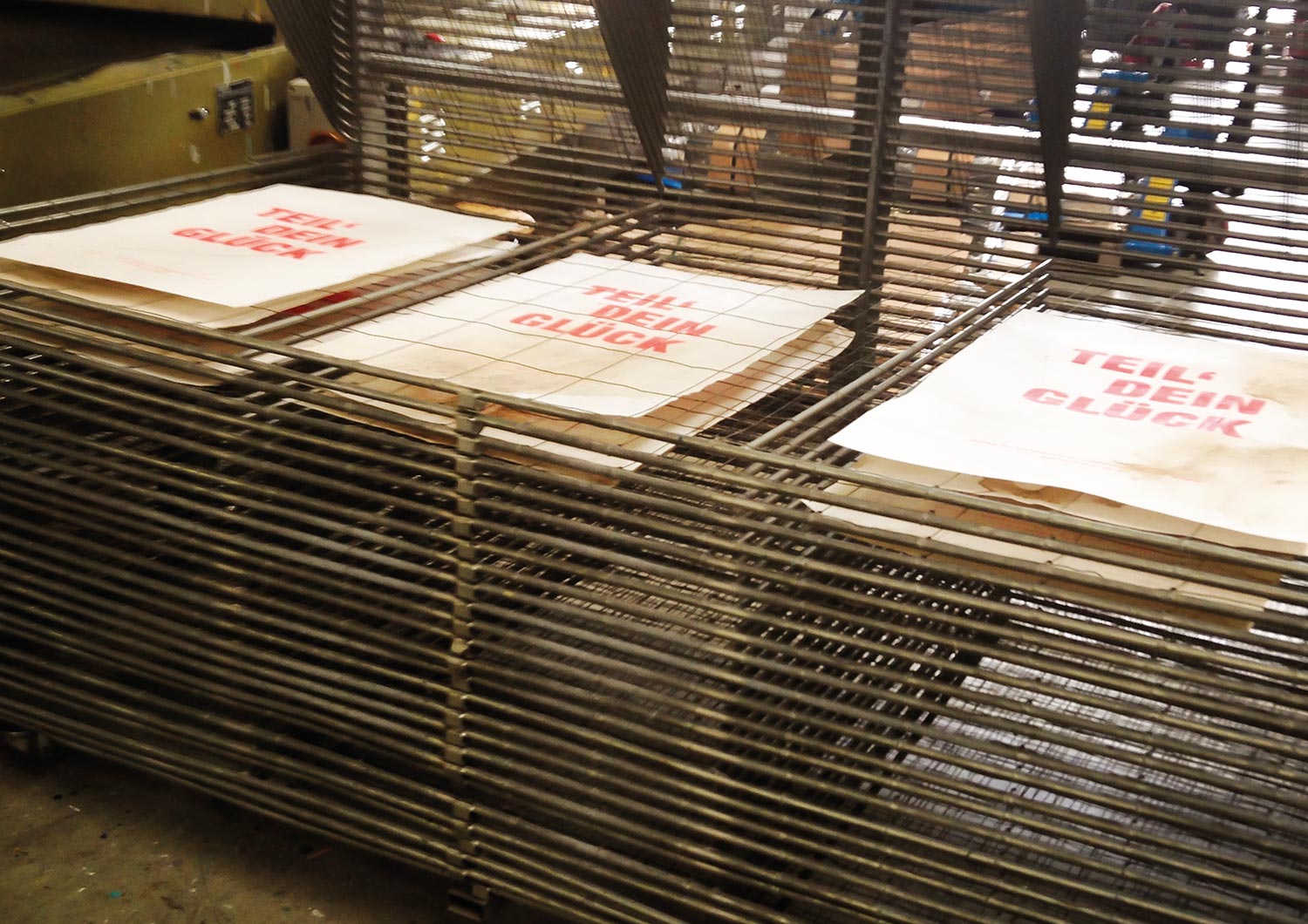
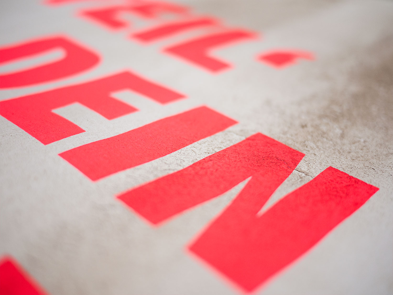
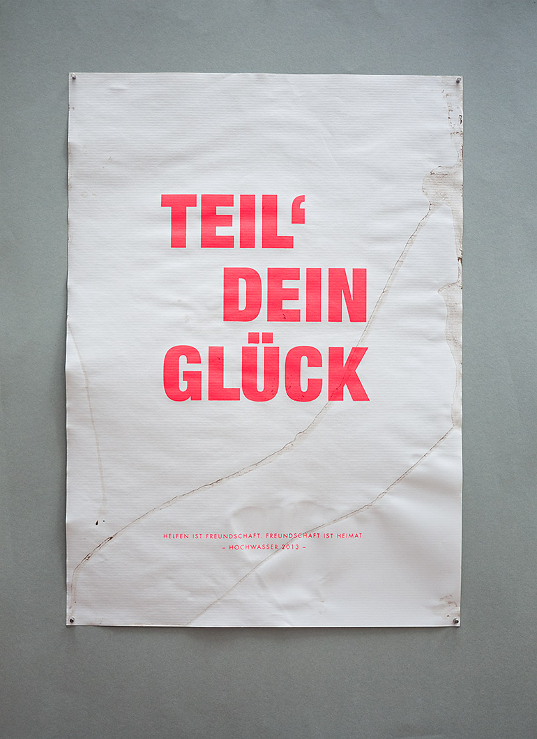
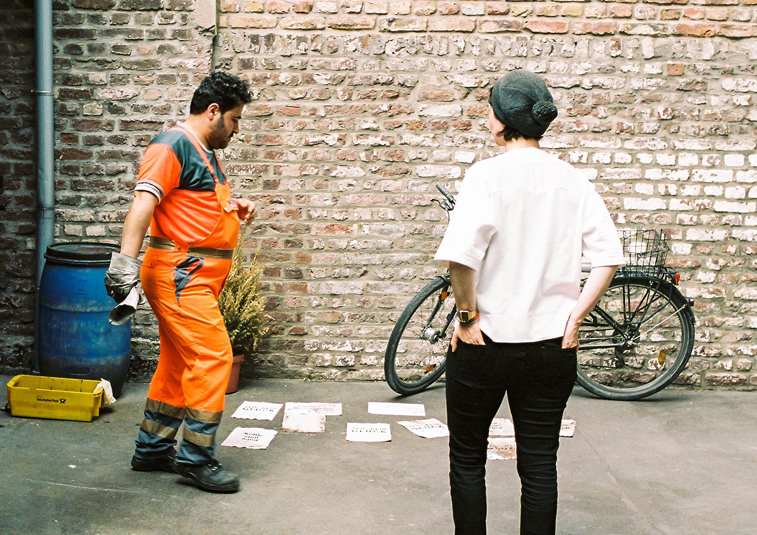
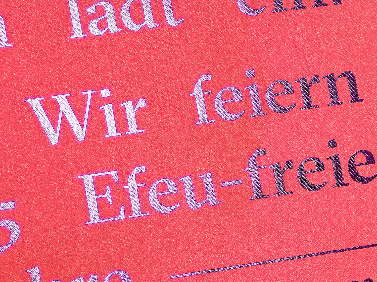
Each poster was unique and handmade. We laid the paper into dirty flood water and printed afterward a neon screen print on it. We sold each copy for 50 Euros. All donations went directly to charities.
Do you like what you see?
Yes – let’s chat!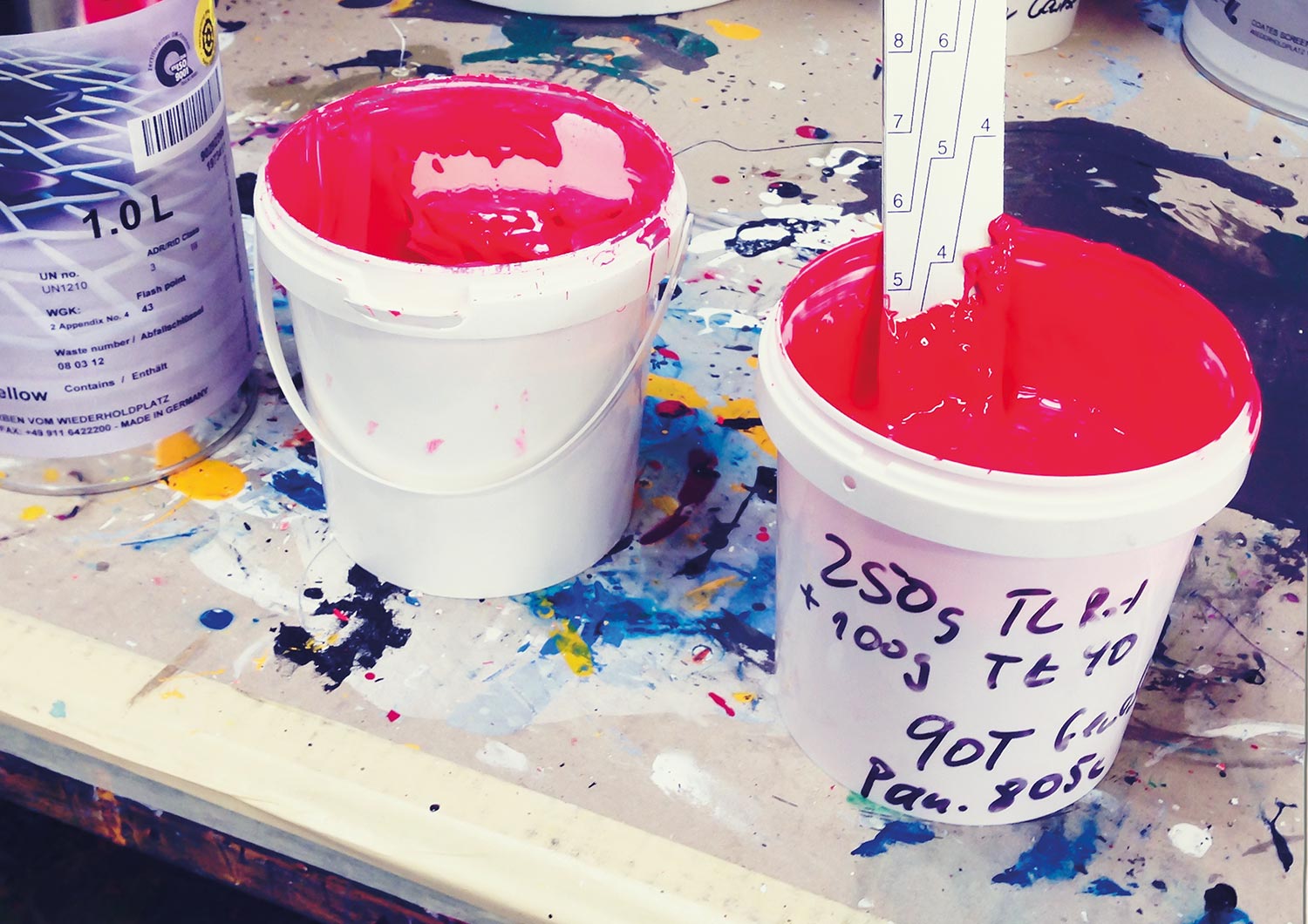
ONOGRIT
year
2016
client
ONOGRIT
industry
Creative Consultancy
services
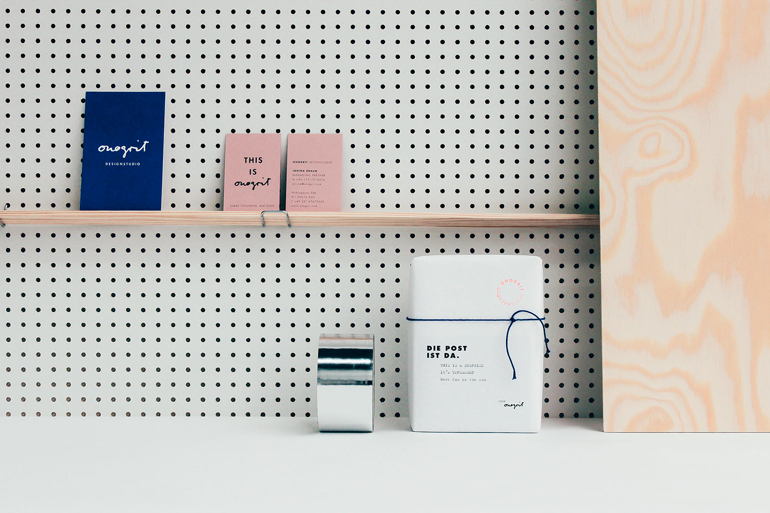
Corporate Identity, Stationary
scope
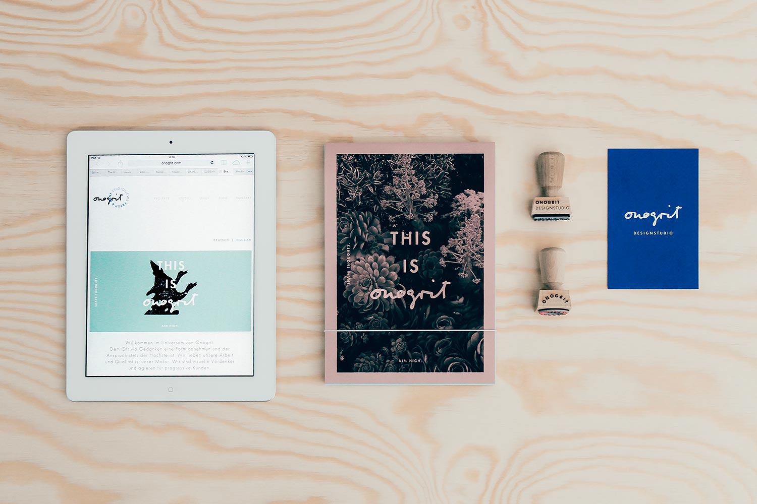
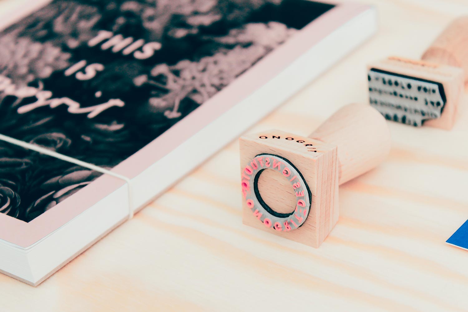
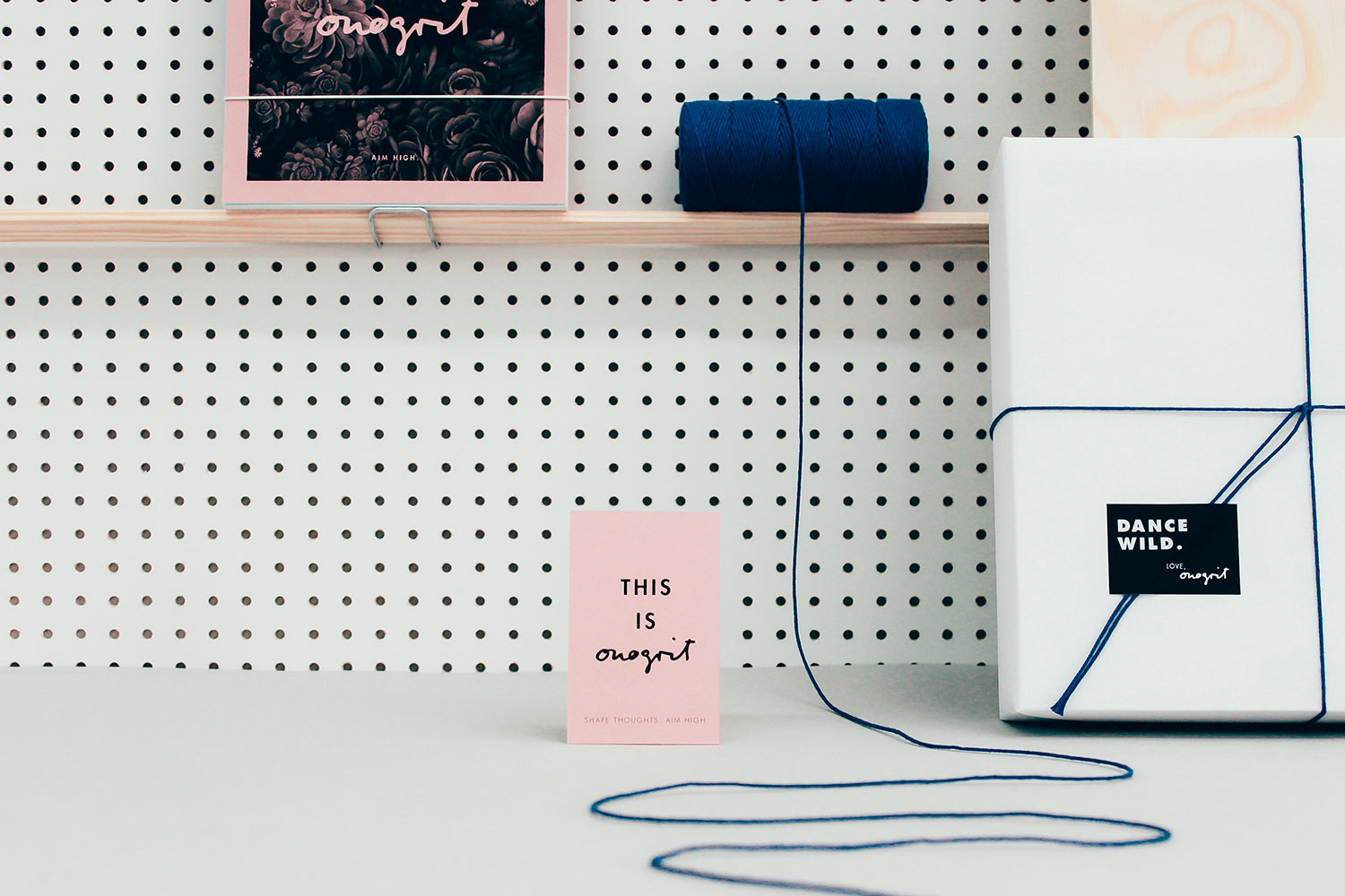
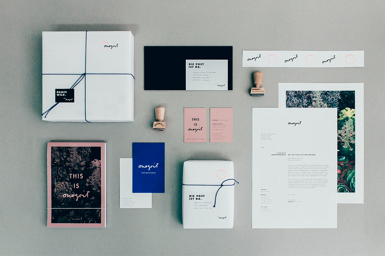
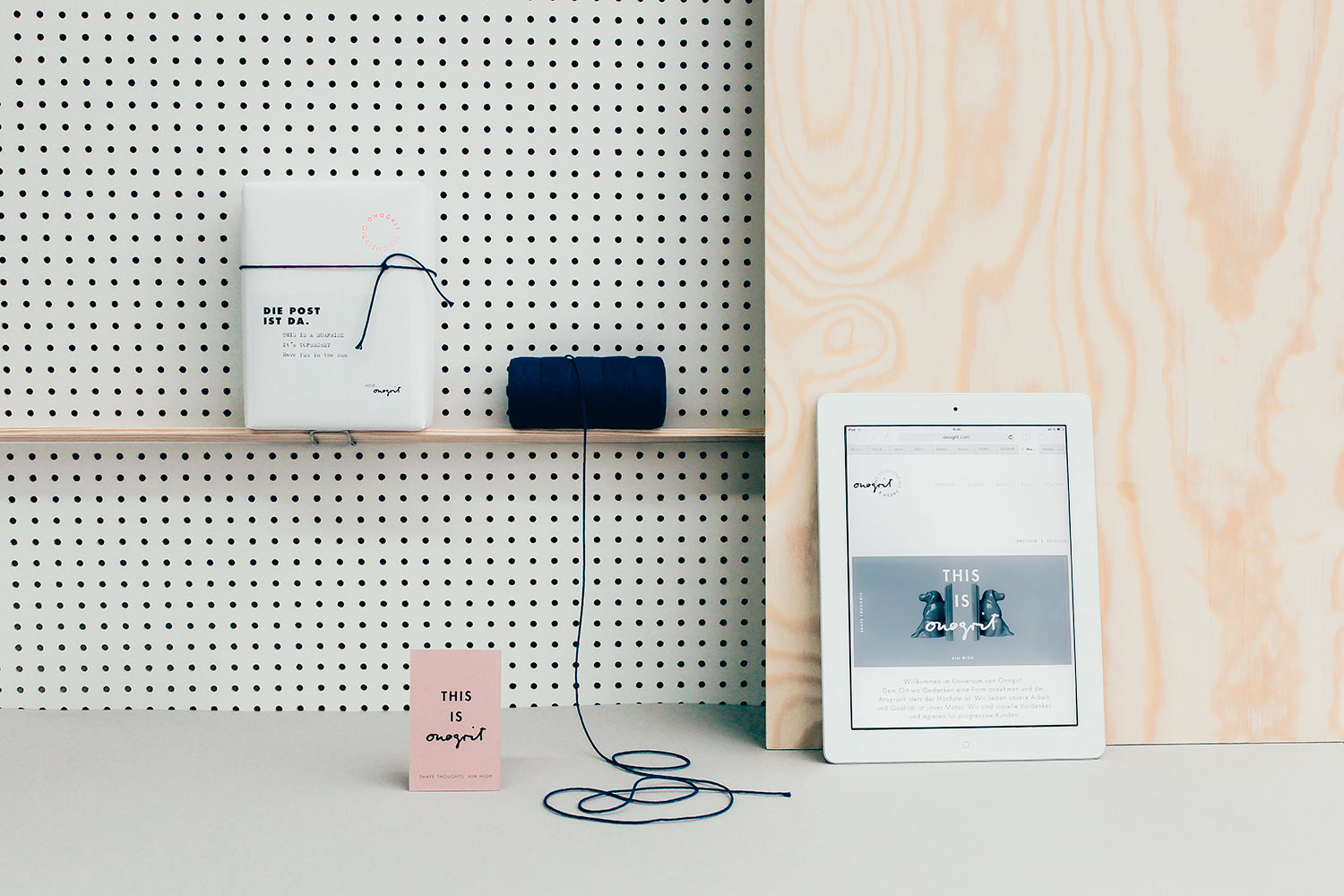
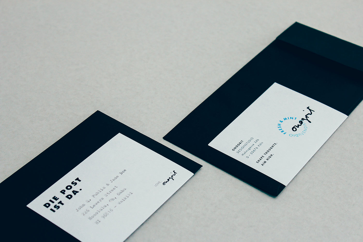
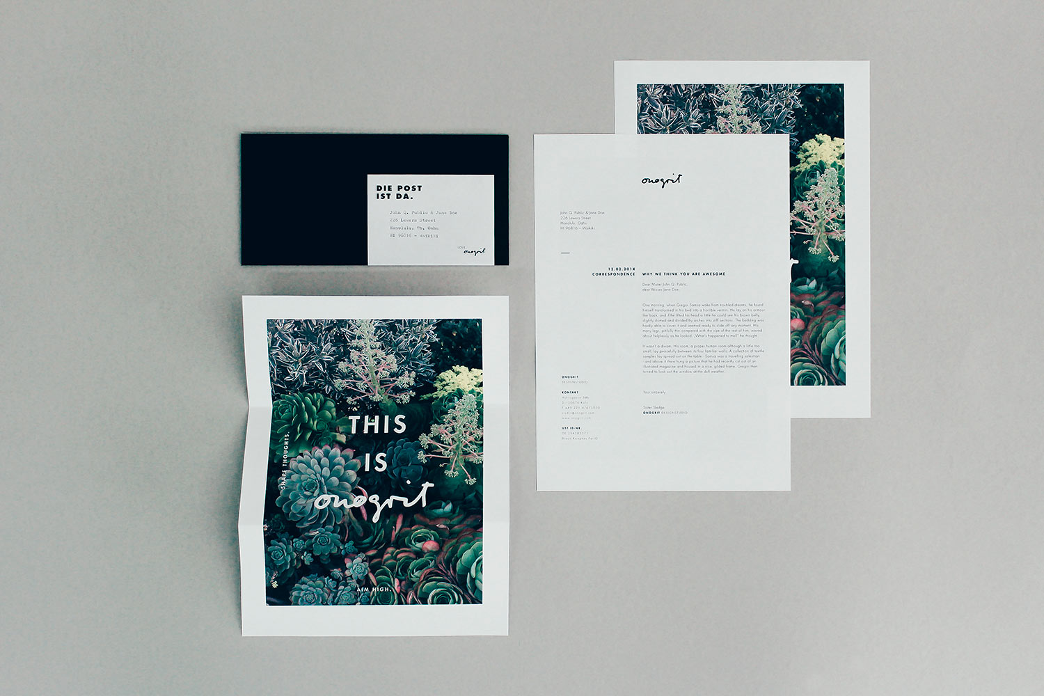
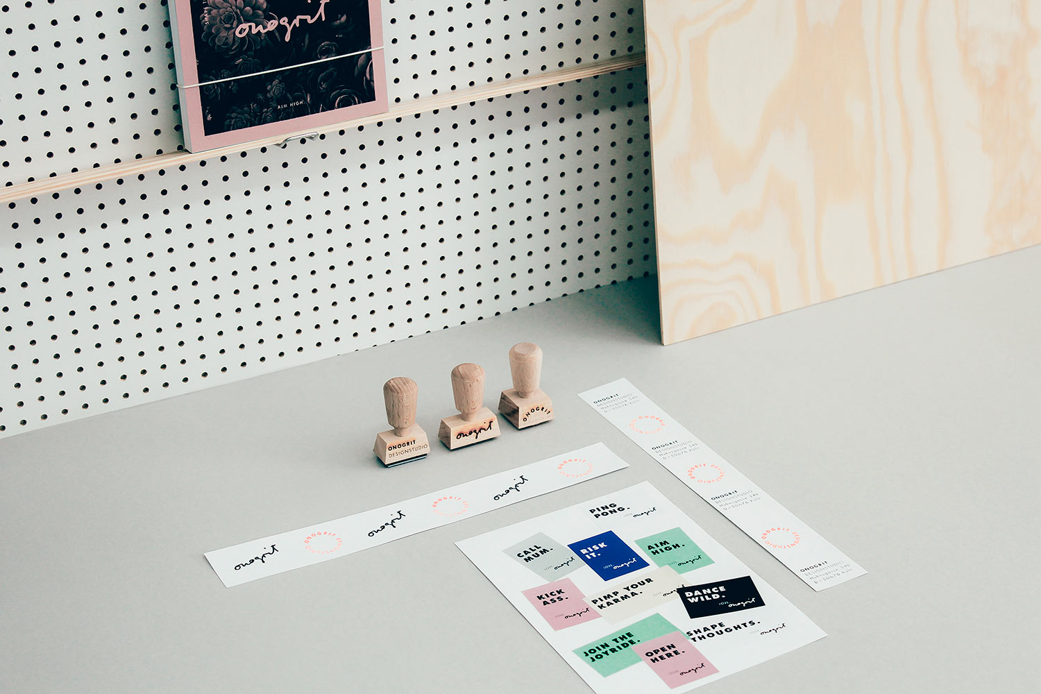
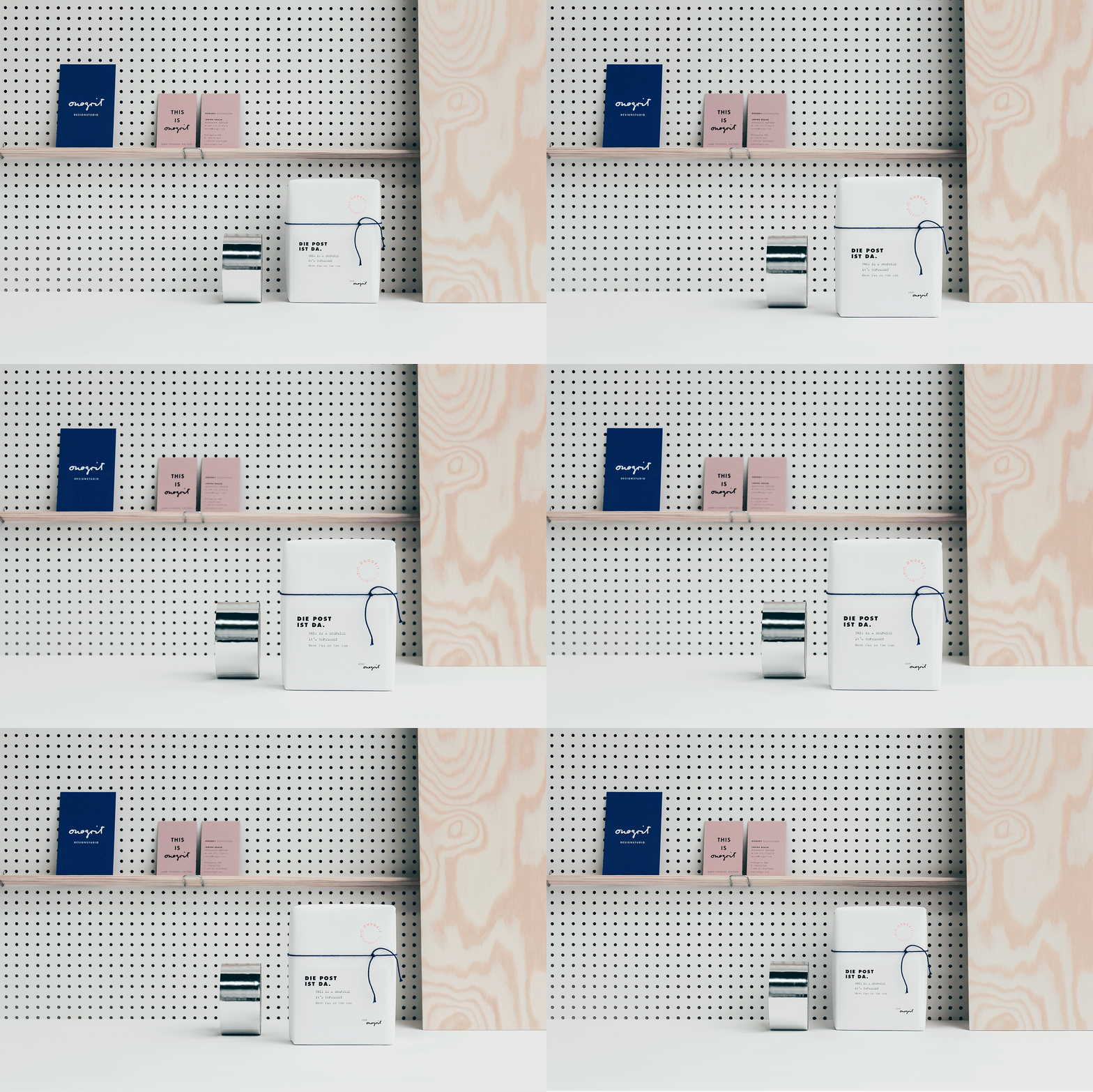
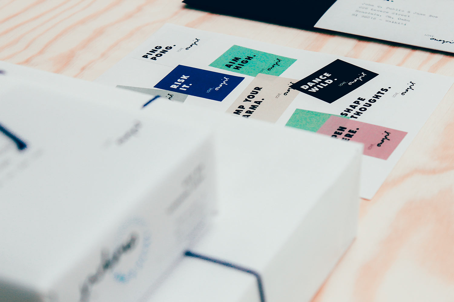
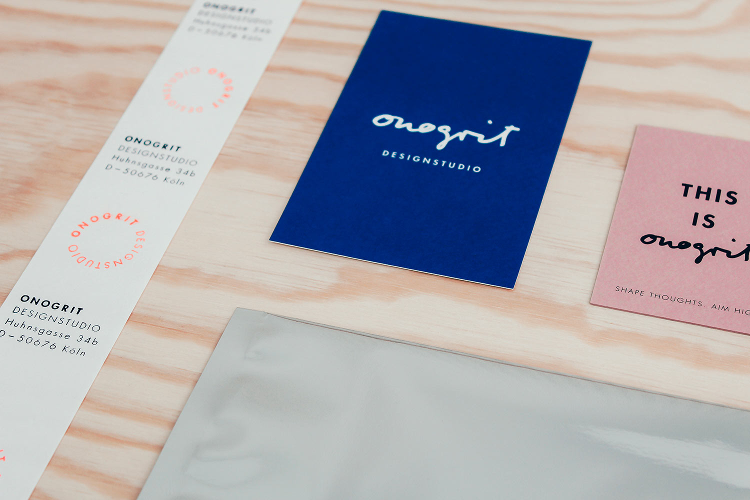
Logo, Letterhead, Business Cards, Greeting Cards, Stamps, Stickers, Labels, Copywriting, Packaging, Notepad, Responsive Website
We together?
Let’s aim high together!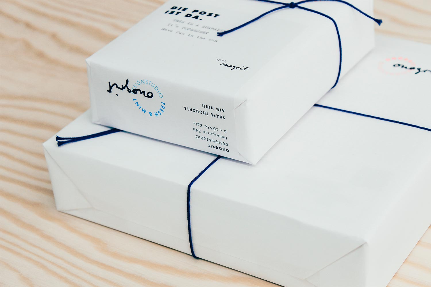
King of Ghana
year
2016
client
King of Ghana
industry
Royal person of public interest
services
Branding, Packaging
scope
Letterhead, Business Cards, Invitation, Copywriting, Envelope design, Packaging
CLIENT
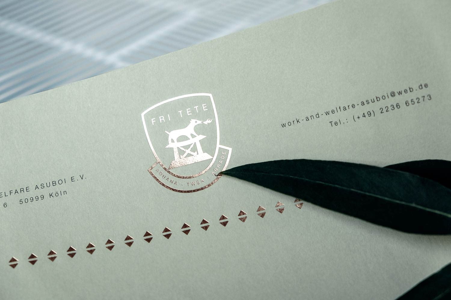
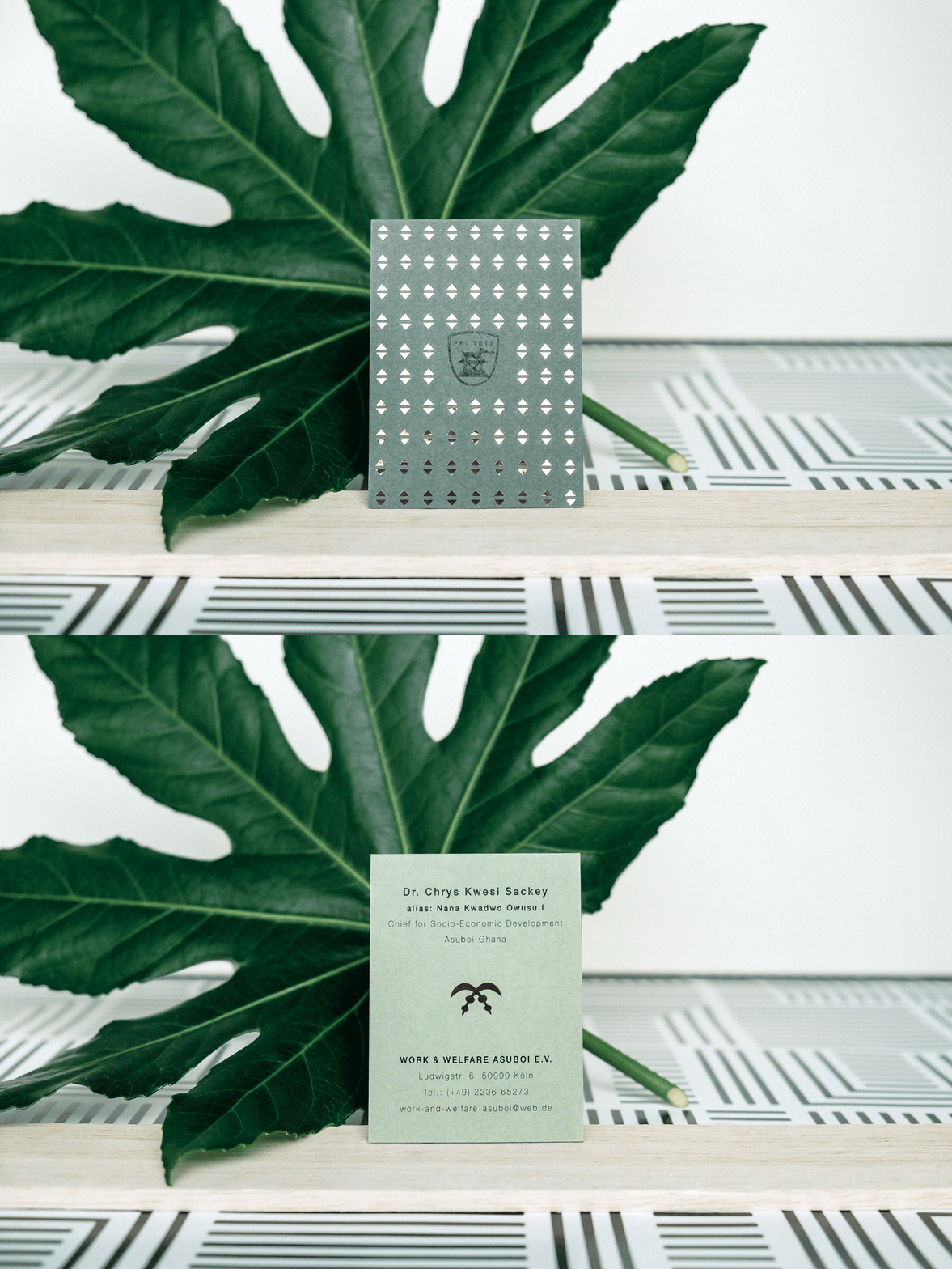
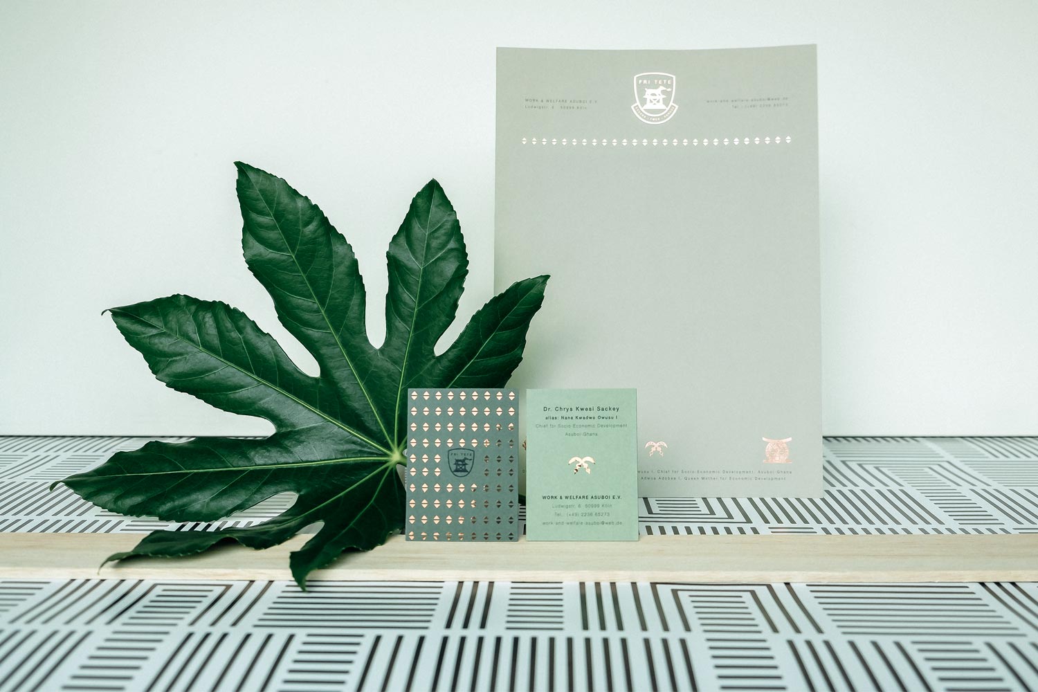
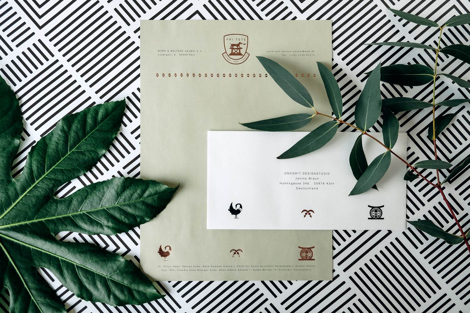
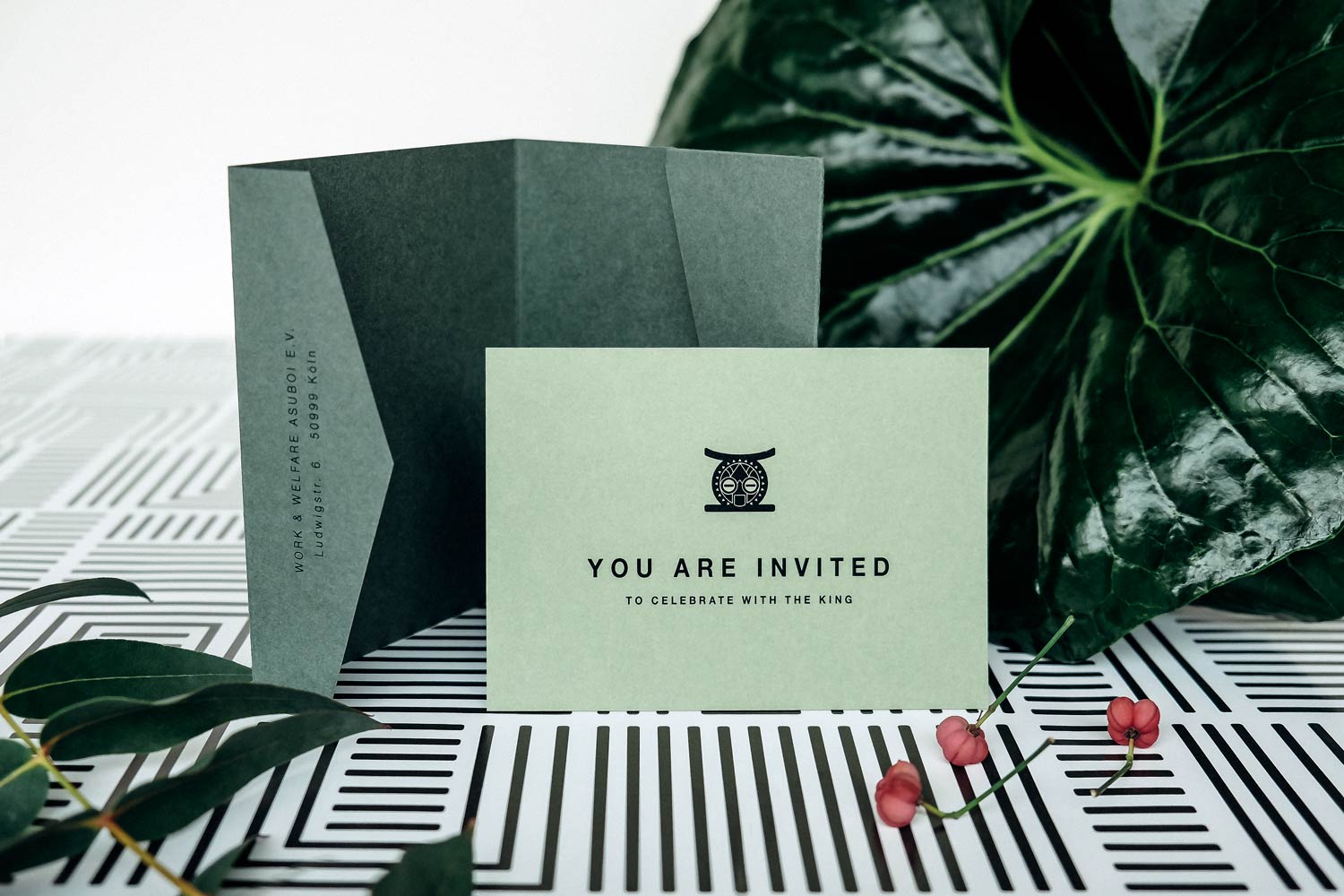
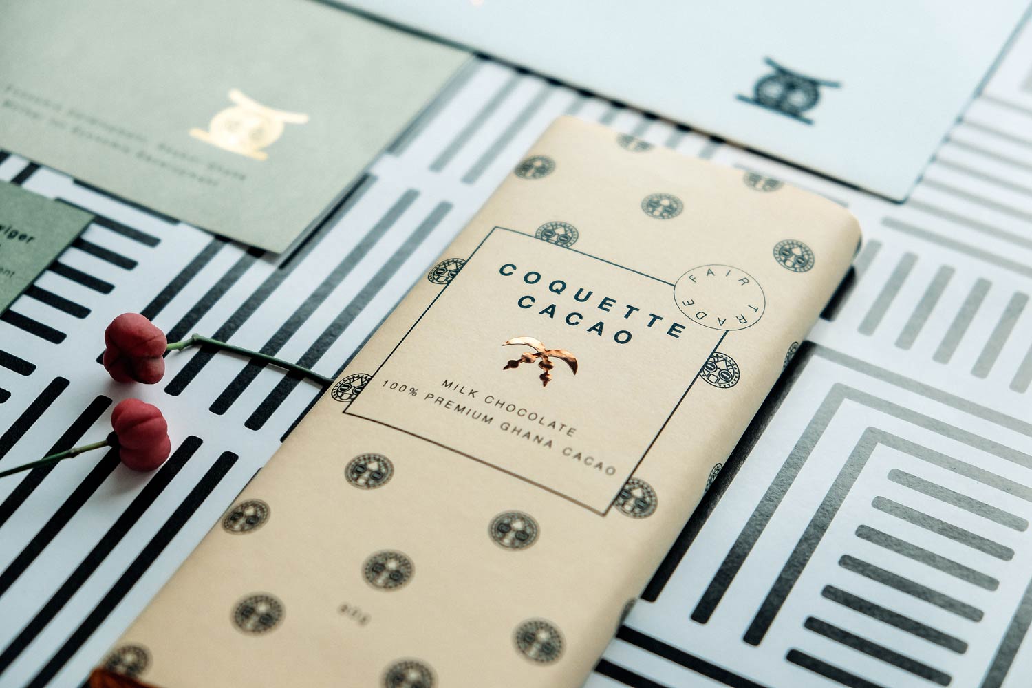
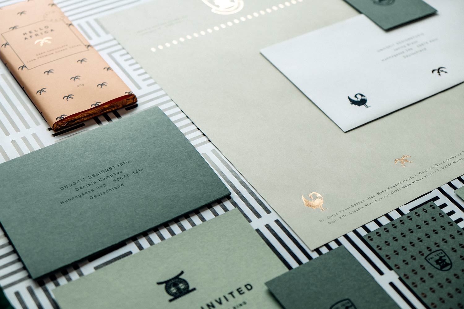
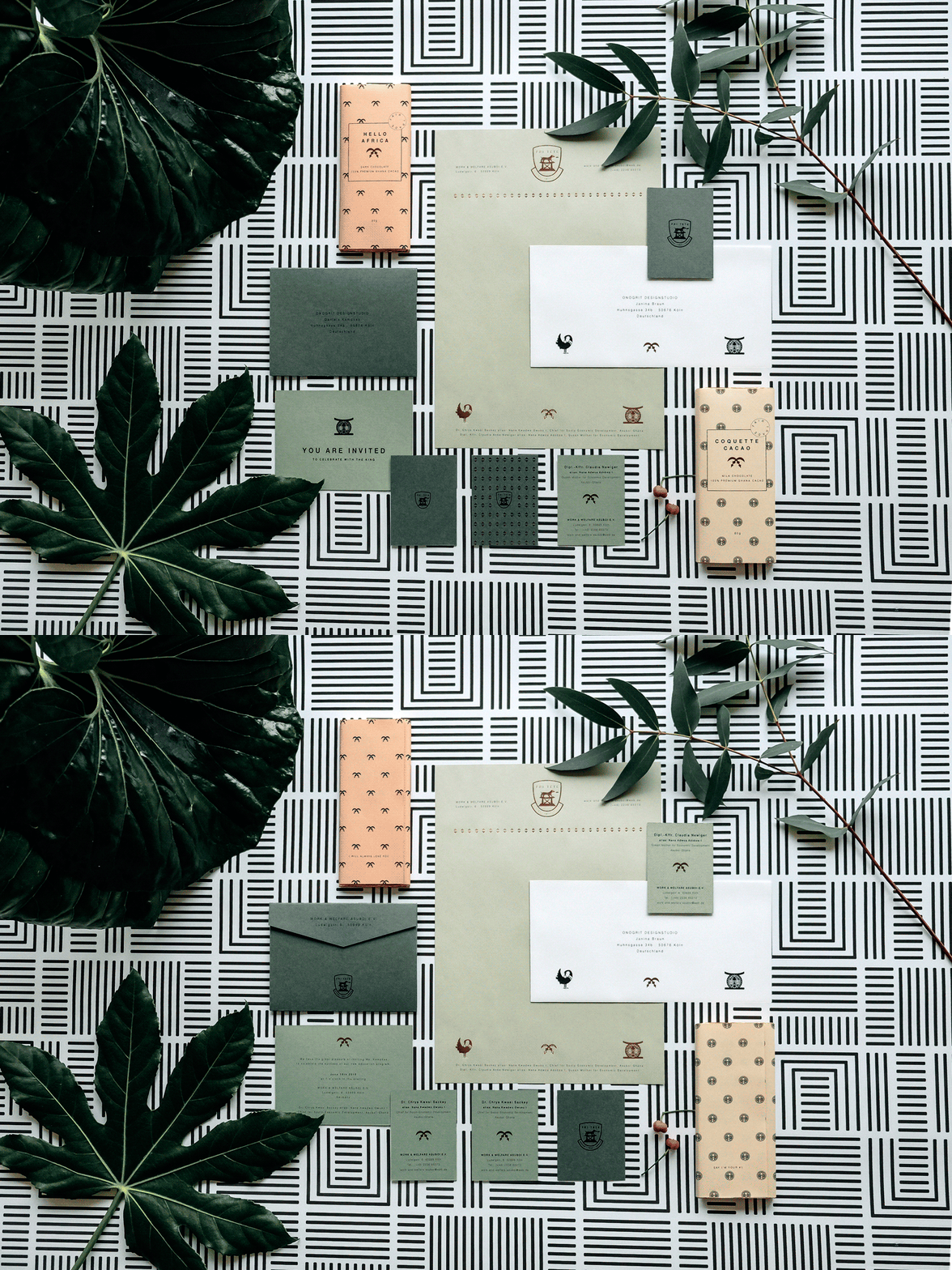
A real king in the house! For the African King Nana Kwadwo Owusu I from Ghana our studio designed a stationary set consisting of letterhead, business card and invitation card for his business correspondence.
challenge
APPROACH
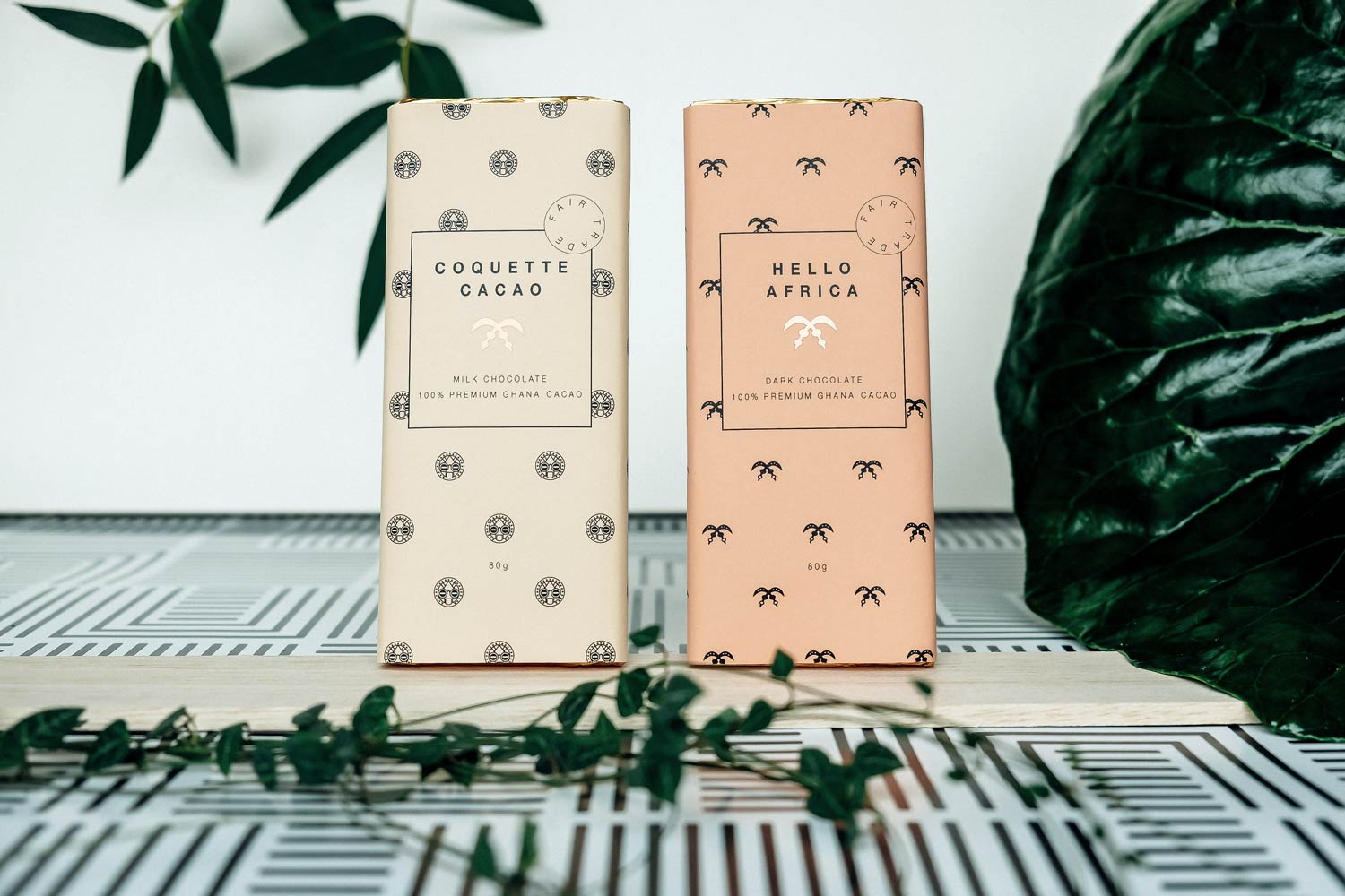
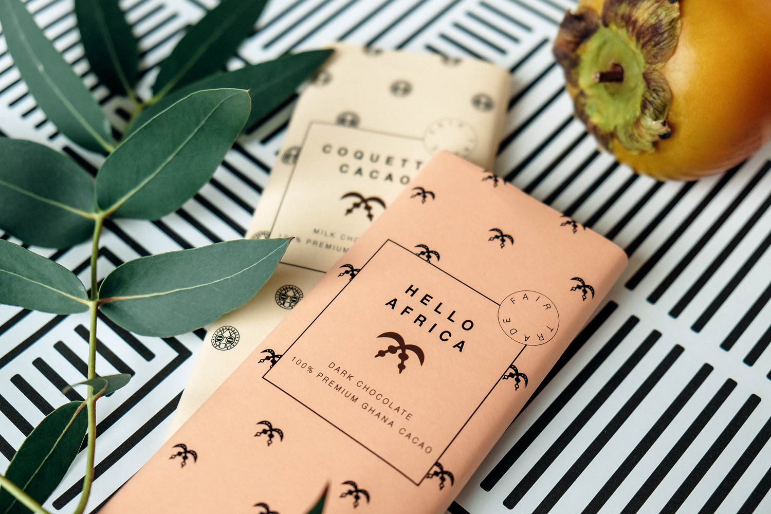
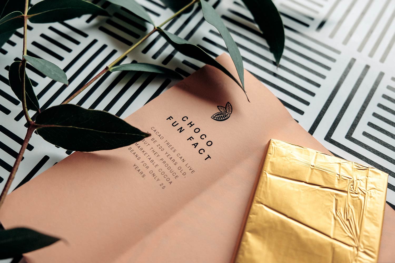
The illustrations show traditional royal ghanaian symbols, which we have developed into uniform icons. One of these classic symbols is, for example, the West African Sankofa bird – a symbol of learning from the past for a better future. As an encouraging fun part, we created a packaging design for a fictitious chocolate. For this we developed a branding based on the business papers and complemented it with a few chocolate fun facts.
How do you like it?
I like what I see!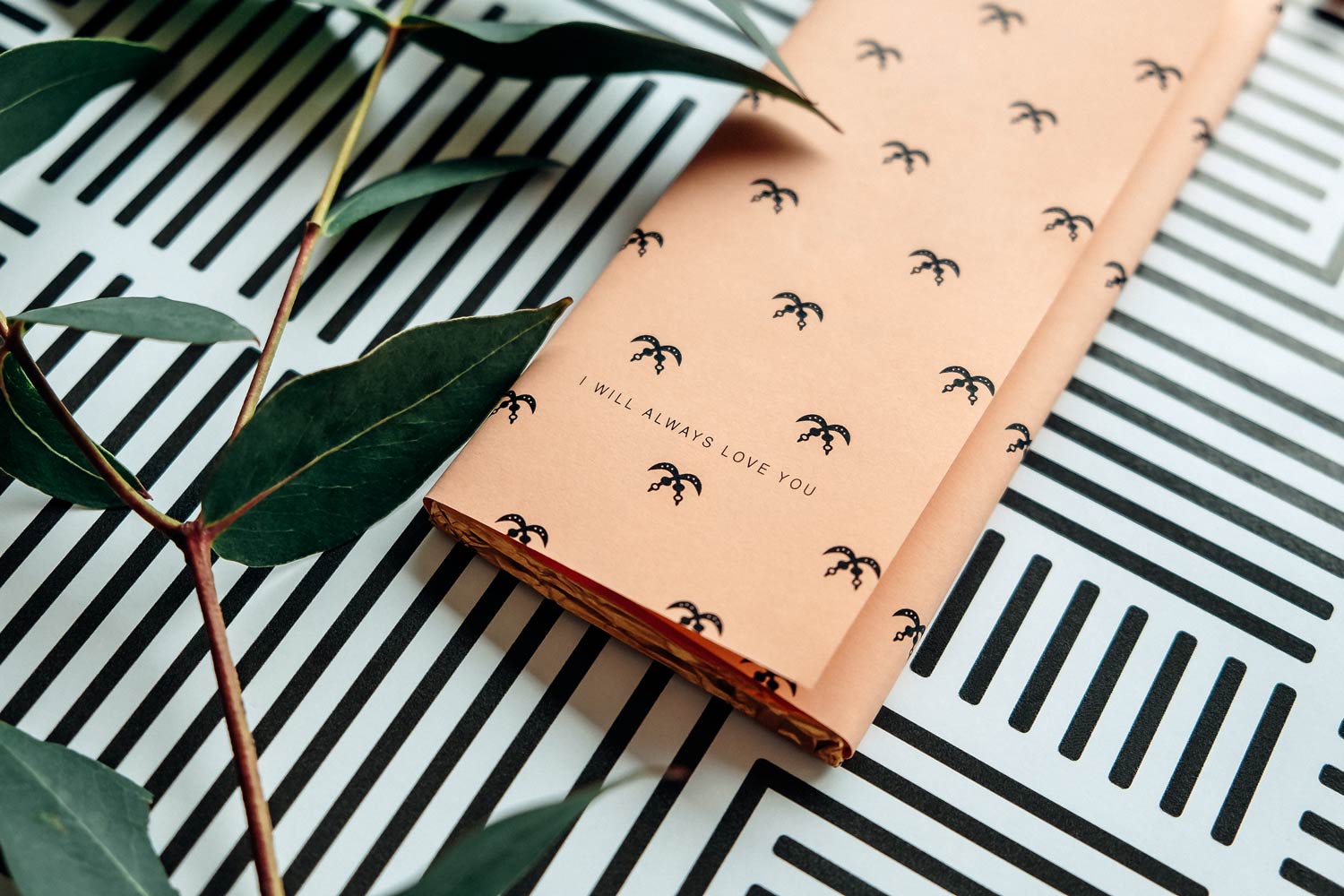
HELL & FREUNDLICH
year
2018
client
hell & freundlich
industry
Interior Design
services
Exclusive Invite
scope
Ideation, Concept, Copy, Production support
CLIENT
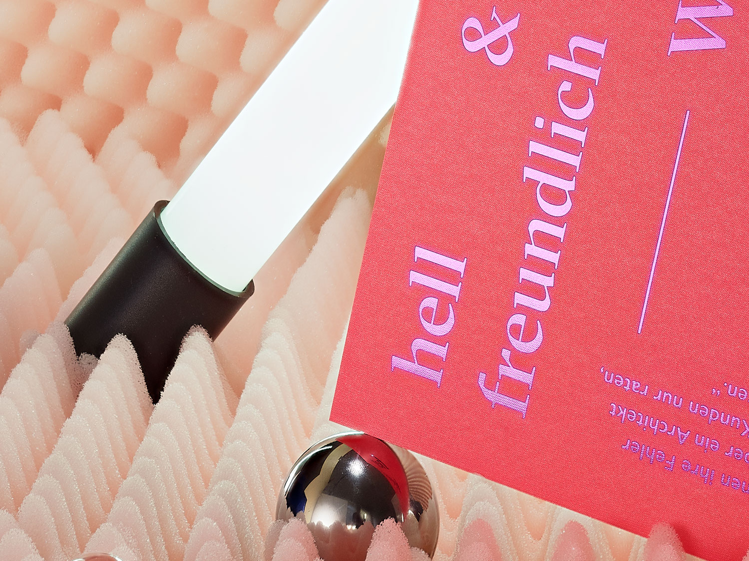
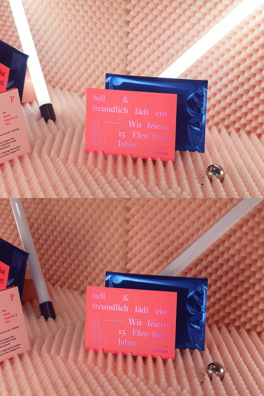
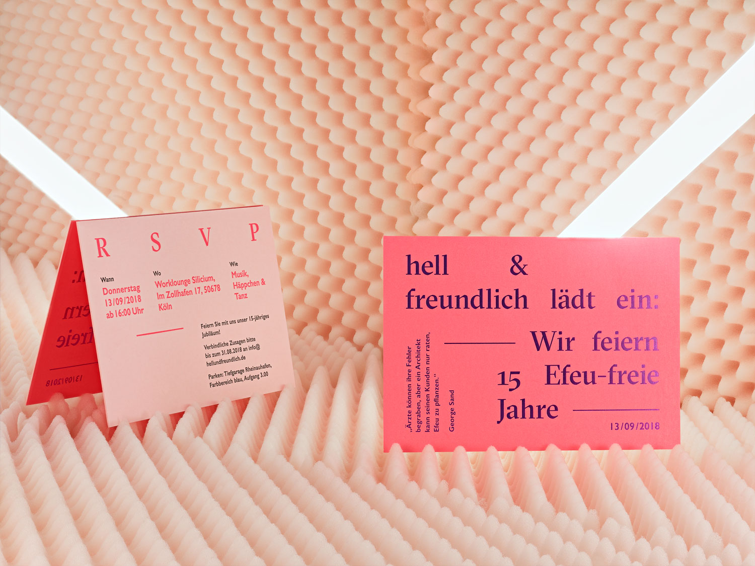
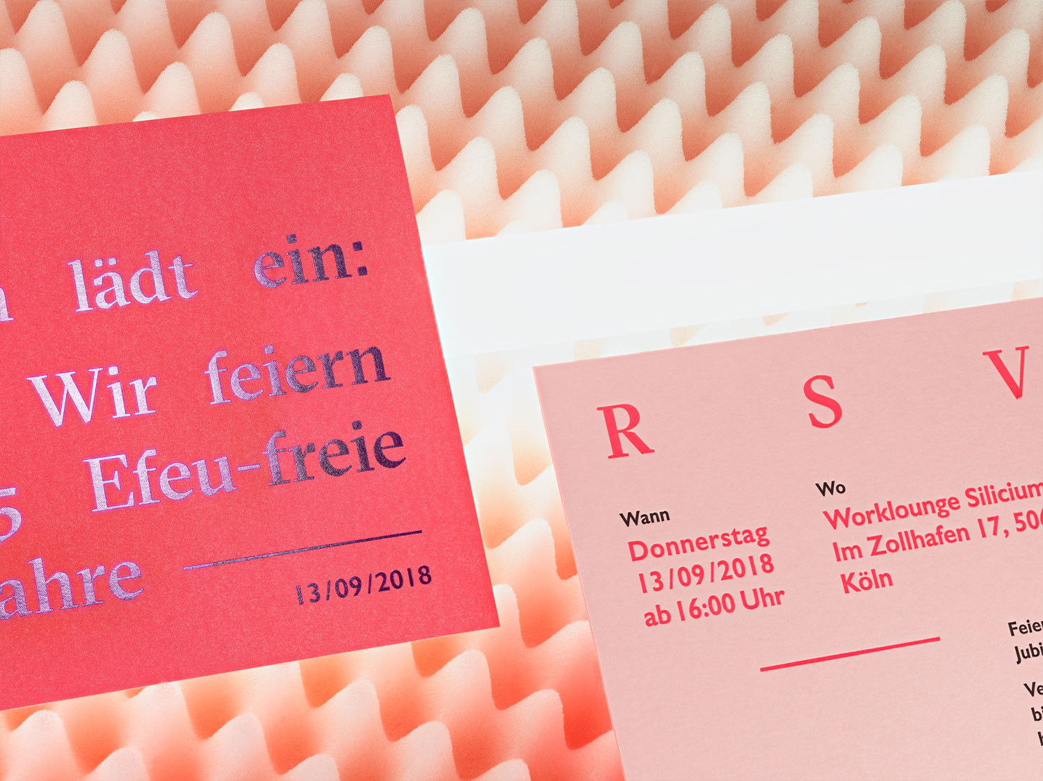
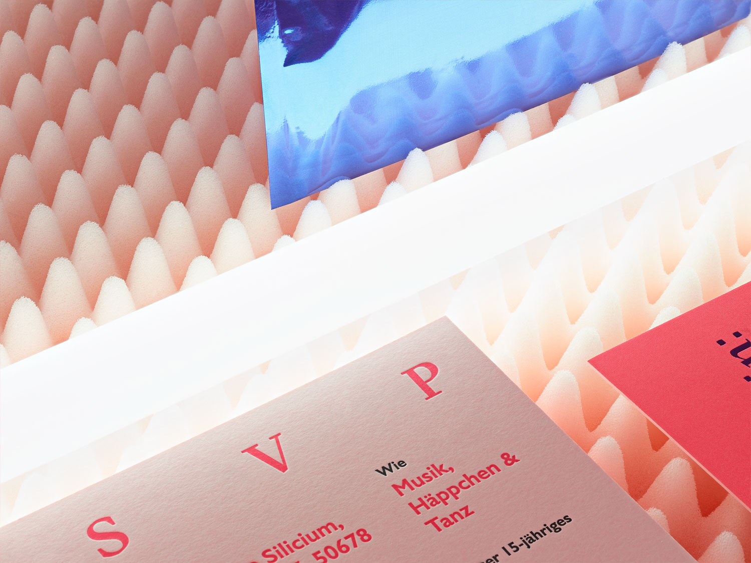
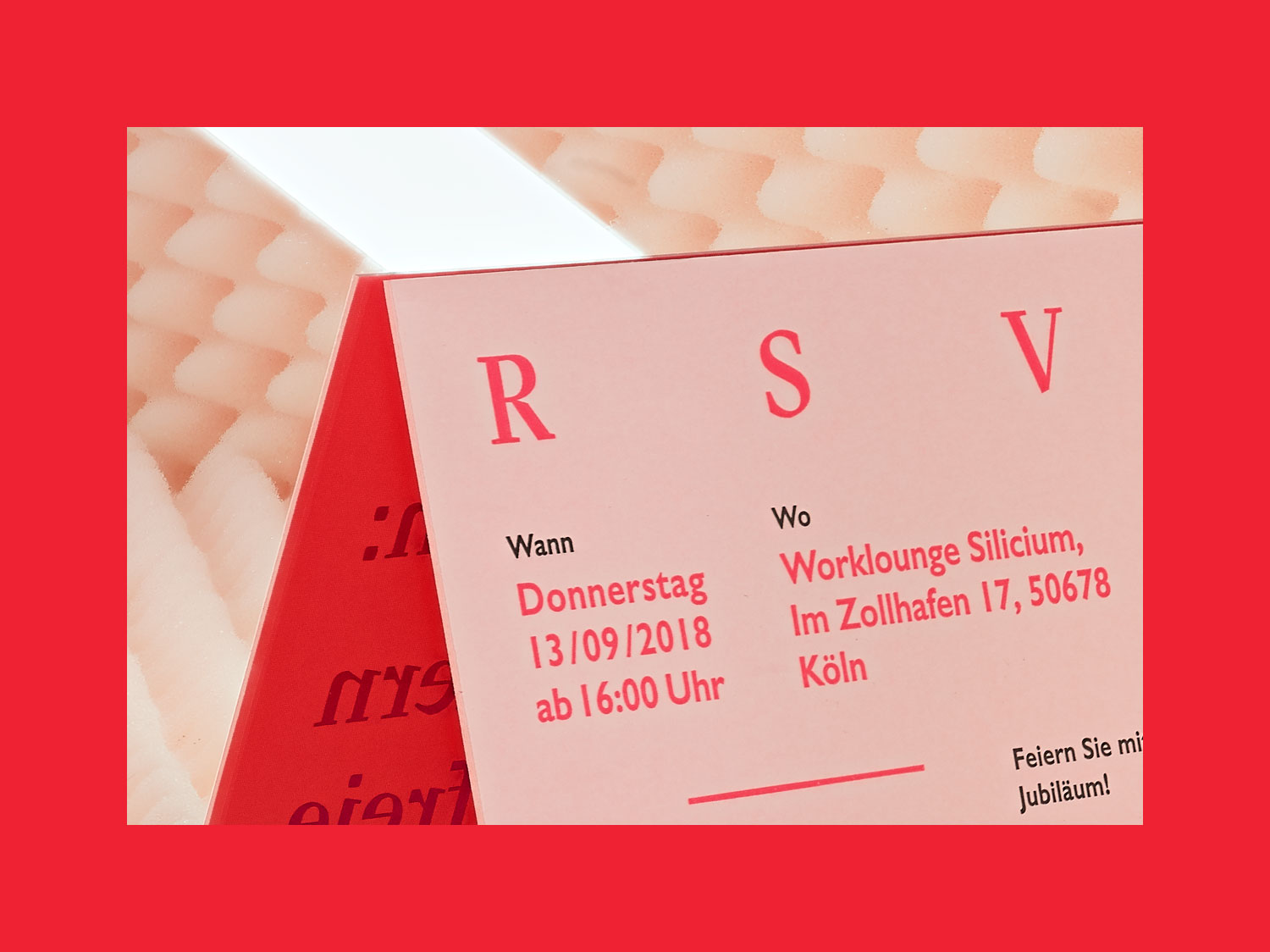
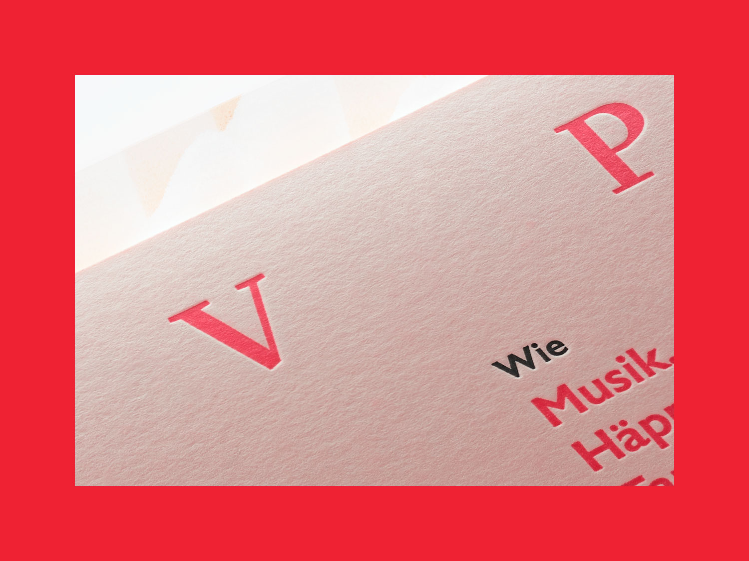
Together with Patricius C. M. Schalkwijk – owner of the interior design agency hell & freundlich – we wanted to create an invitation that would make it to a place of honour on the recipient’s desk. It’s so beautiful that it won’t be thrown away light hearted with other printed products. And which remains enthroned on the table even after the actual event – simply because it is so beautiful.
challenge
How do you create lasting value these days? How can something quite ordinary become something special? By a good taste of the client, by a high design skill and an excellent print production.
APPROACH
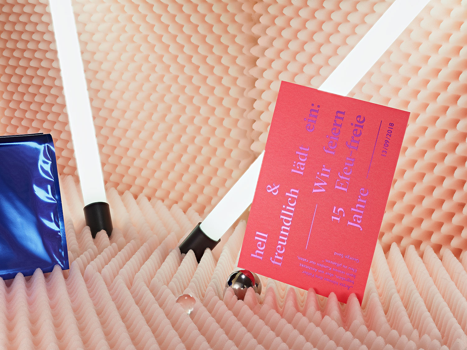
“Doctors can bury their mistakes, but an architect can only advise his clients to plant ivy.” This quote from George Sand was of course a wonderful hanger for our invitation card for the 15th company anniversary. And so we invited directly to “15 ivy-free years” to celebrate this achievement.

logo u0026 colors
The invitation card was realized with our friendly printer Letterjazz from Essen. A real Din A5 “board” was laminated up to a massive 800 gsm after a 2-colour print. In addition a fancy envelope from the series Colorplan.
Do you like what you see?
Let’s work togetherBASF MAKING HEADWAY
year
2014
client
BASF Coatings
industry
Automotive
services
Editorial Design
scope
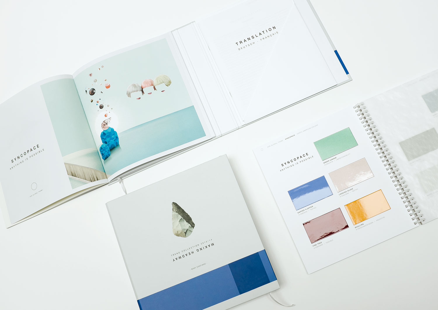
Workshops, Concept Trend Catalogue, Typography, Collages, Key Visuals, Print Production, Bookbinding
CLIENT
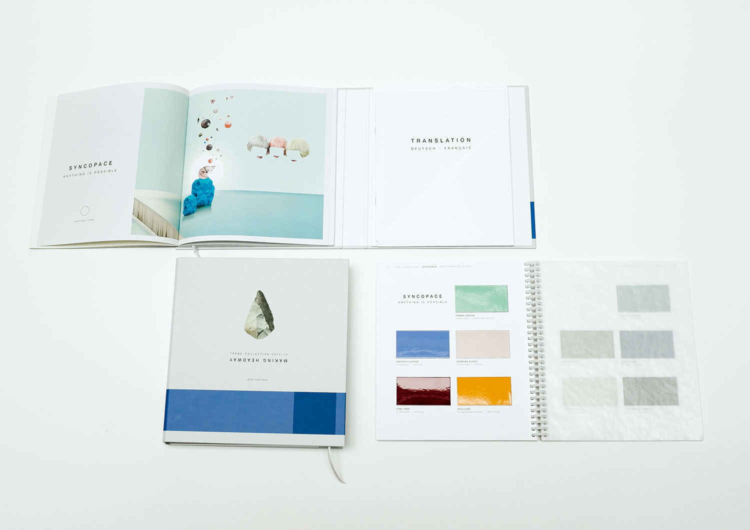
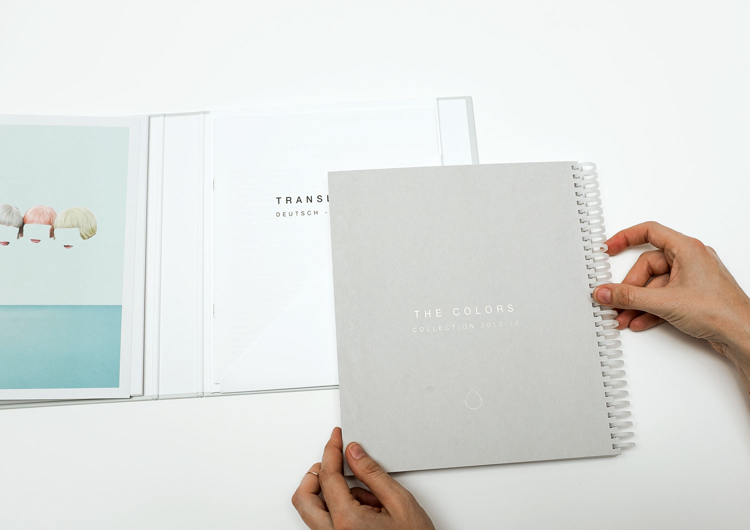
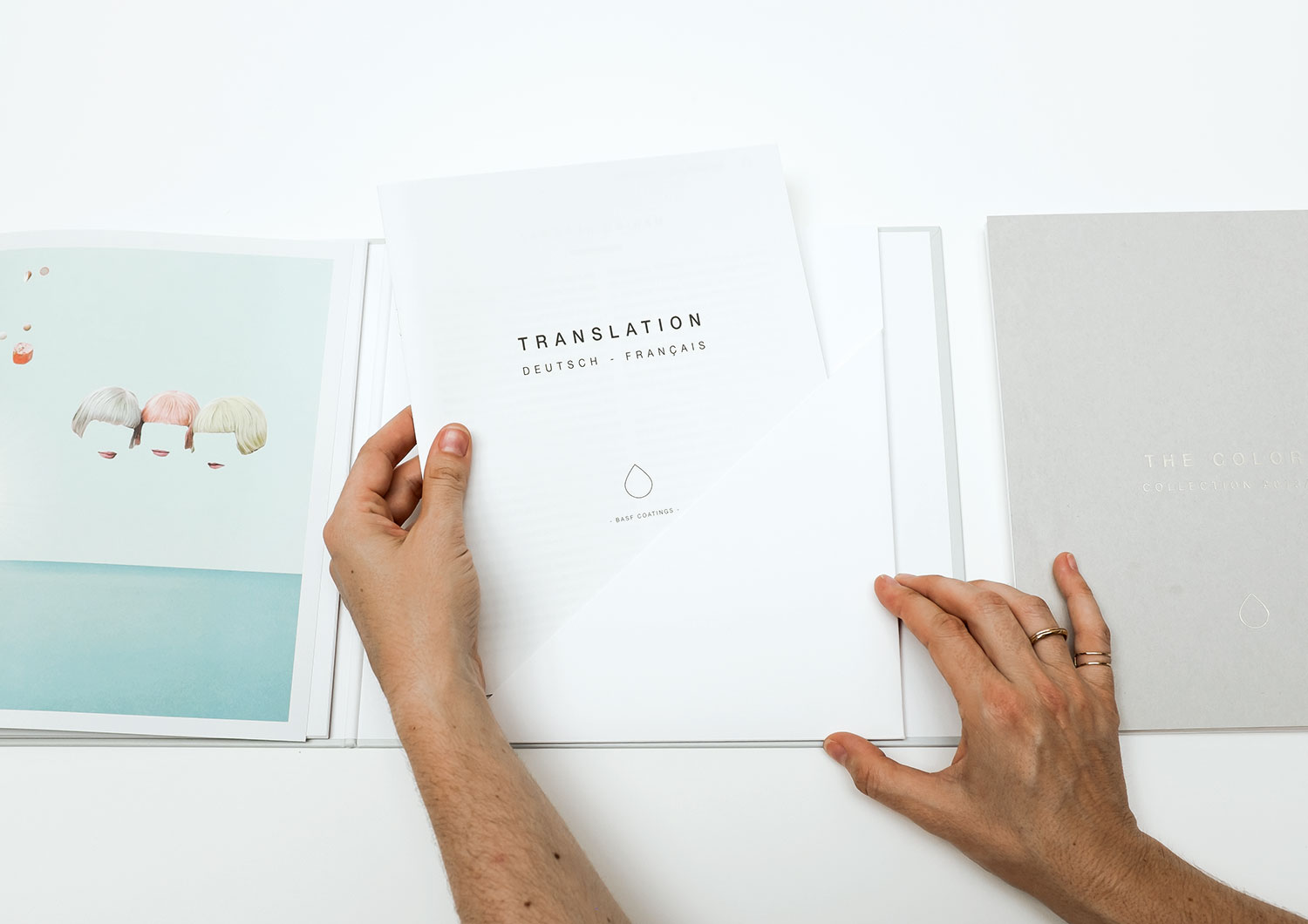
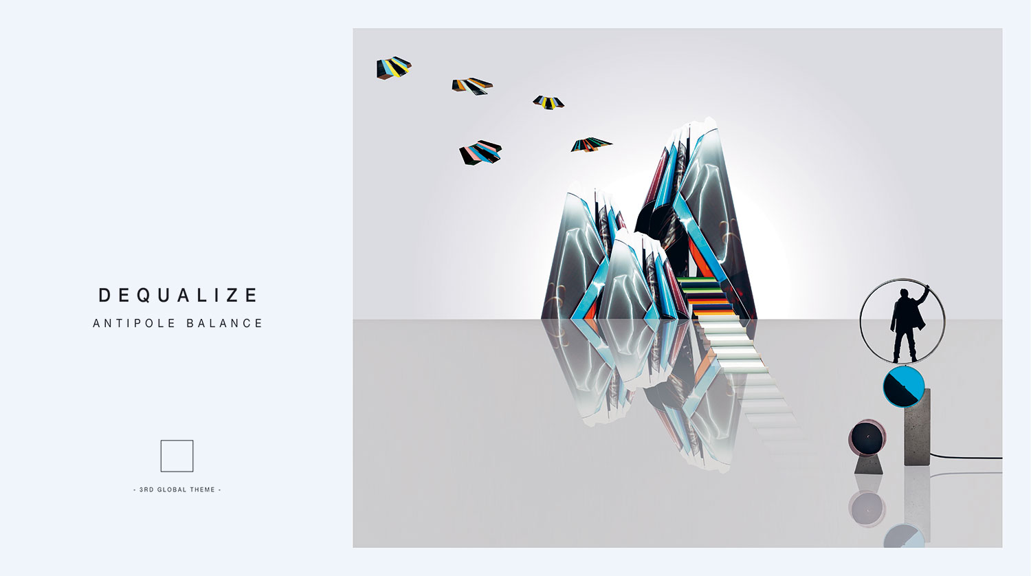
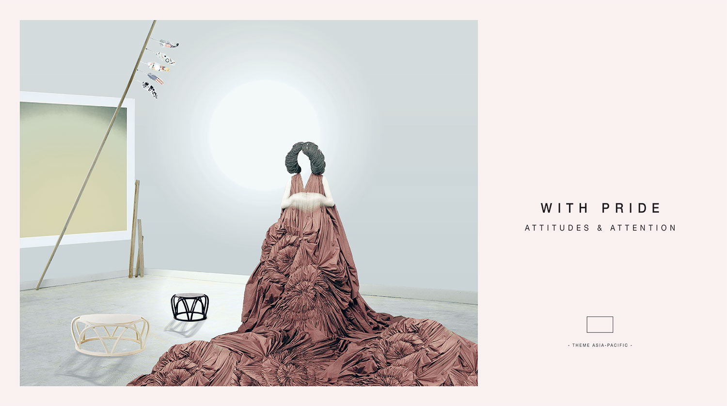
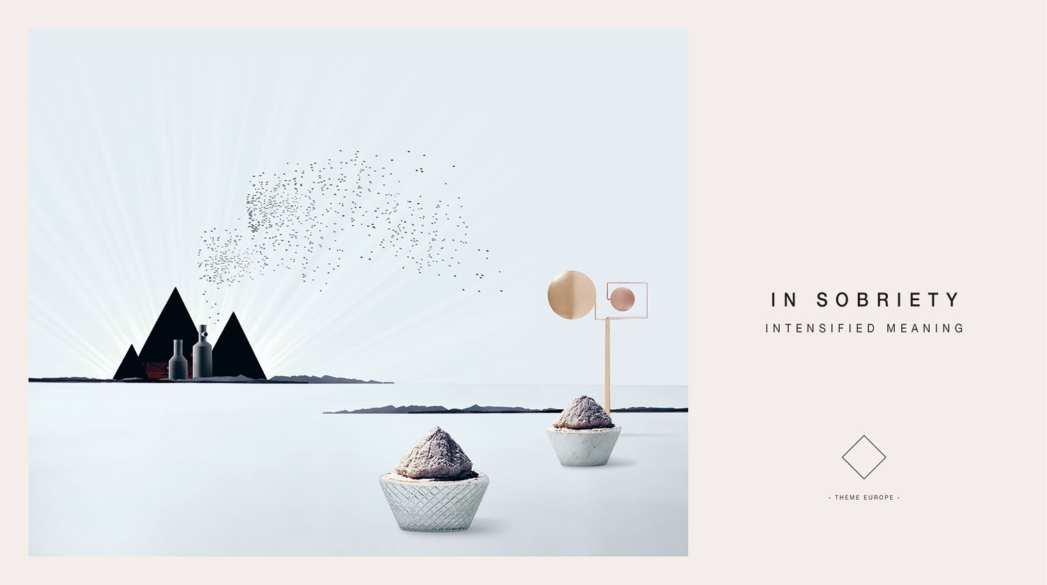
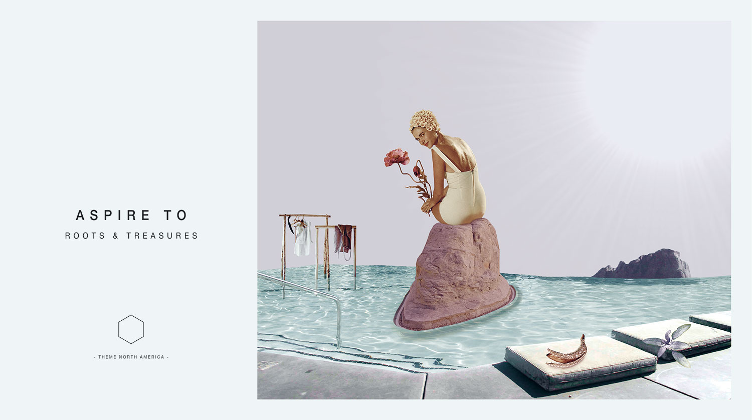
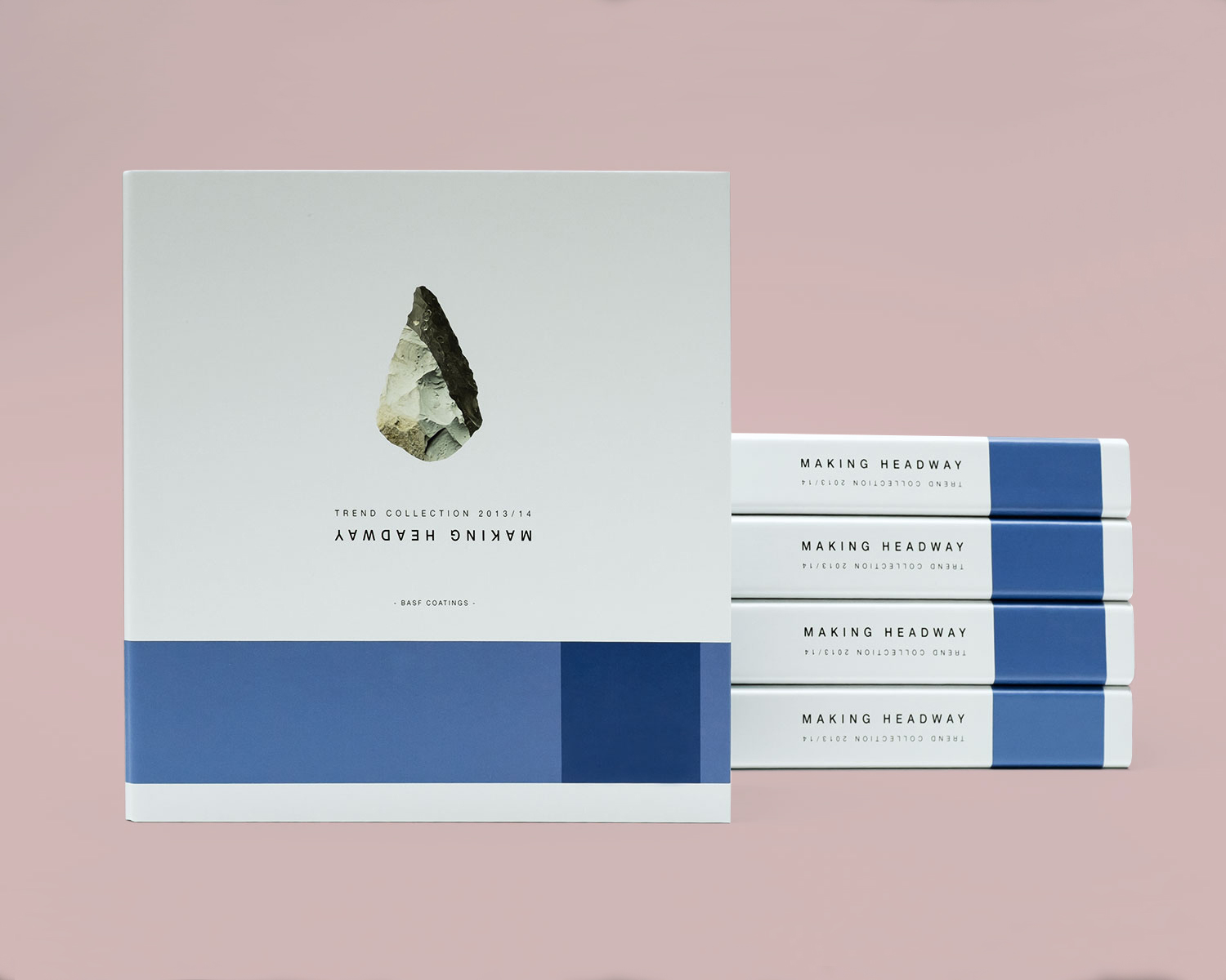
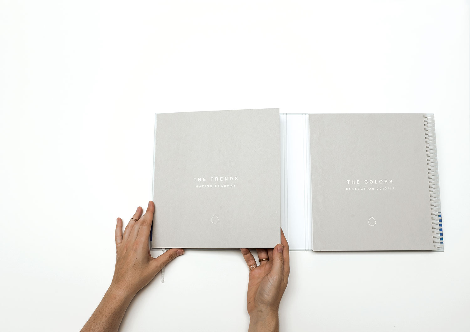
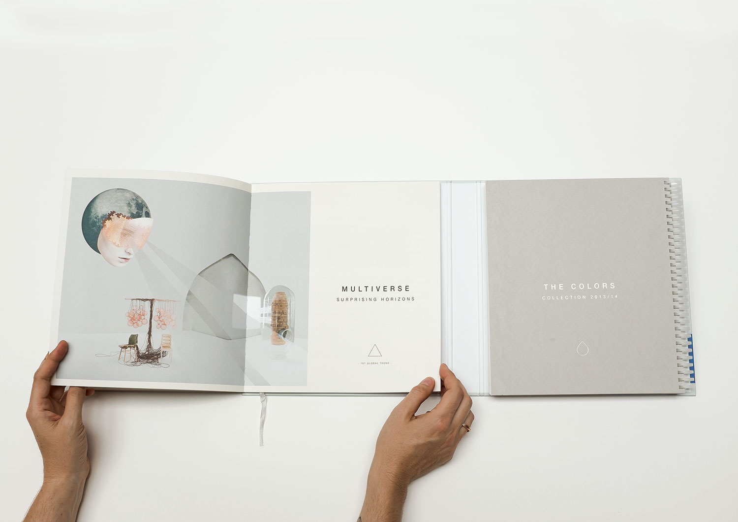
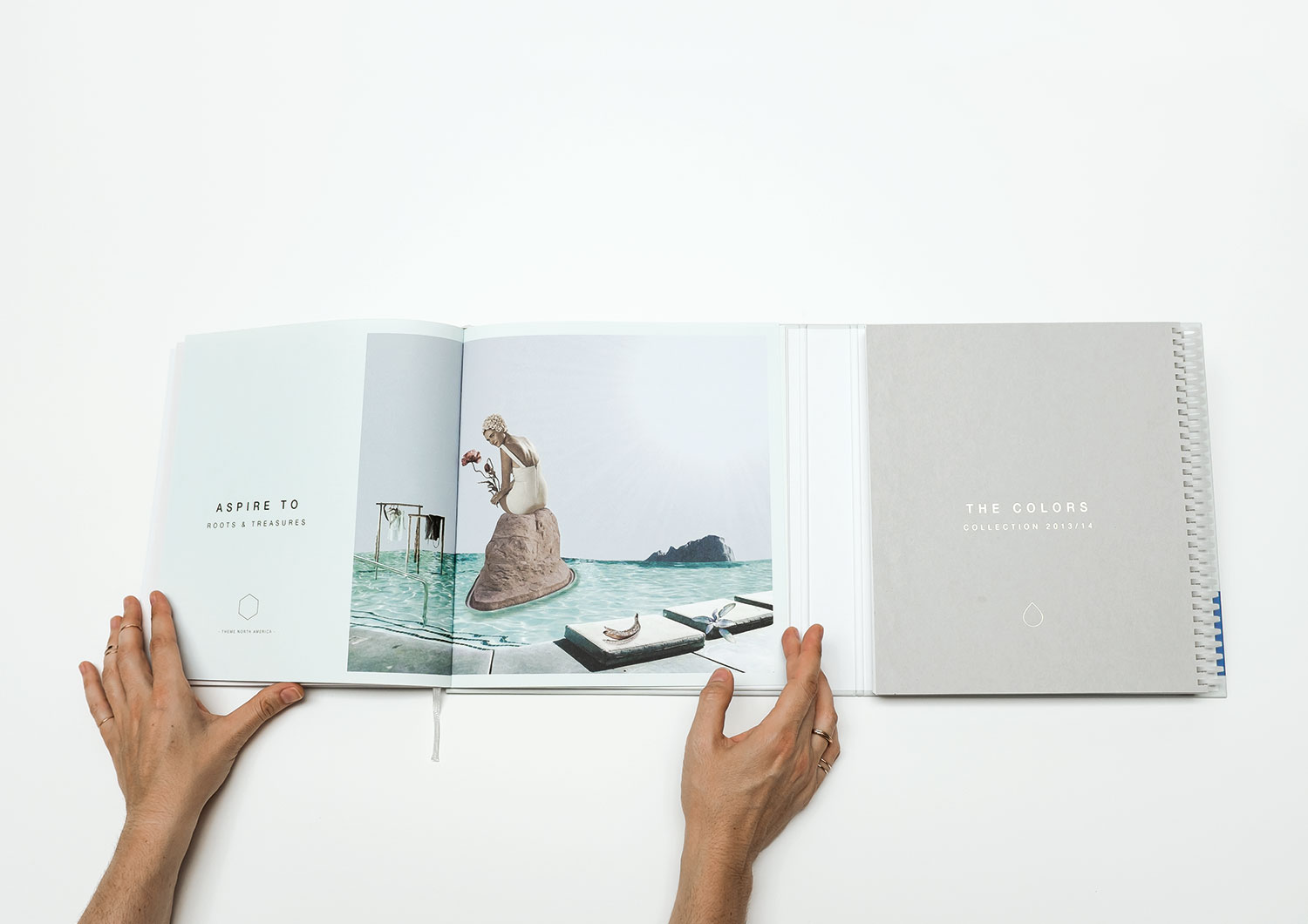
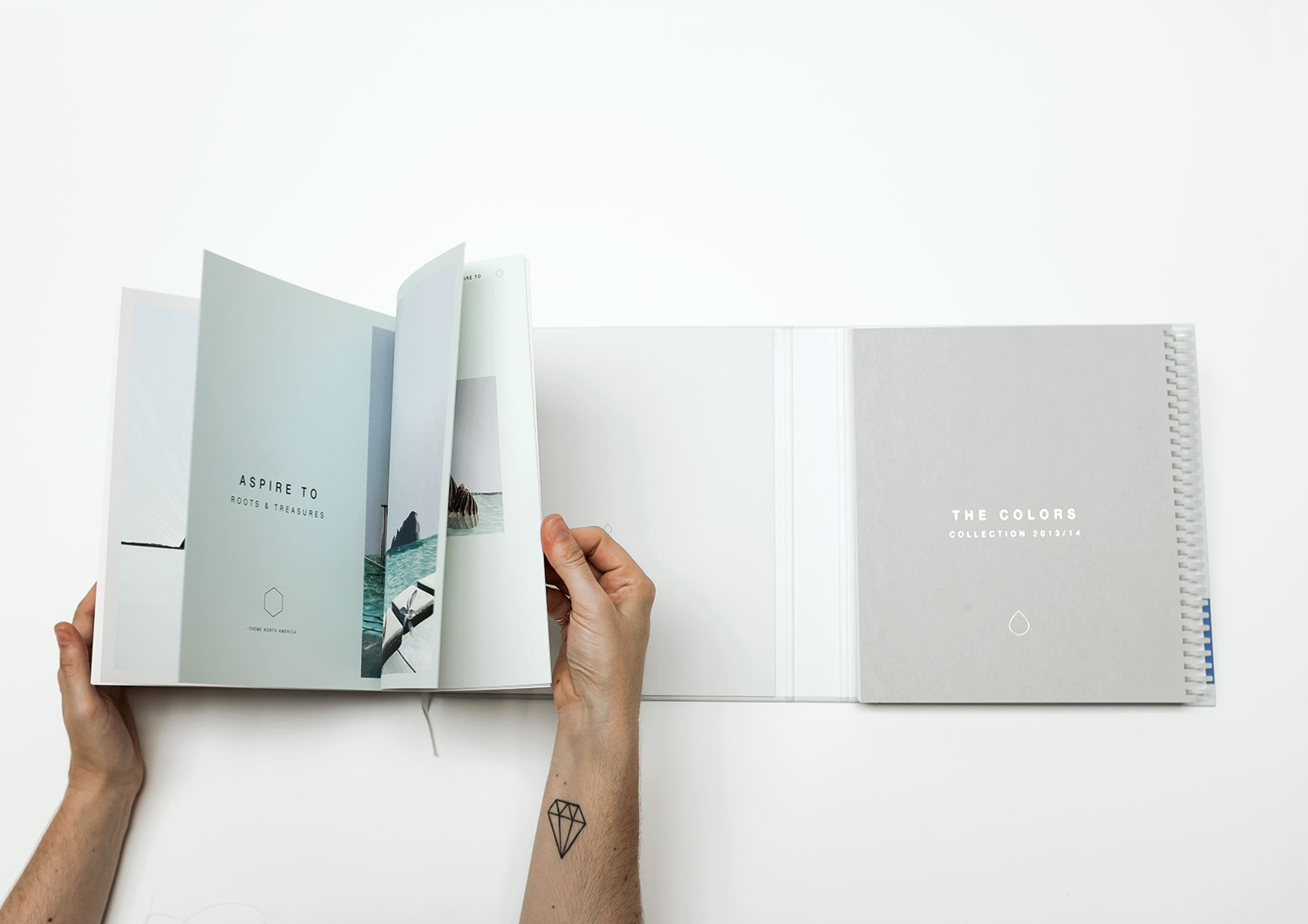
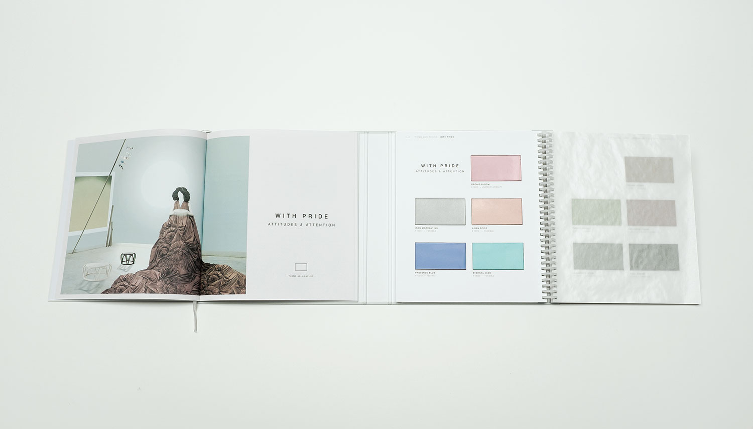
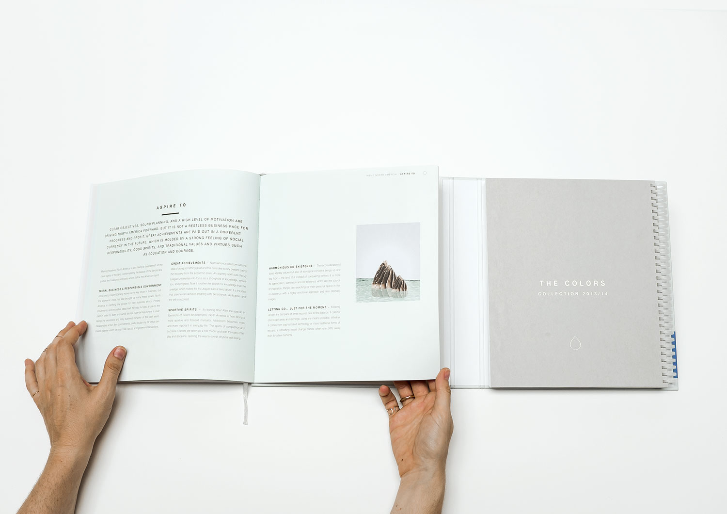
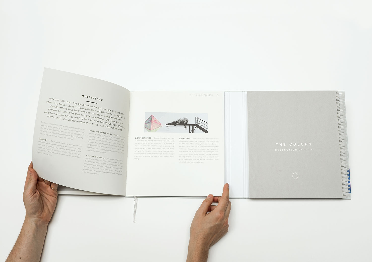
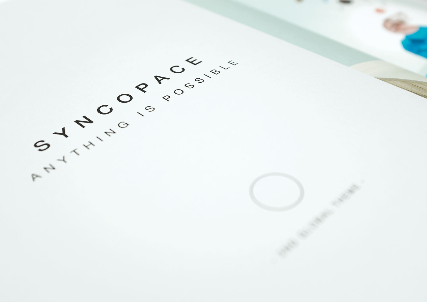
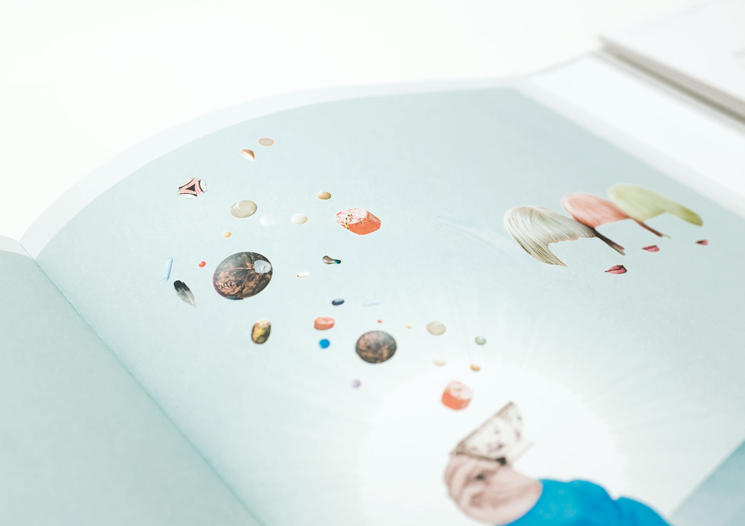
The trendbook titles always showed the way: from COME CLOSER to WIDE AWAKE to MAKING HEADWAY. We declared it the “year of collage,” simply because the time was right.
challenge
It was all about MAKING HEADWAY in the global trend book. Moving step-by-step in the right direction – and that meant something completely different for each region. For Europe that meant saving a few countries from financial collapse; for the United States that meant Barack Obama fighting for a second term or a first one for Mitt Romney. And Asia Pacific sought balance between tradition and modernity.
APPROACH
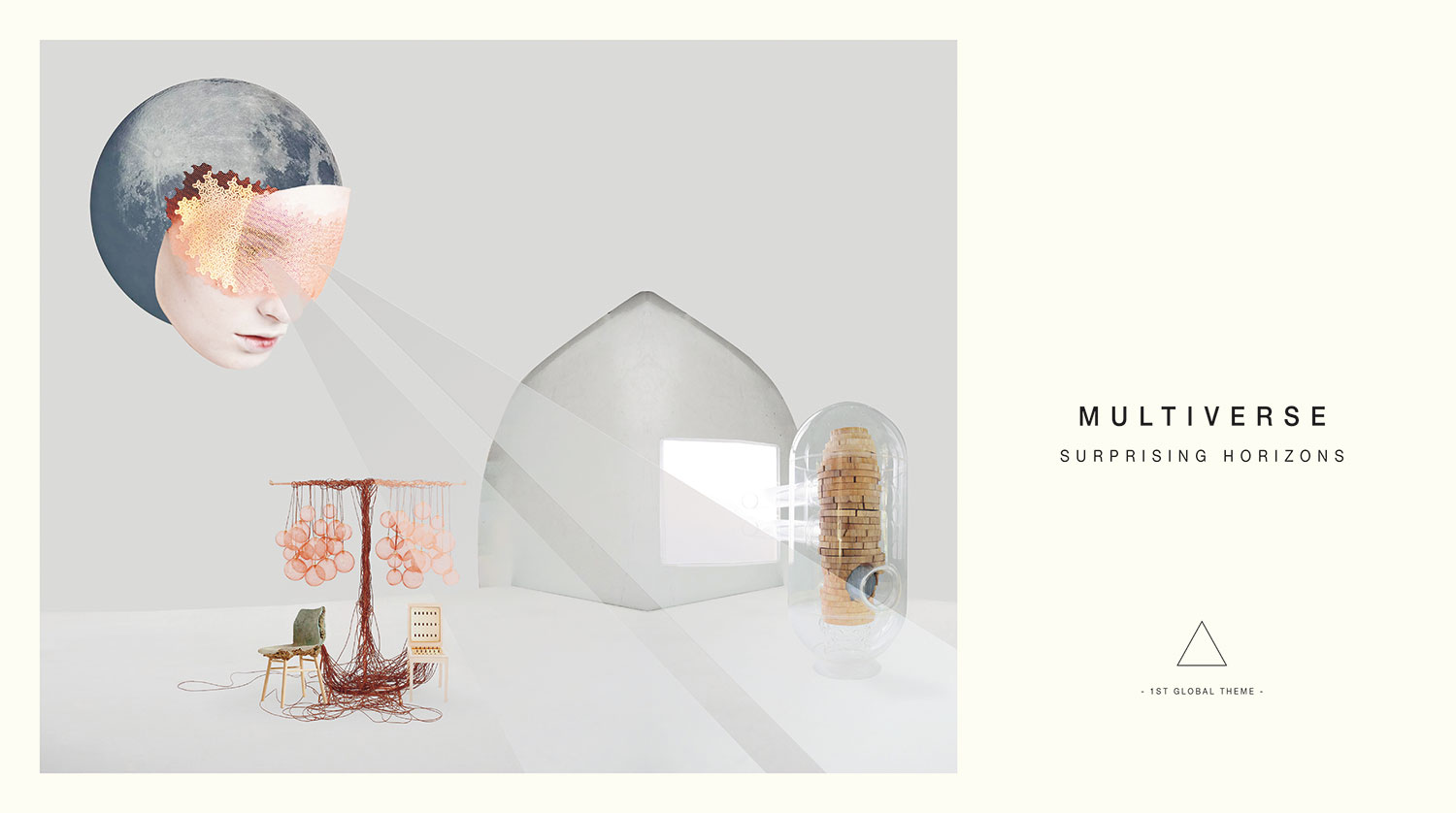
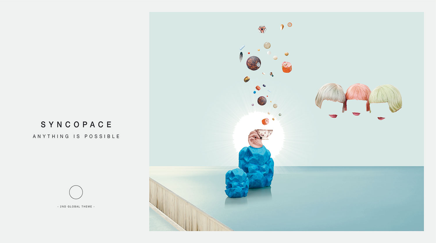
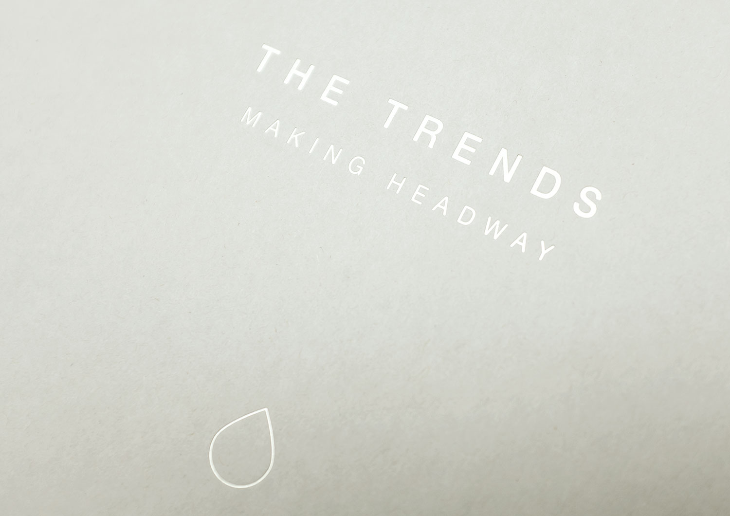
We knew collages would be the next big design thing, so why wait? What a relaxed world we conjured up for ASPIRE TO! How beautiful WITH PRIDE for Asia Pacific! With a store of just 10 images per world we had limited material to evoke magic, but succeeded surprisingly well. We duplicated, retouched, masked and hyperventilated from dawn to dusk. And we’re most proud of the title. Sometimes second ideas are the best – and if you have been around for a while, you know when it’s a good time to call it a day. A handheld wedge as a symbol of “progress” needs no further explanation. A truly global icon. Sometimes it’s OK to be proud of yourself.
Do you like what you see?
Let’s work together