Kabel 1 Doku
year
2017
client
Kabel 1 Doku
industry
TV, Television, Entertainment
services
Digital Design
scope
Logo development, Design System, Corporate Design, Appearance, Visual Language
CLIENT
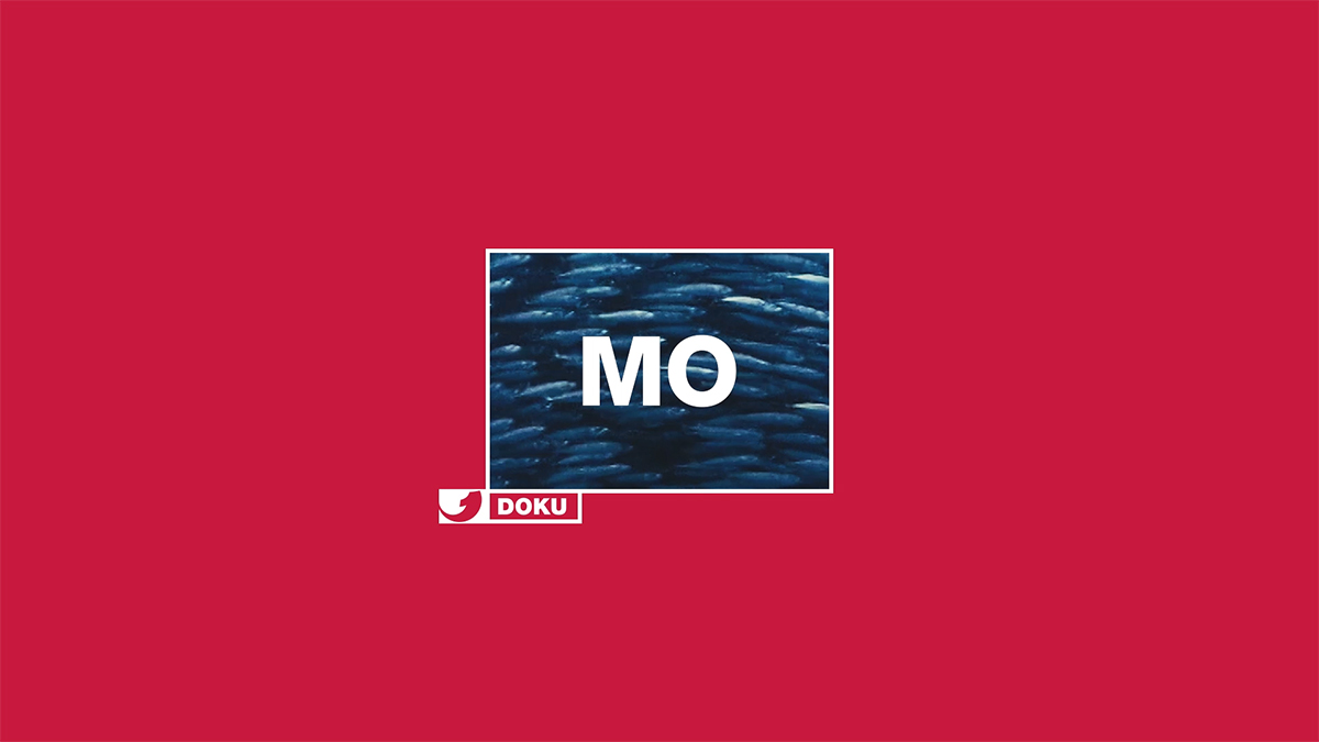
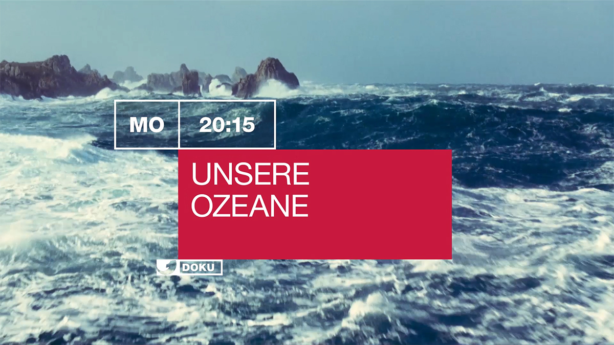
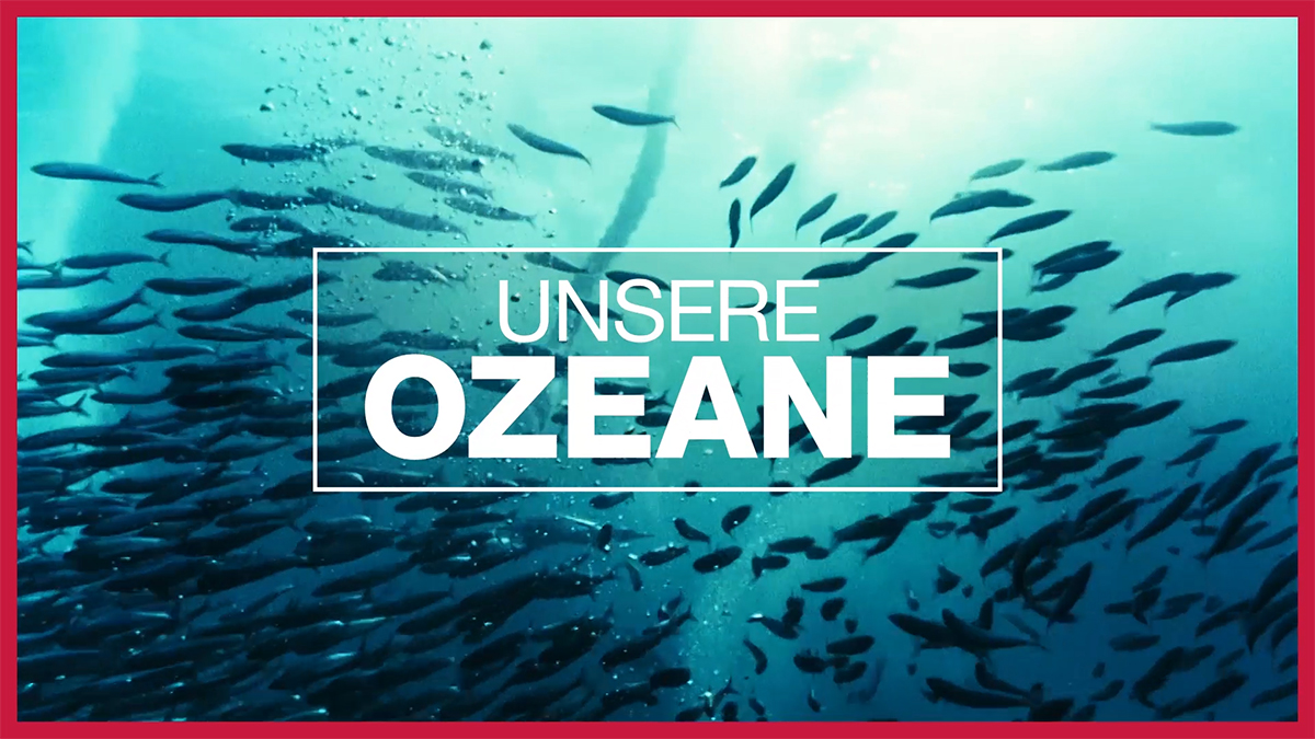
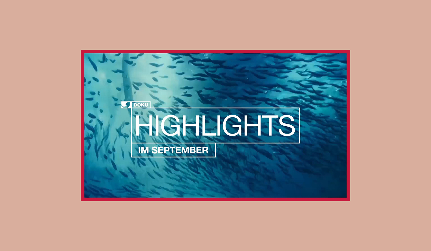
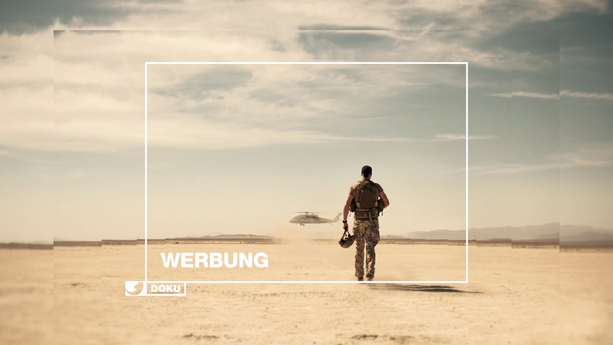
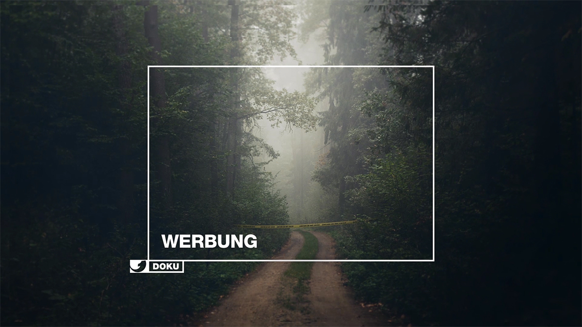
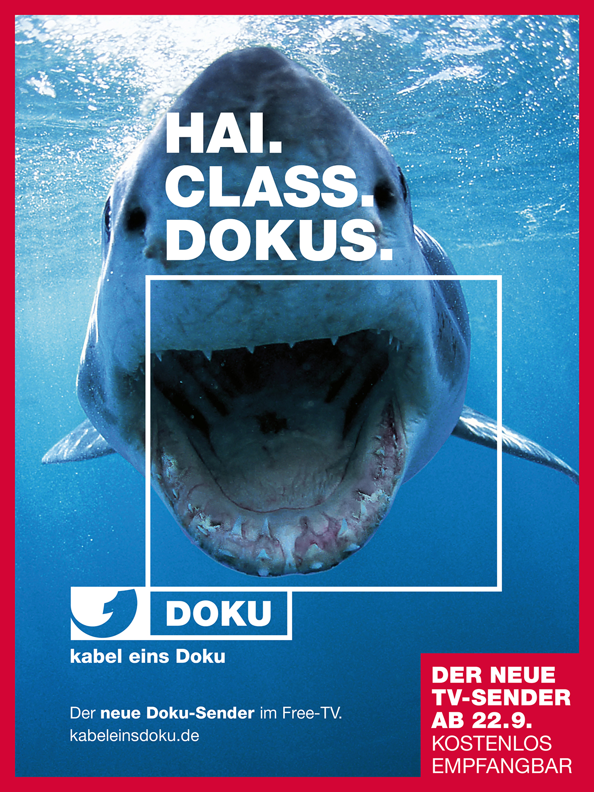
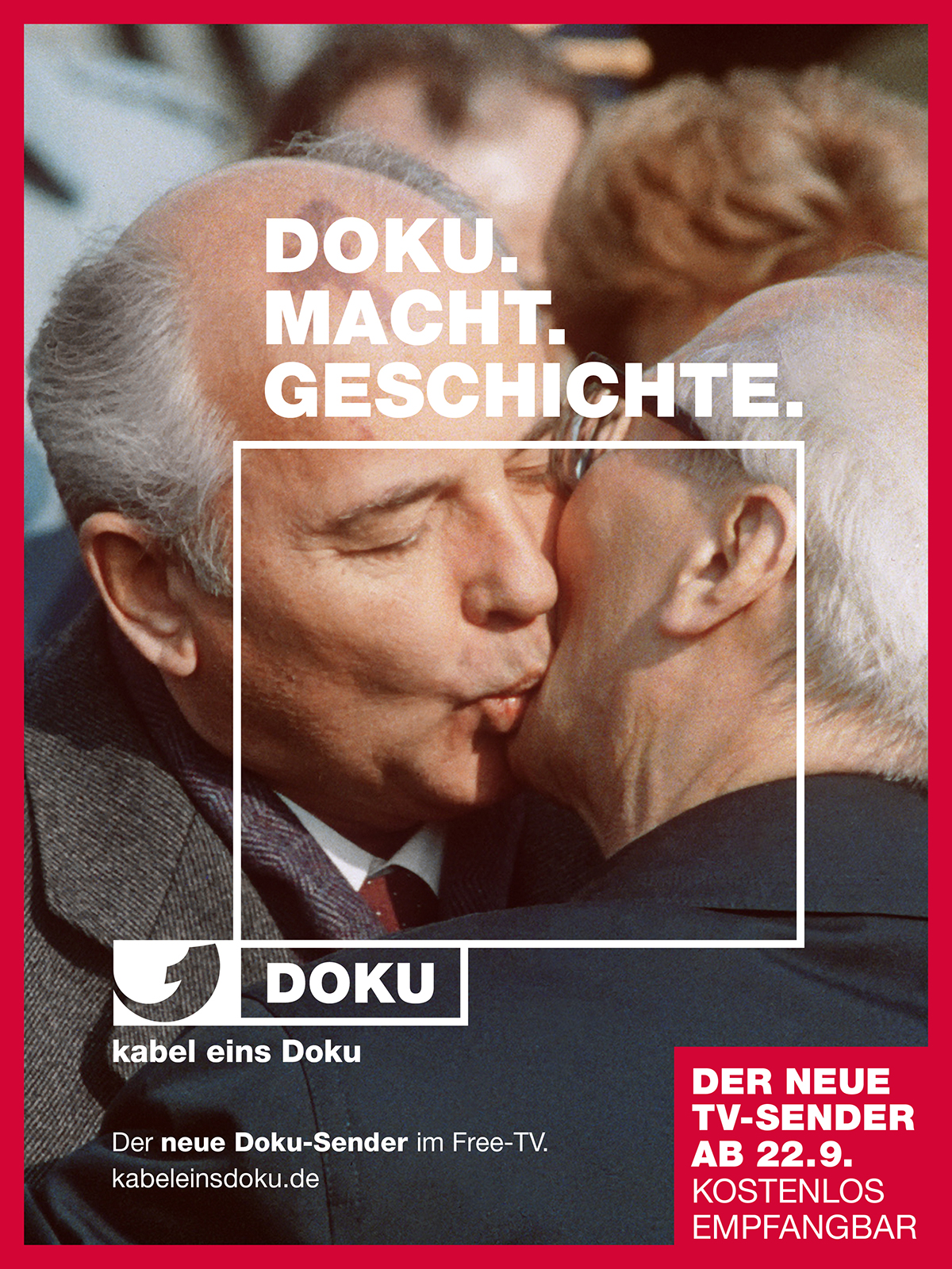
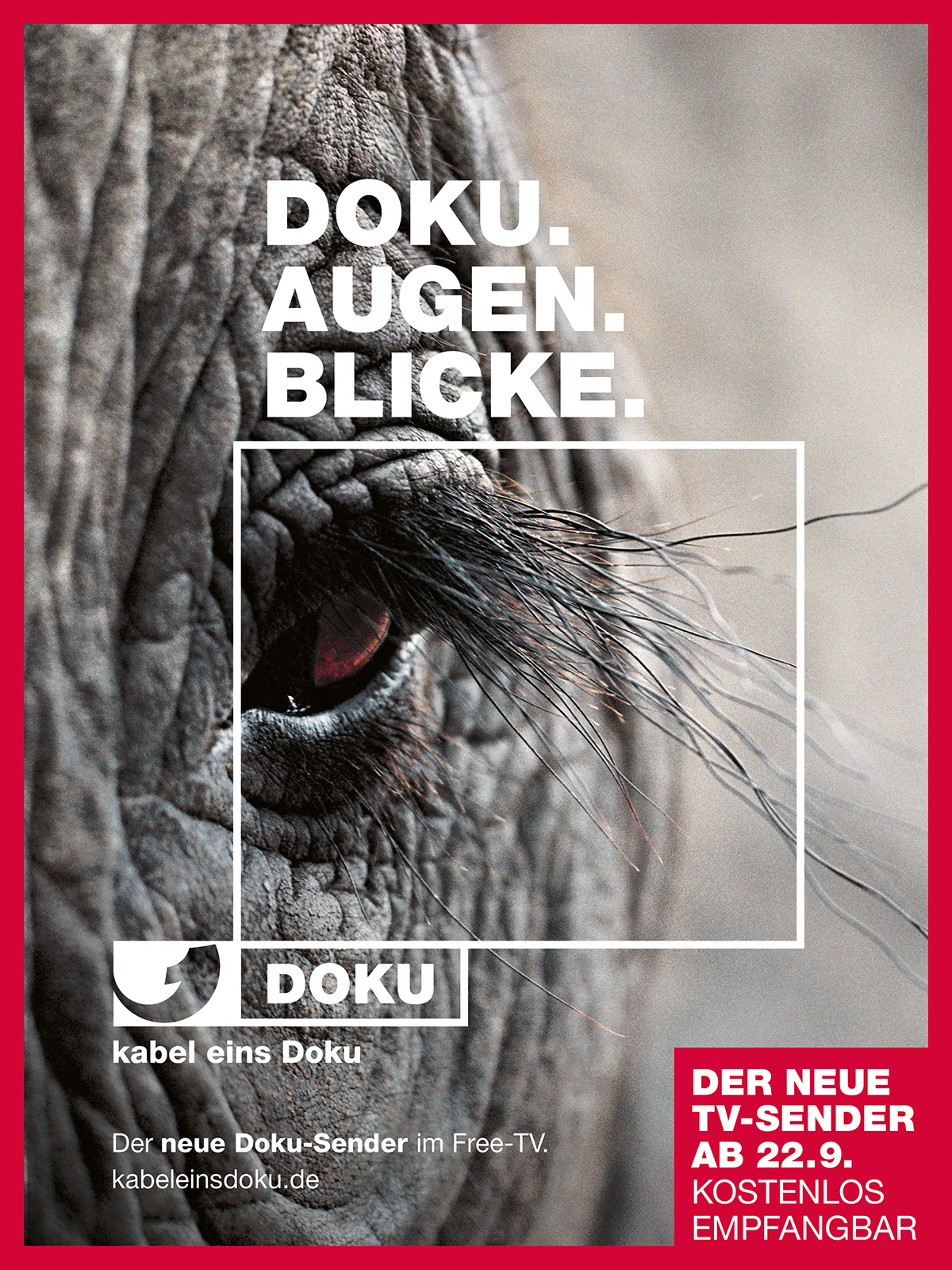
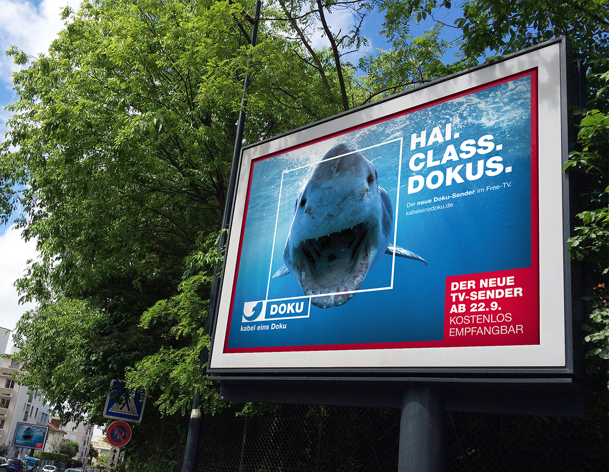
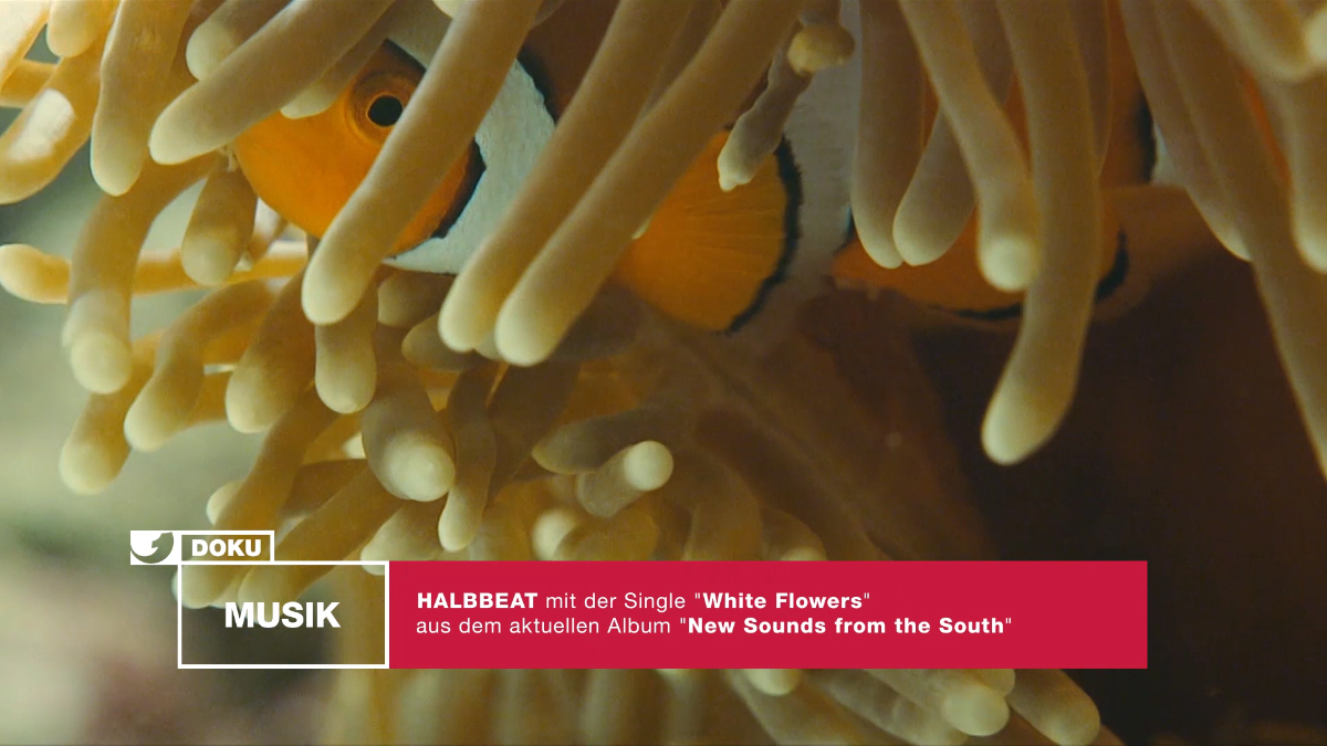
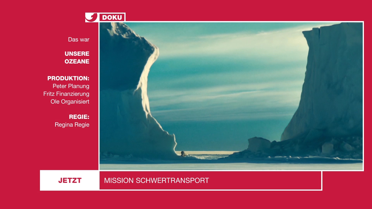
Kabel 1 Doku stands for high-quality documentation and reportages and went on air in autumn 2017. The wholly-owned subsidiary of ProSiebenSat.1 Media SE commissioned our friendly Cologne based agency FeedMee to develop a new on-air design. And these brought us into the design boat.
challenge
ONOGRIT, supported by Parissa Chargi, developed a modular design system for the TV channel and developed a visual language for the on-air design and the print campaign. The campaign was displayed on more than 20,000 advertising pillars throughout Germany and won the ADC nail in gold. Bäm.

APPROACH
ONOGRIT, supported by Parissa Chargi, developed a modular design system for the TV channel and developed a visual language for the on-air design and the print campaign. The campaign was displayed on more than 20,000 advertising pillars throughout Germany and won the ADC nail in gold. Bäm. www.kabeleinsdoku.de
Do you like what you see?
Pfff – Are you kidding me?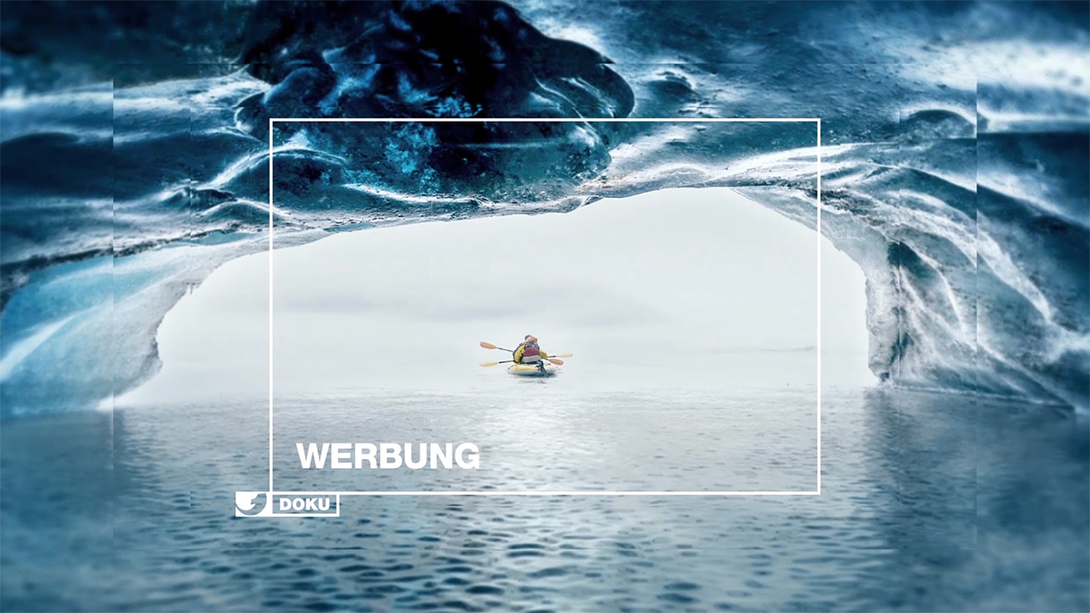
BONUSLAND APP
year
2016
client
Bonusland
industry
Agriculture, Affiliation
services
UX Design
scope
Concept, User Experience Design, IA, Interaction Design, Visual Design
CLIENT
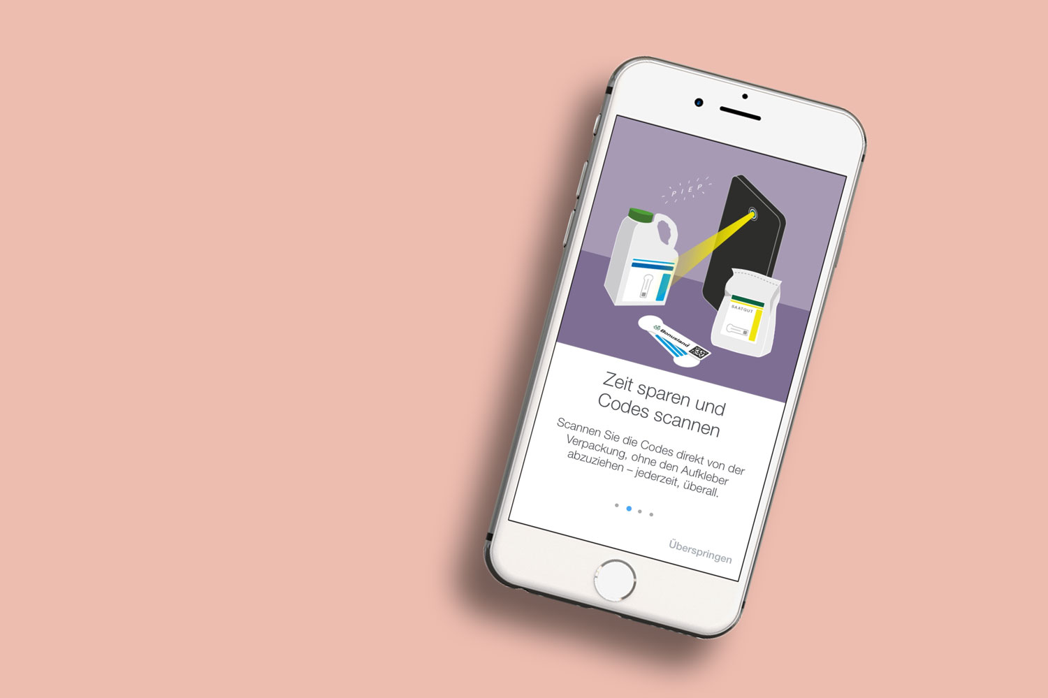
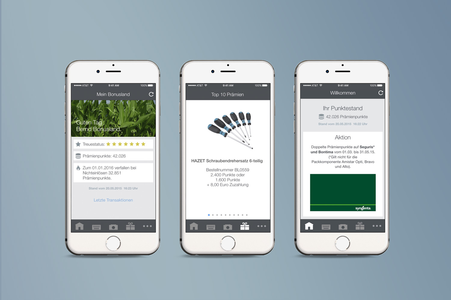
Our studio is in charge of Bonusland, Syngenta’s rewards program, since 2010. We had already worked on several projects together such as catalogues, brochures, newsletters and a website update – so this was just the next step for our partnership. In addition to our visual design services, we advised the company when it came to strategy and kept them regularly informed of current developments and potential opportunities within the market.
challenge
APPROACH
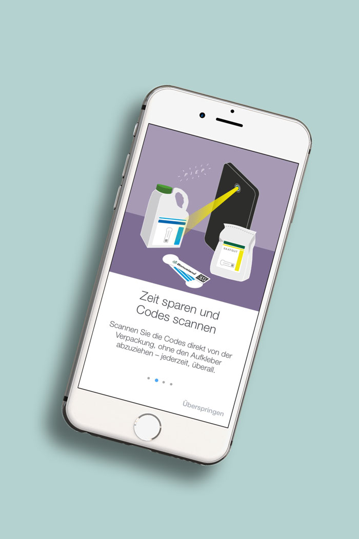
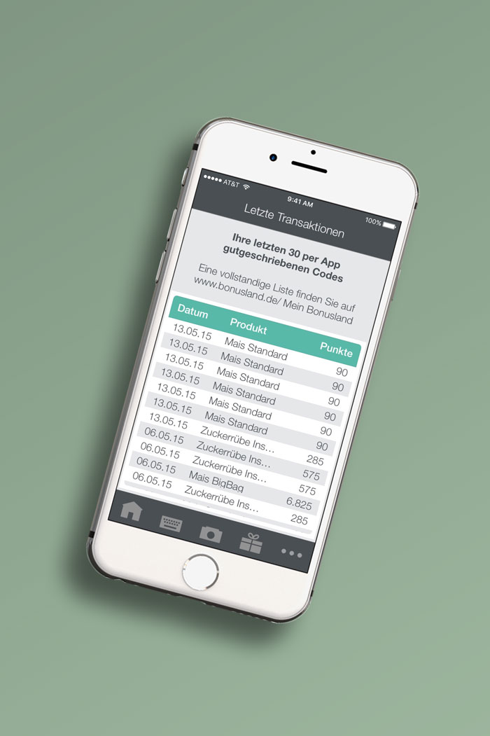
When it came to the app, we developed and designed an application that allows participants of the rewards program to scan codes directly via smartphone, therefore collecting points easily. The app is designed for both iOS (iPhone) and Android (Samsung, etc.) to ensure a wide accessibility for various users. We planned the user-friendly organisation of content (Information Architecture), illustrated a series of introductory graphics for new users, designed the screens of the application and took over the whole coordination with the engineers and programmers – so that our customer was able to focus on other significant decisions.
Download
Android: here
iOS: here
How do you like it?
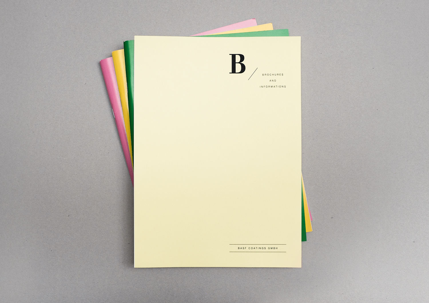
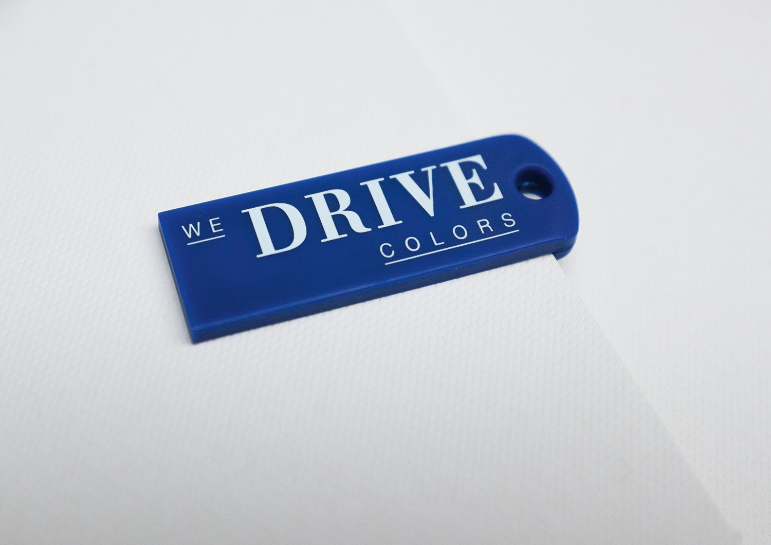
Looks cool!BASF COATINGS EXCLUSIVE CONFERENCE FOLDER
year
2014
client
BASF Coatings
industry
Automotive
services
Invitation, Envelope Folding
scope
Concept, Layout, Typography, Production support
CLIENT
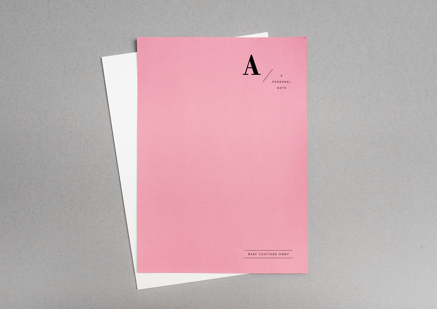
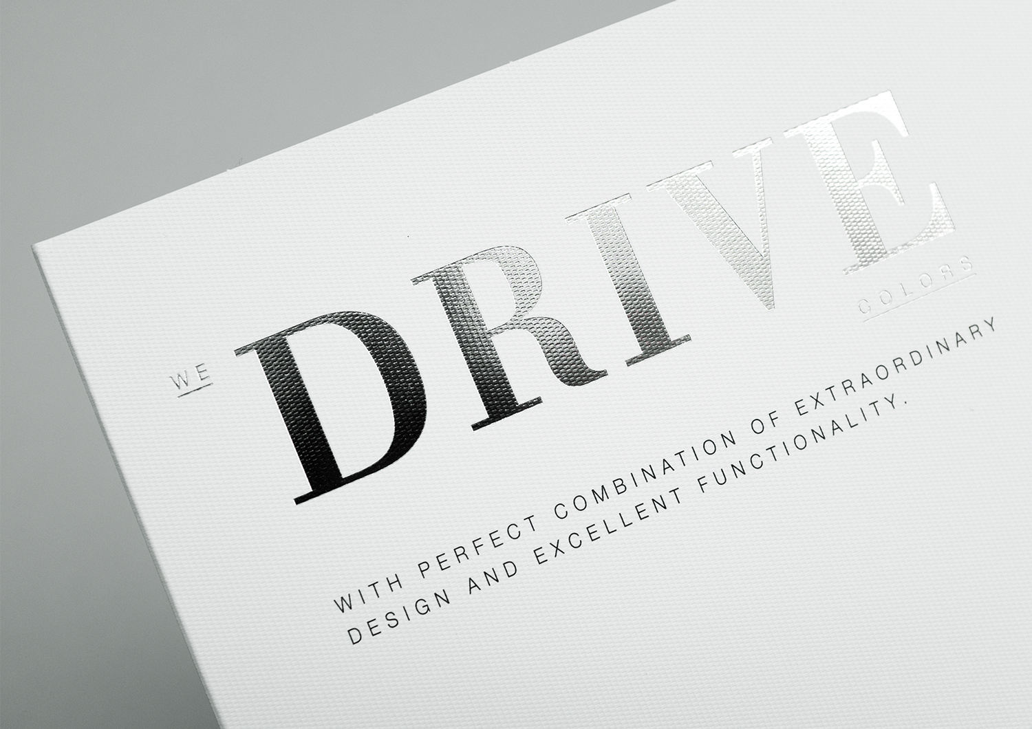
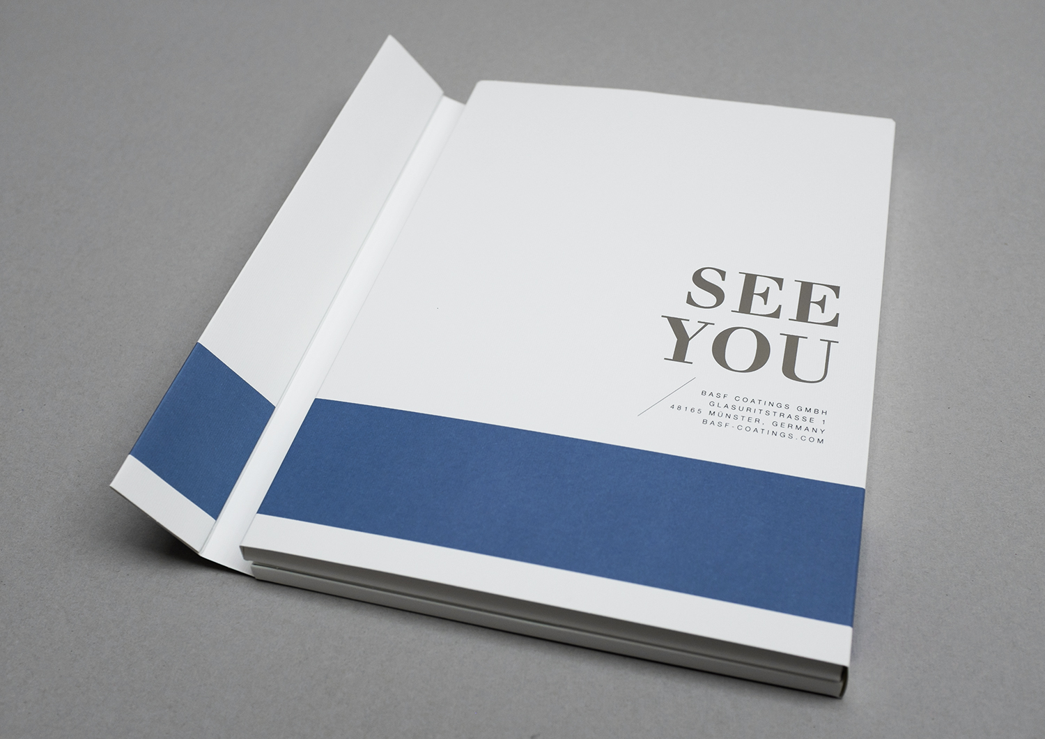
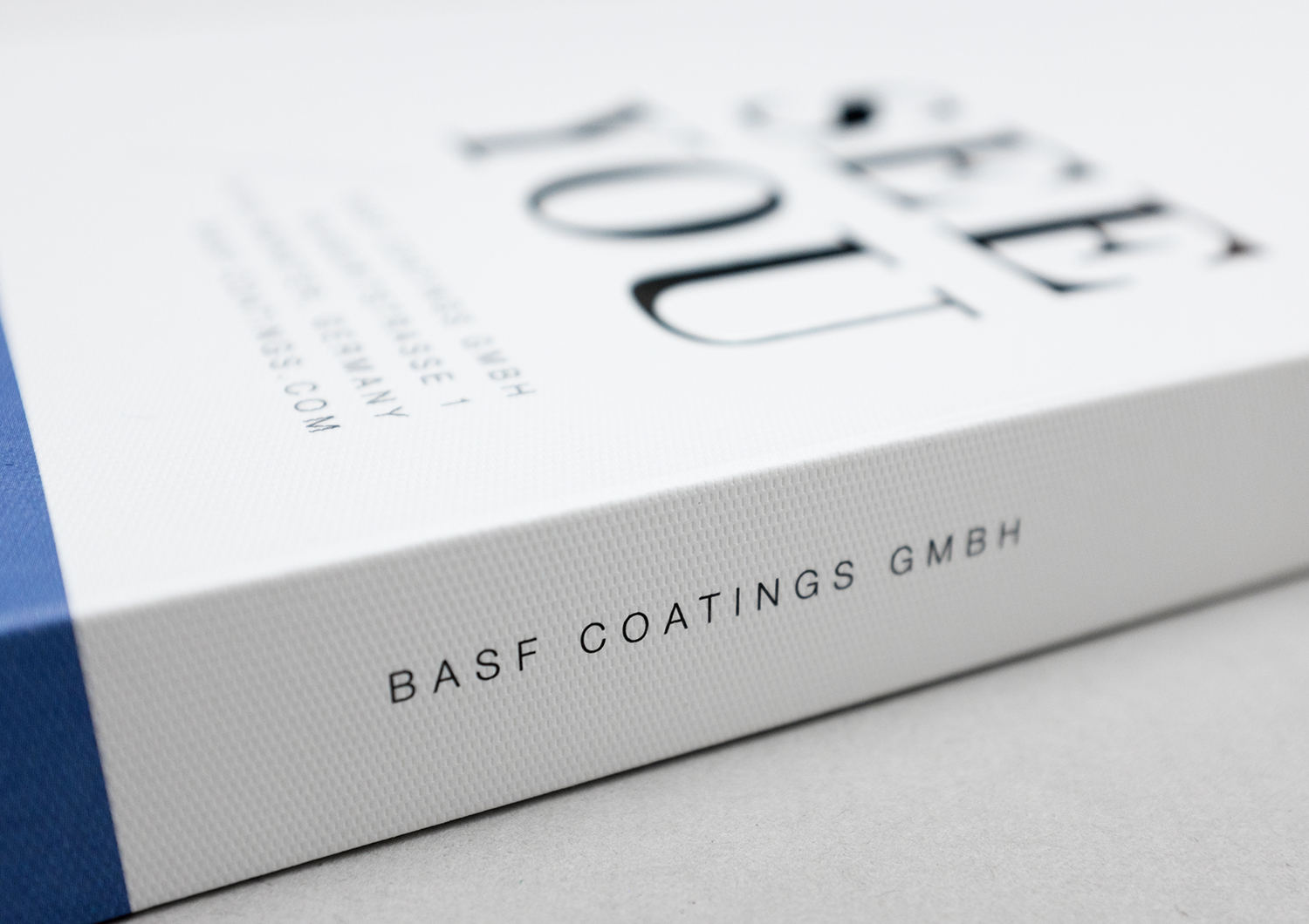
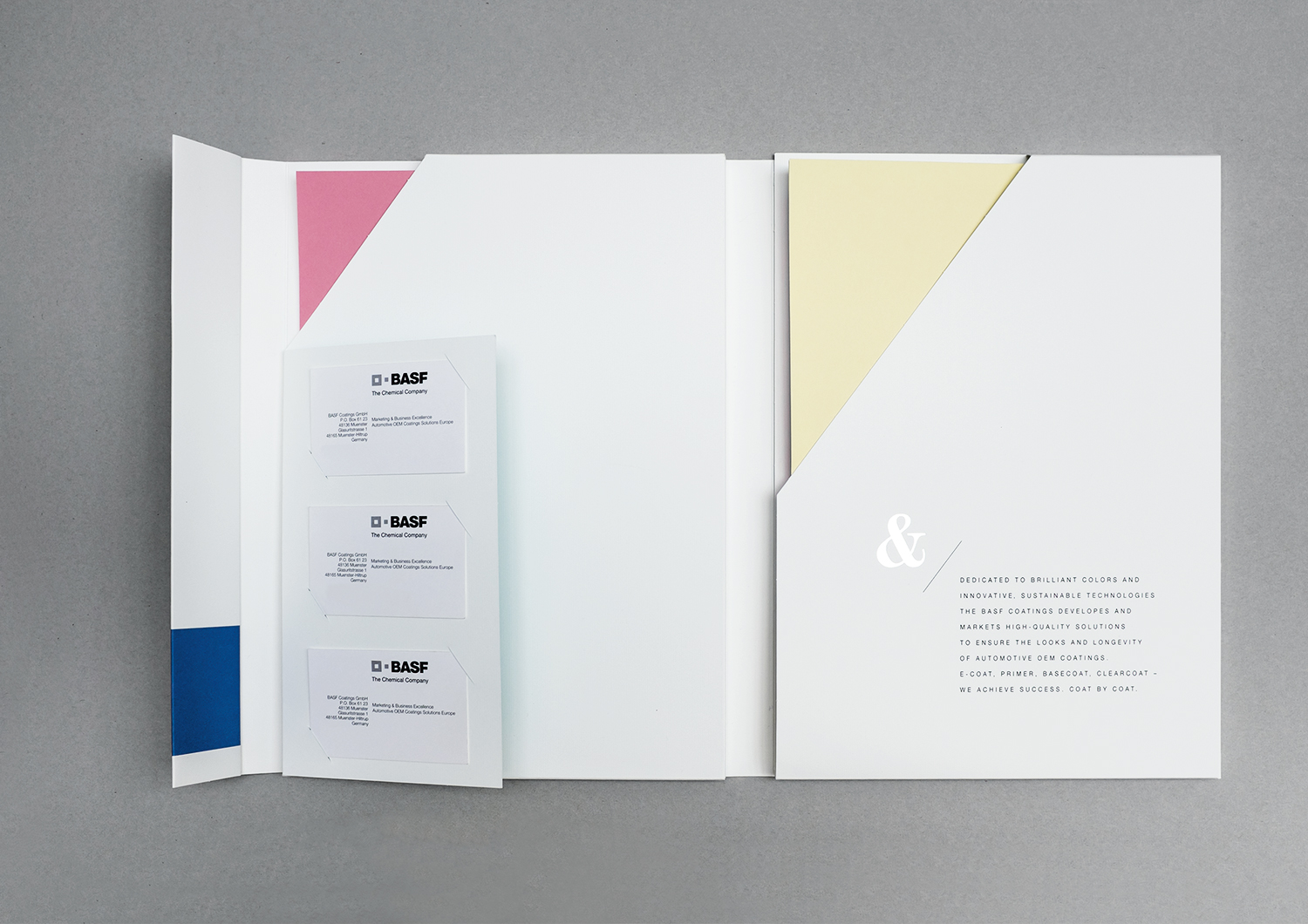
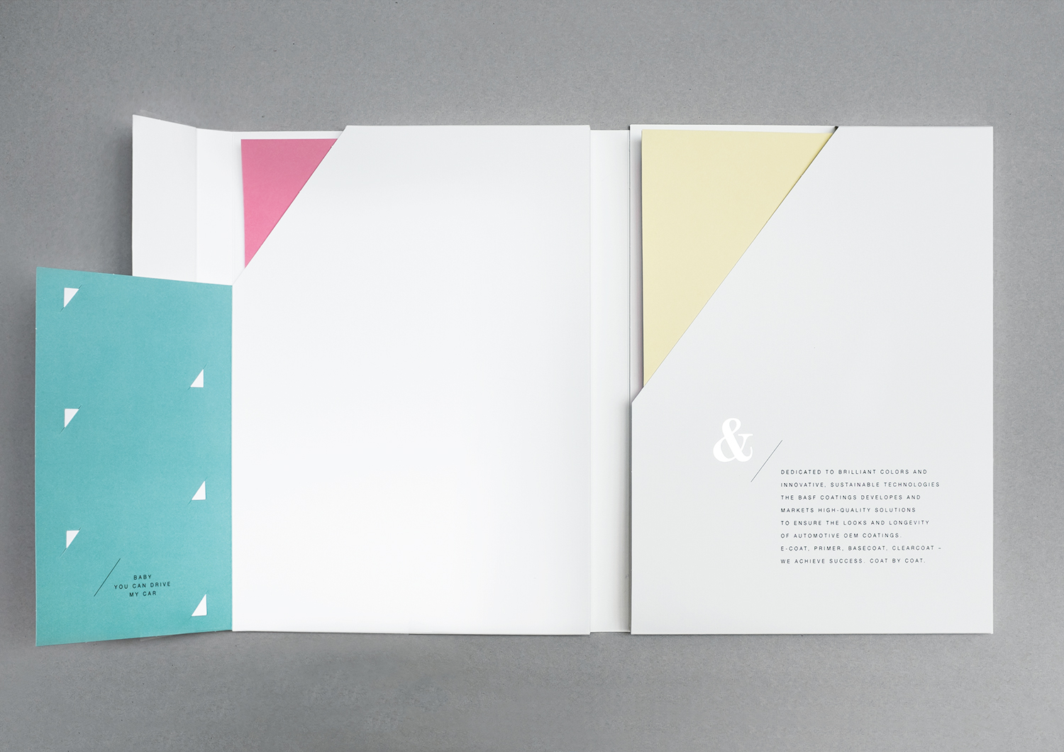
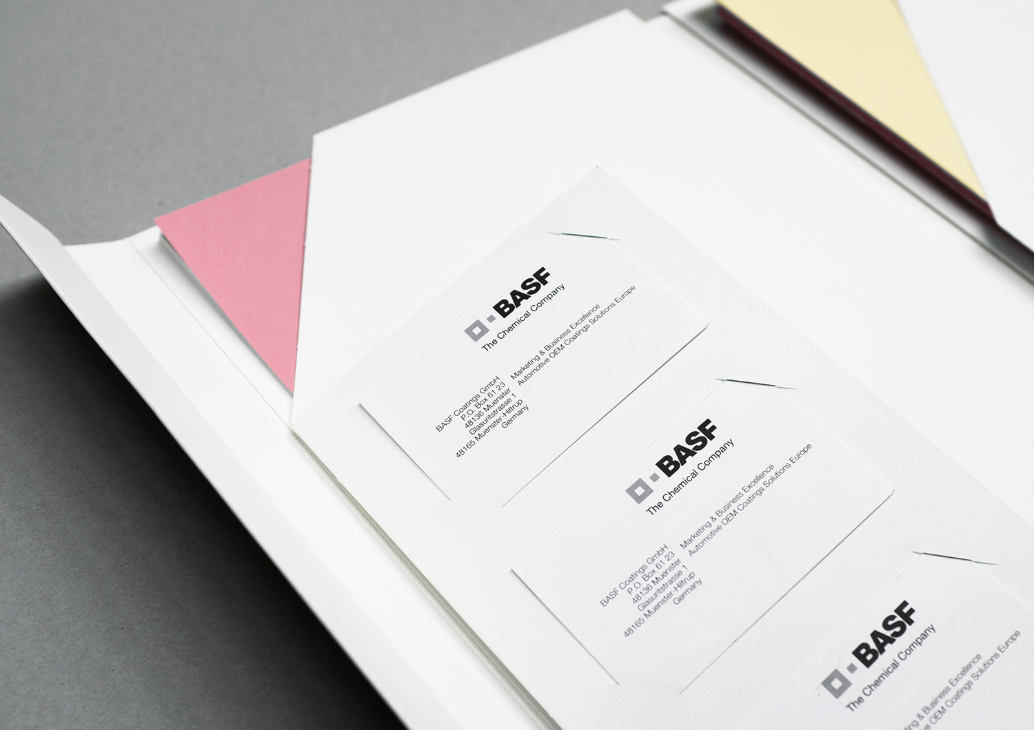
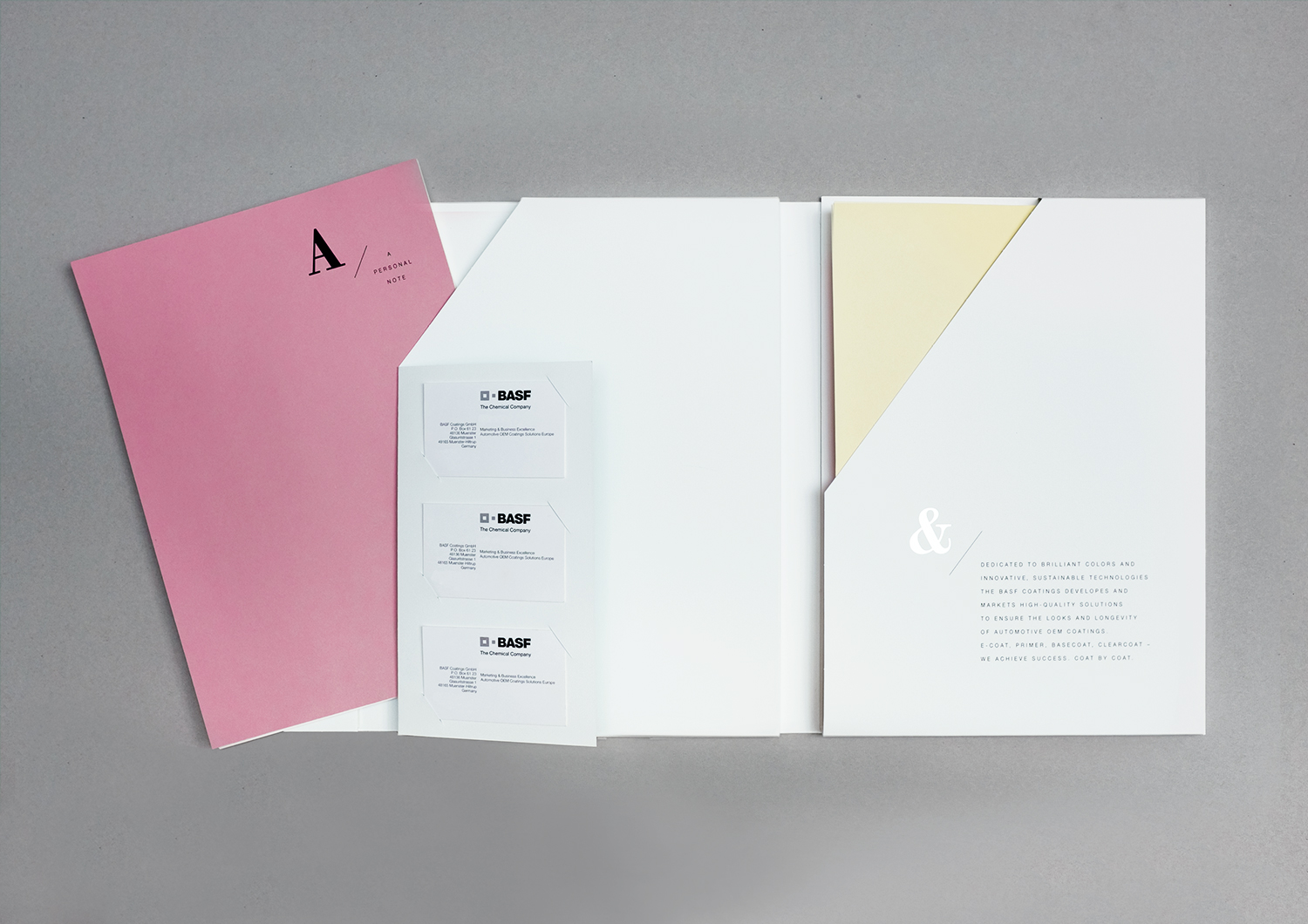
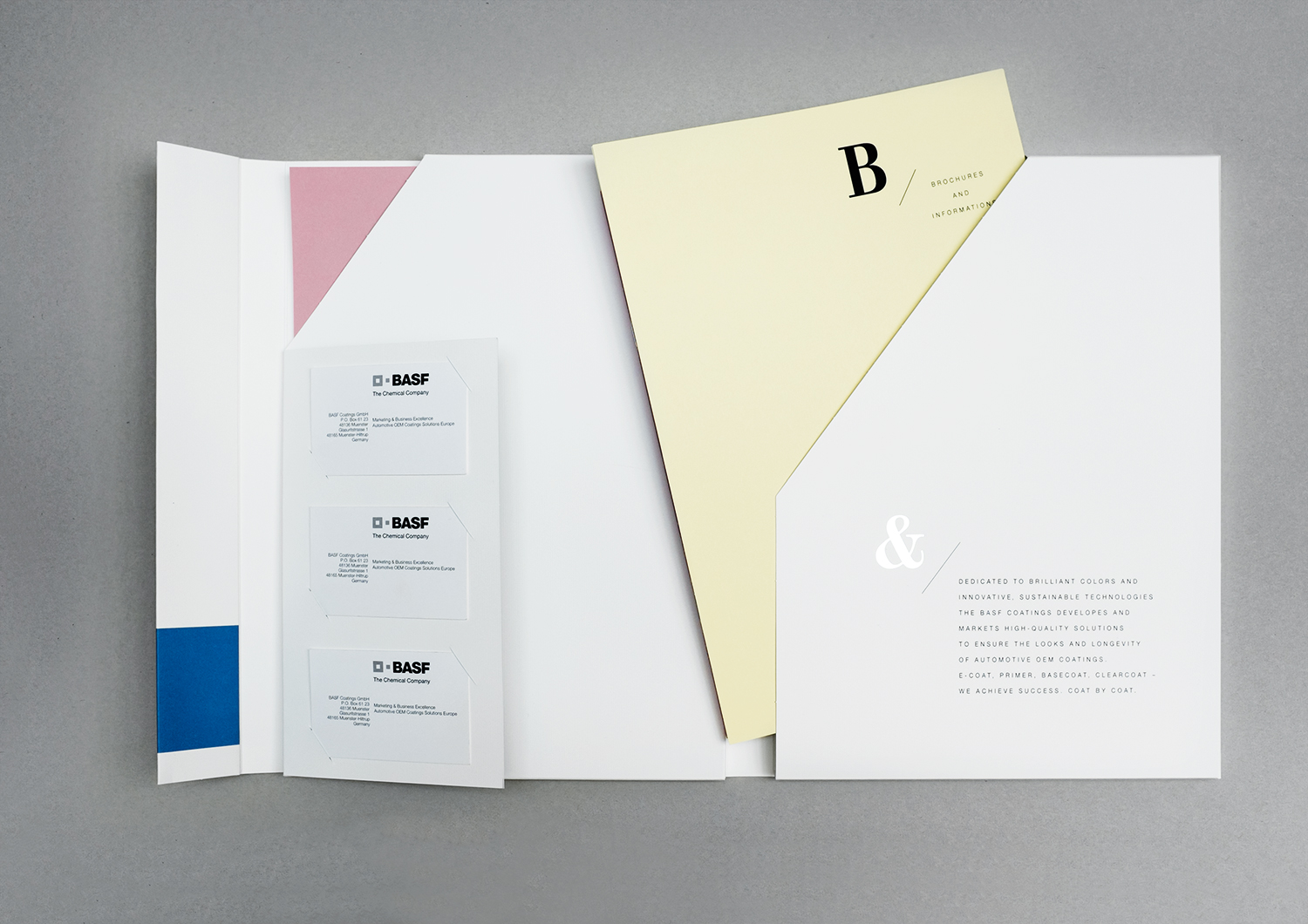
The members of the board at BASF Coatings GmbH needed an exclusive portfolio folder. So we developed it. Completely bespoke.
challenge
APPROACH
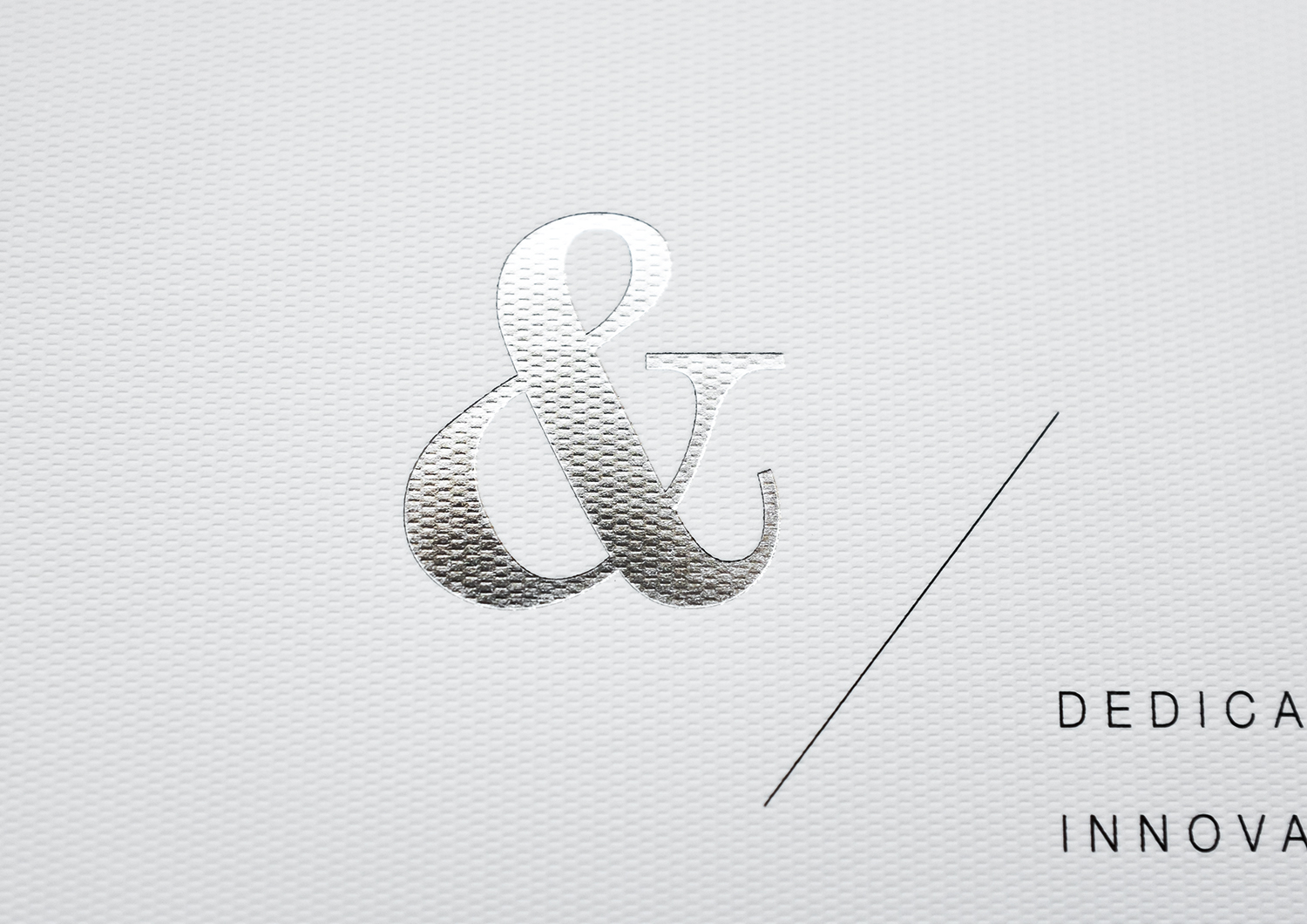
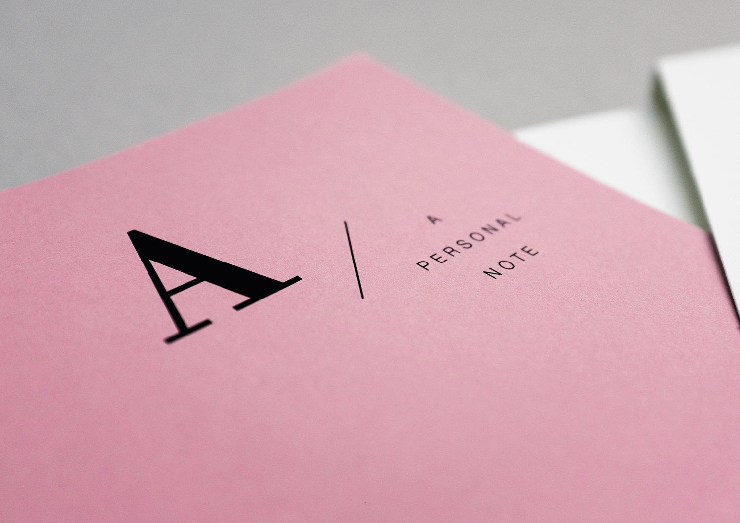
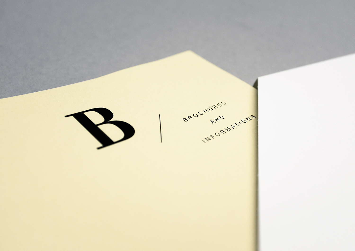
Die-cut and folded from a single piece of material, now it holds all important documents: correspondence, brochures, business cards, a USB flash drive. We embossed the folder with silvery lettering and design on the oustide and inside.
Do you like it?
This looks beautiful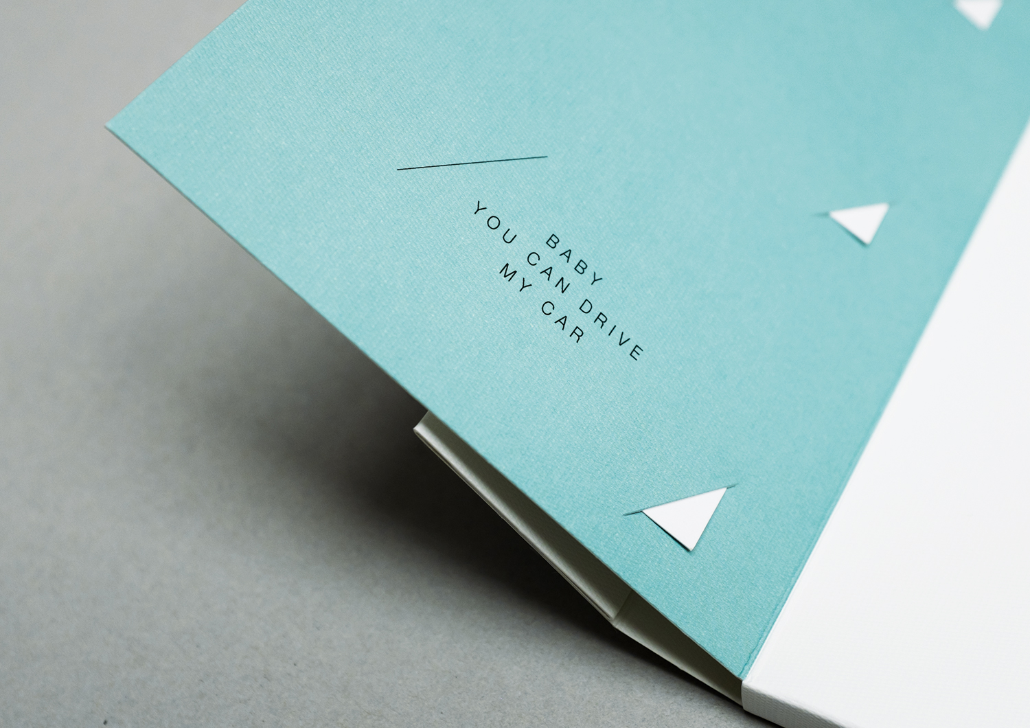
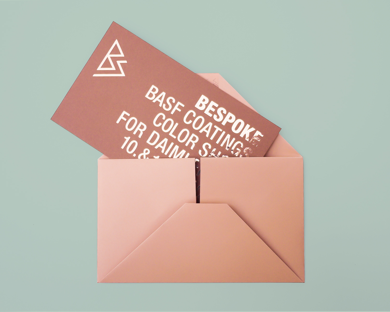
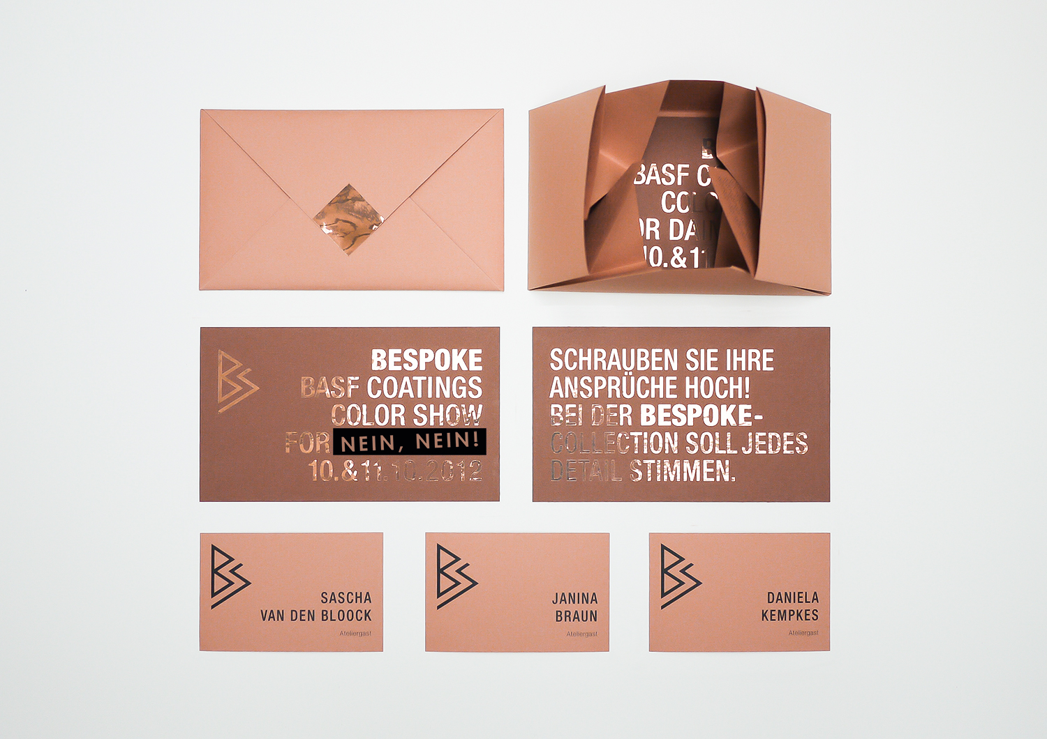
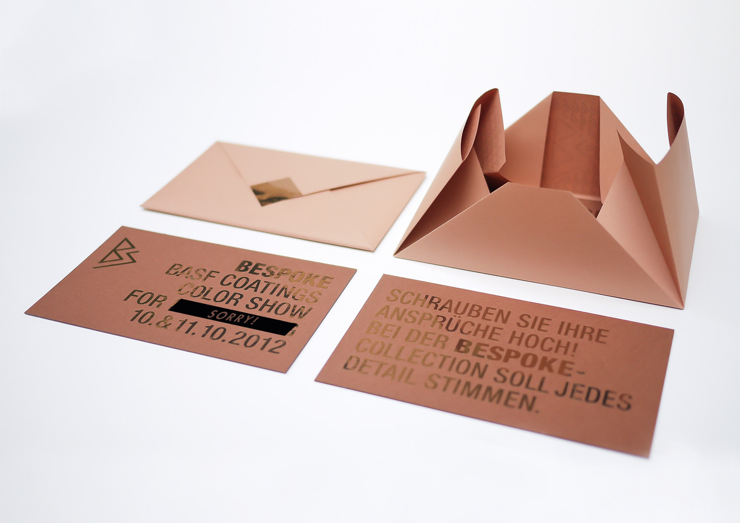
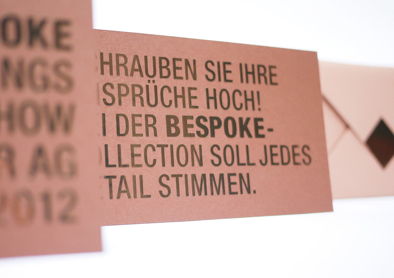
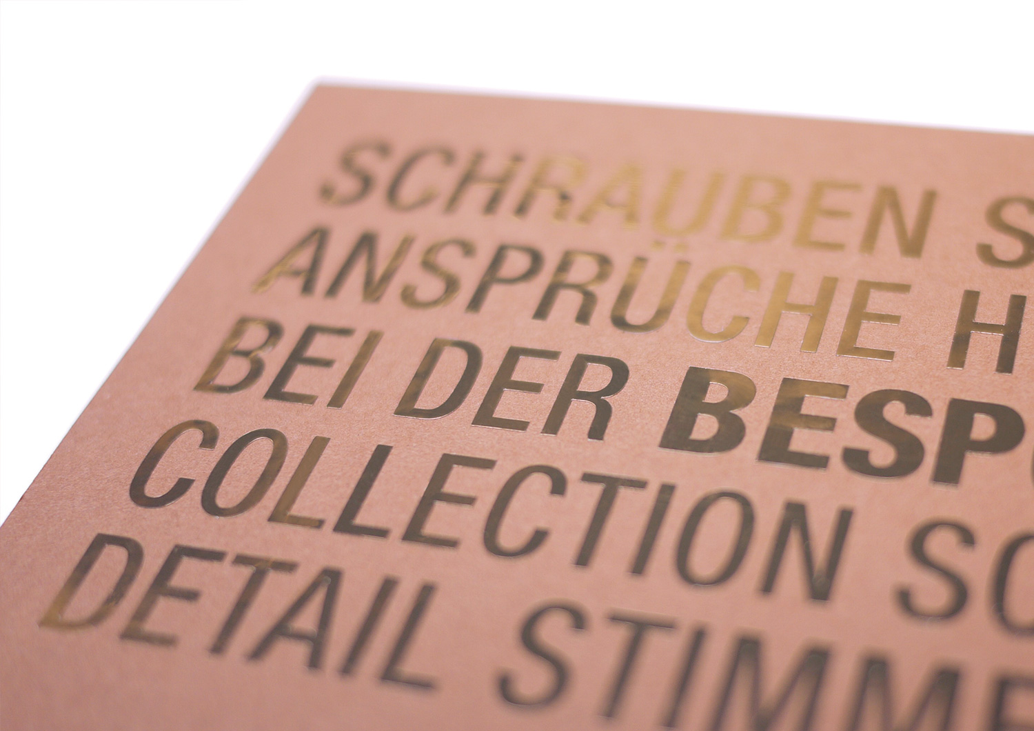
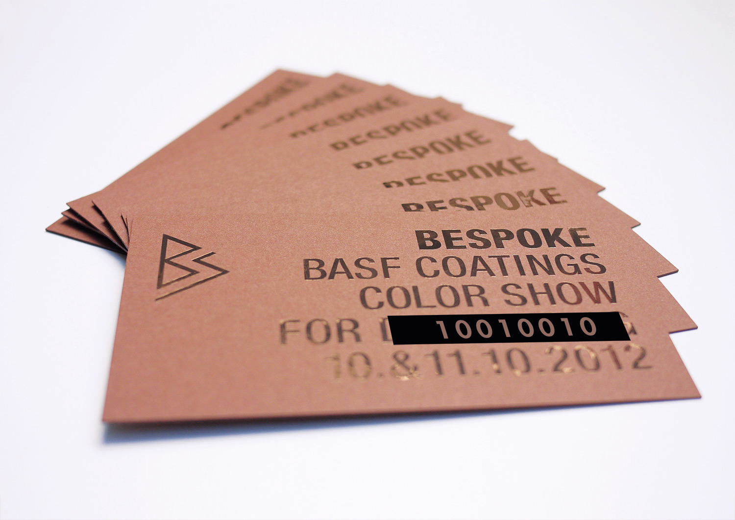
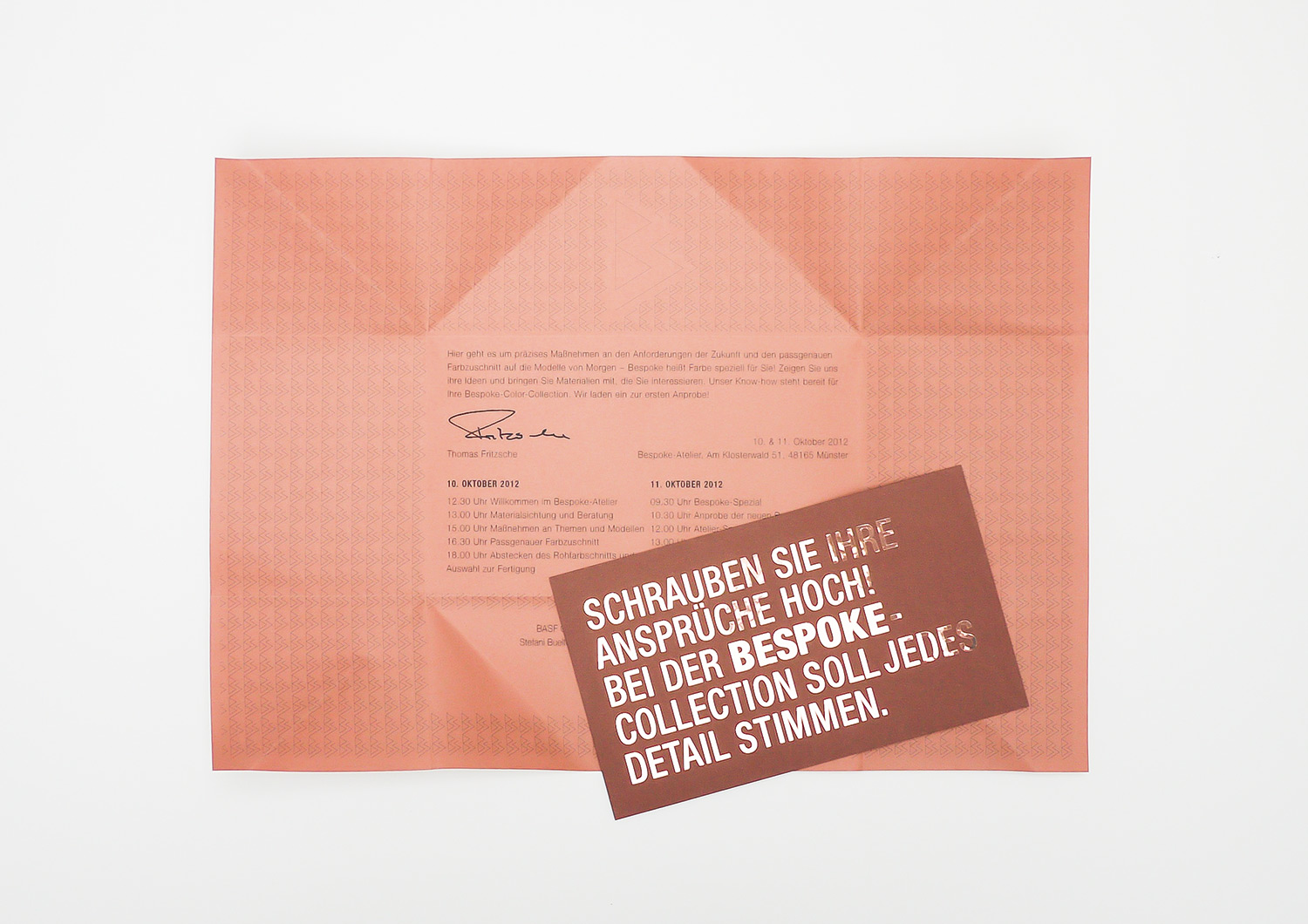
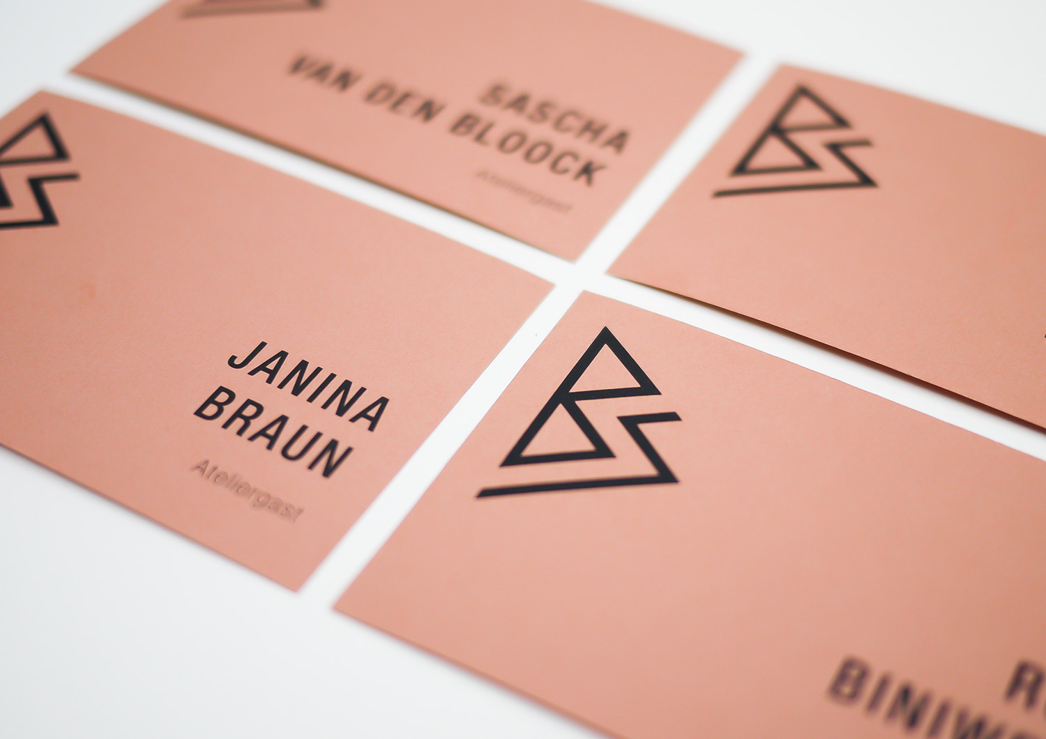
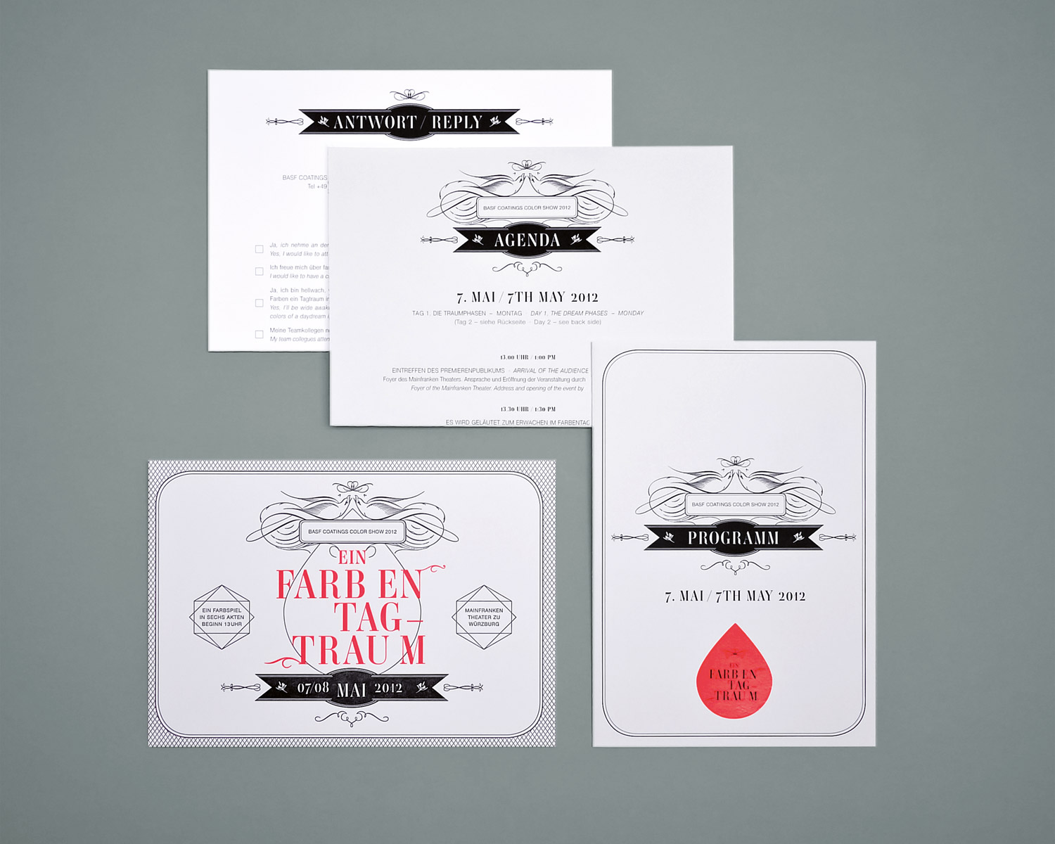
COLORSHOW BESPOKE INVITATIONS
year
2014
client
BASF Coatings
industry
Automotive
services
Invitation, Envelope Folding
scope
Ideation, Concept, Typography, Production
CLIENT
challenge
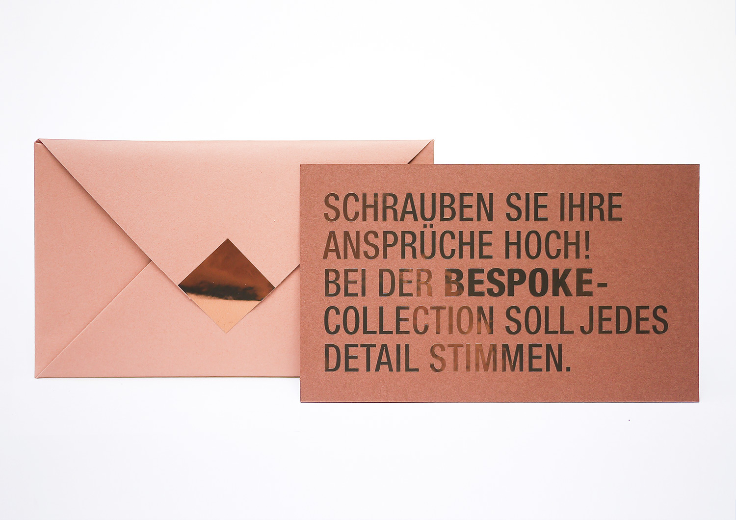
APPROACH
A card that stays, even after the event. To achieve this goal, we tossed all the cool combinations into this challenging print story.. We designed the text block in massive capital letters and plotted them on a fancy copper mirror film. And that’s when the fun really started. So with utmost care, we trimmed every single letter using our scalpels from off the rack. Finally we had to polish every single word by hand and place each invitation into the origami envelope especially created for that project. Financially, a disaster. Creatively, a triumph.
Do you like what you see?
Let’s talk!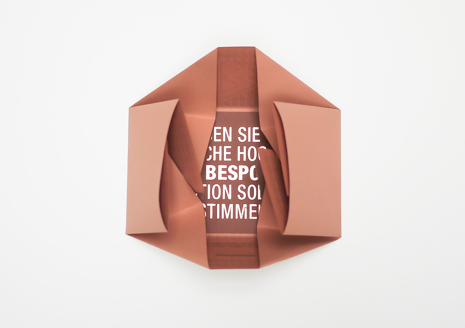
GLOBAL COLOR TREND BOOK
year
2014
client
BASF Coatings
industry
Automotive
services
Editorial Design
scope
Workshops, Concept Trend Catalogue, Typography, Collages, Key Visuals, Print Production, Bookbinding
CLIENT
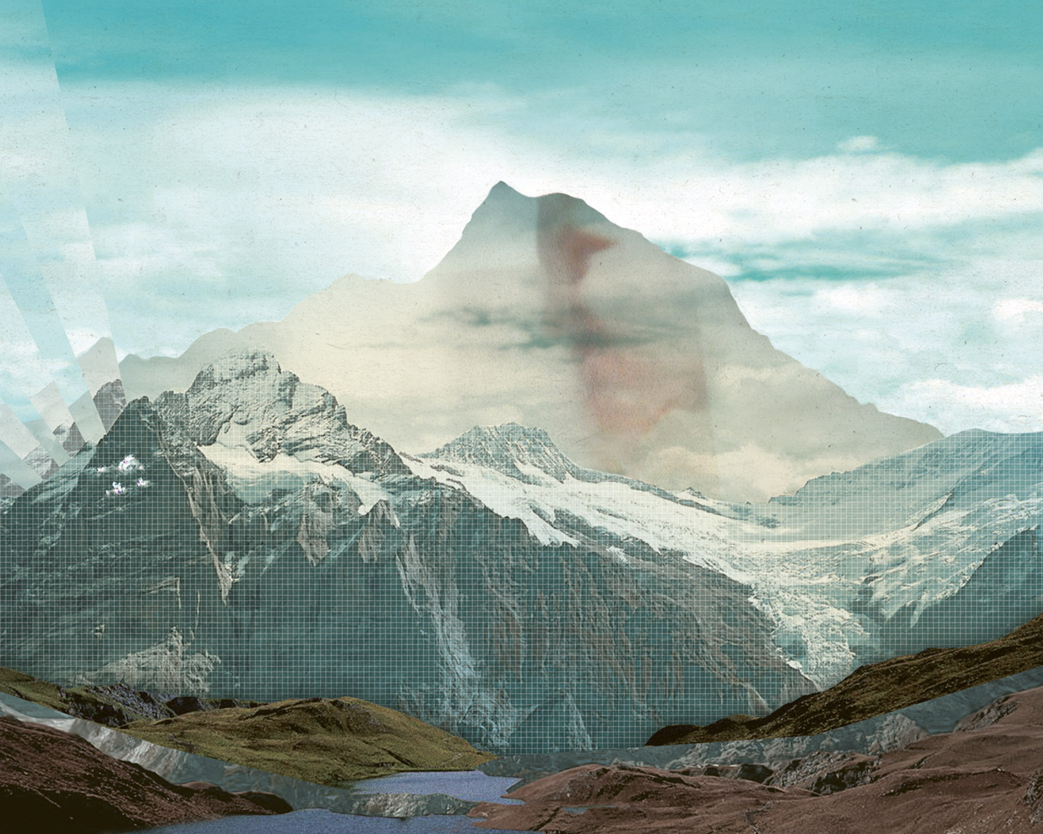
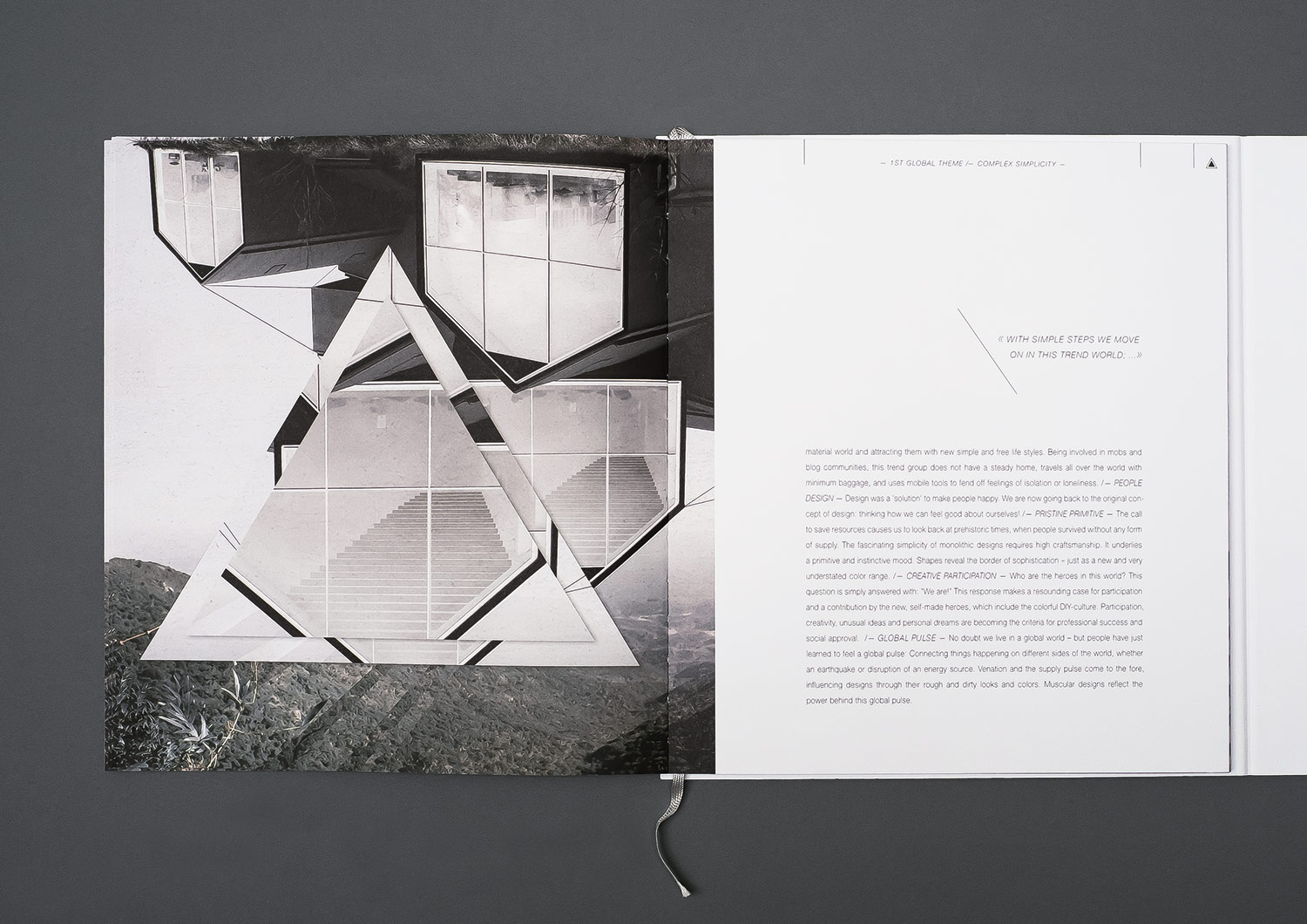
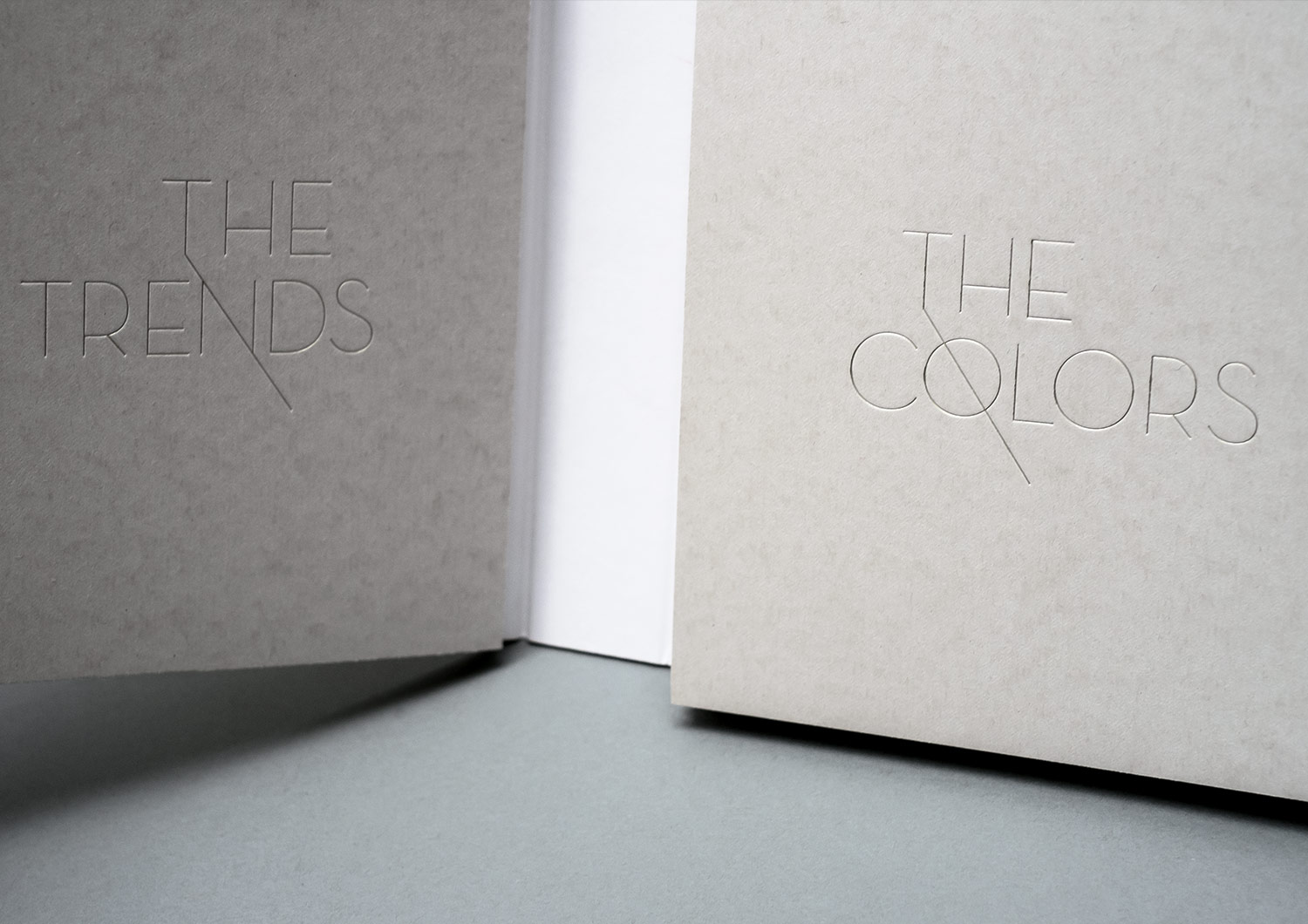
For the first time in our history with BASF COATINGS, we’ve found a place not only for the European point of view but also for the American and Asian ones. May we introduce: The wonderful international Design Team of BASF. Exciting! Our first global theme was COME CLOSER. Because that’s what it’s all about – approaching each other midway with slowness and respect, and finding one’s place in the global world.
challenge
We also had to really dig in, for now our concept had to work convincingly on a global level. Okay, let’s go. But first, the biggest nut to crack was redesigning the book.
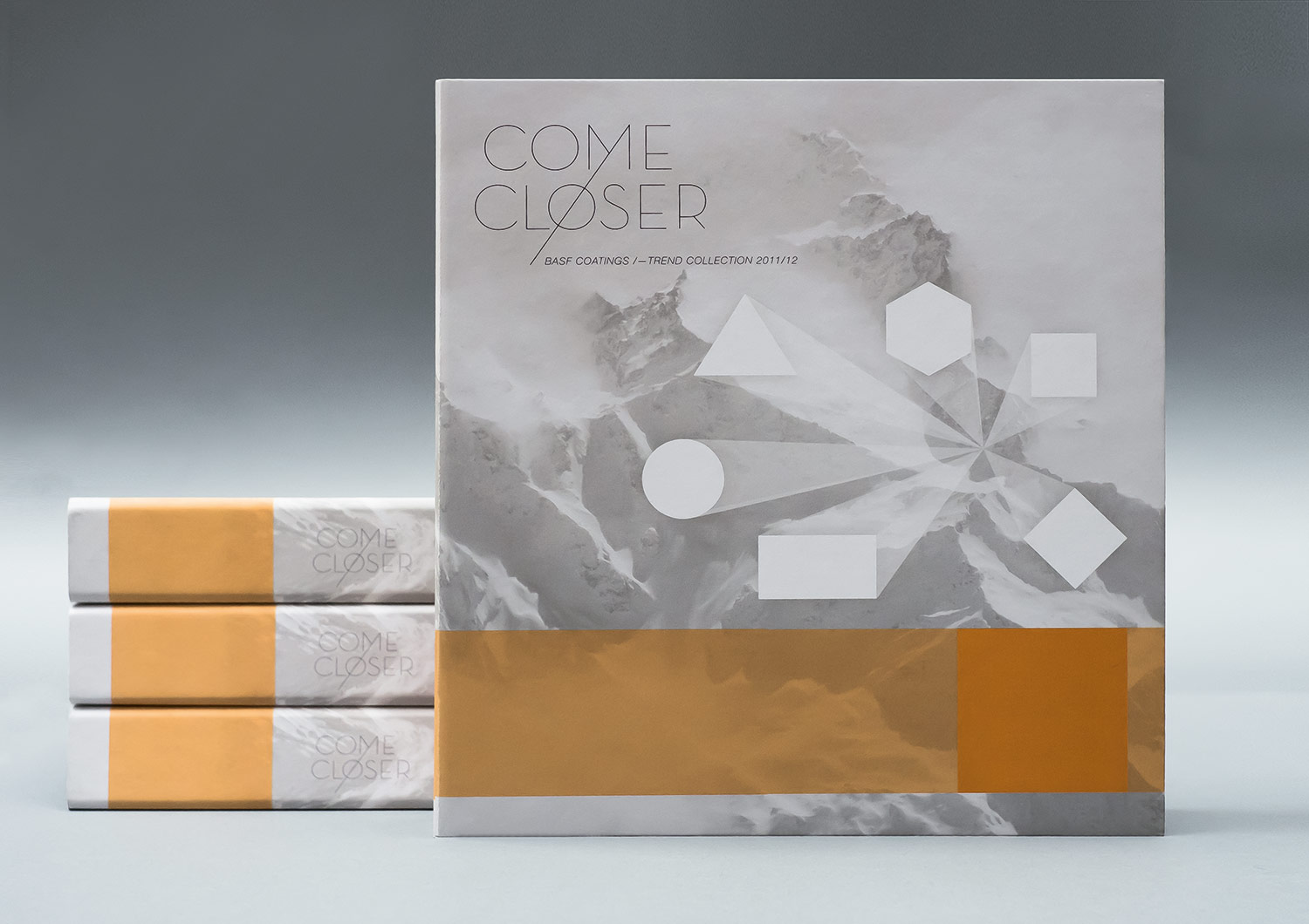
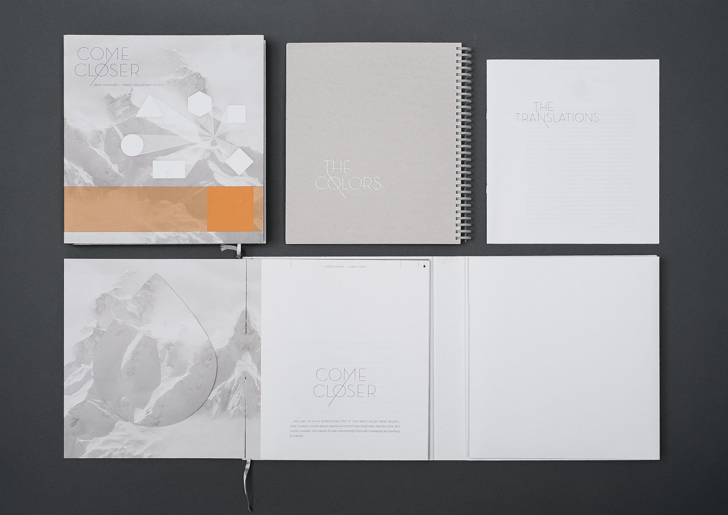
APPROACH
It had to be expandable, high quality, flexible and affordable. To that we added: modular, robust, “separate, yet together.” We developed a concept that we had never seen before in the fancy bookstores around the globe and still haven’t. It let us view both themes simultaneously – trends and colors in one. So the reader can read and view the trend world and at the same time enjoy the corresponding colors. That has never happened before – and will never happen again!
How’s that?
Fantastic!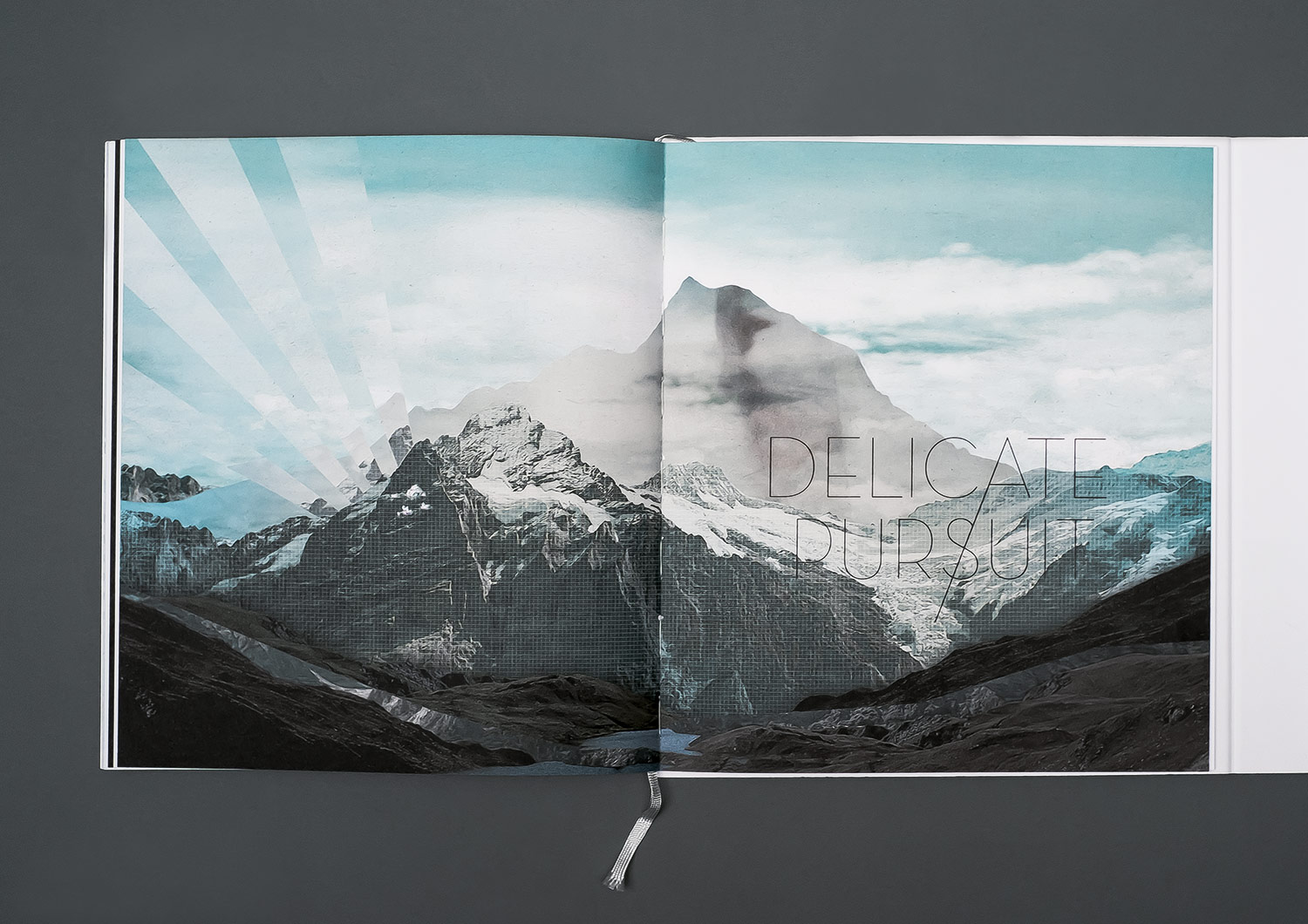
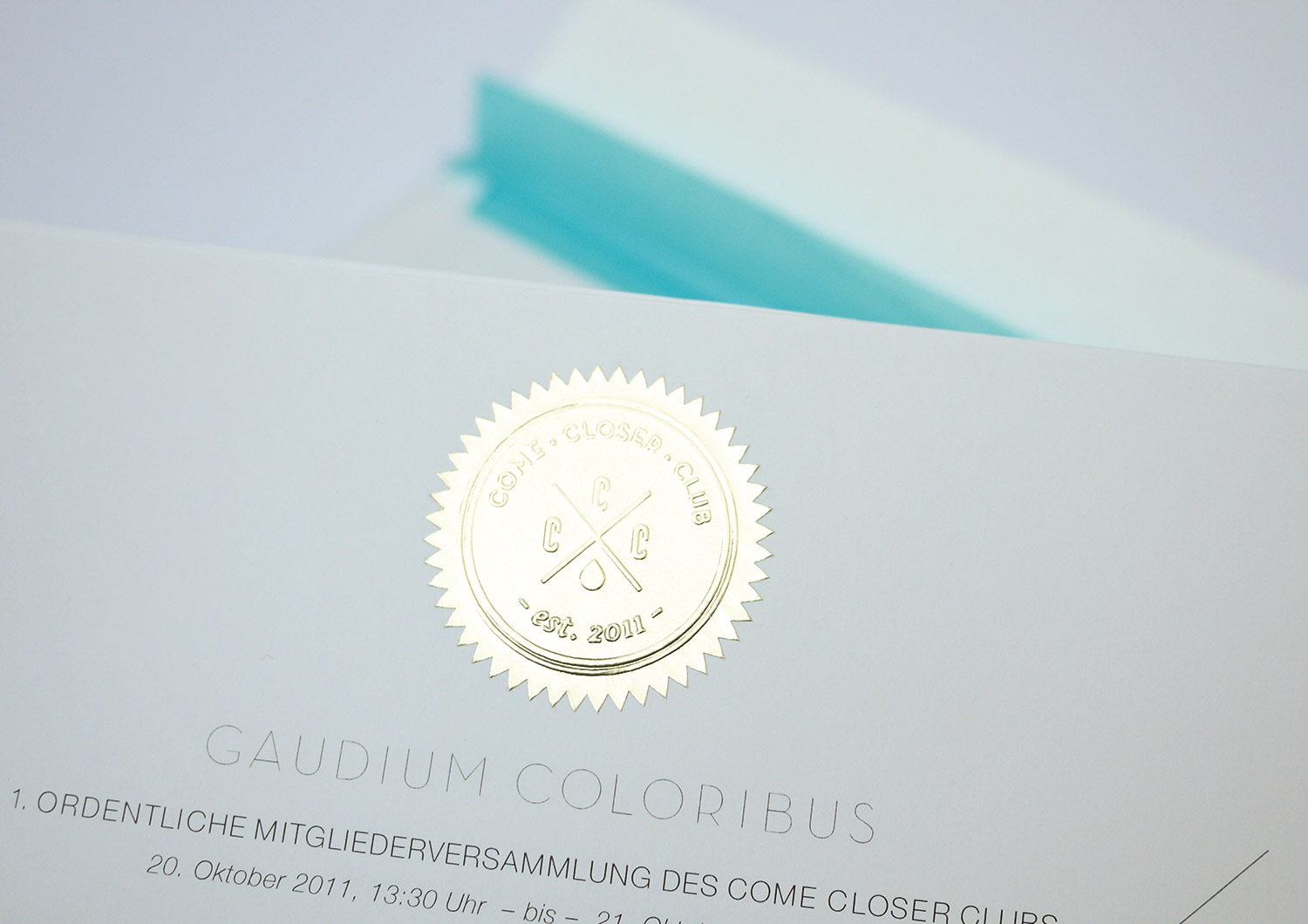
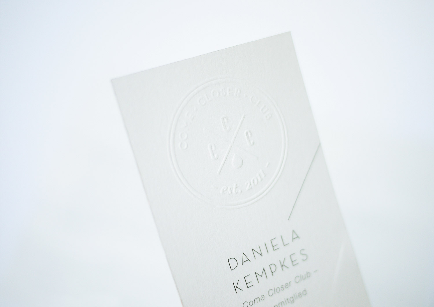
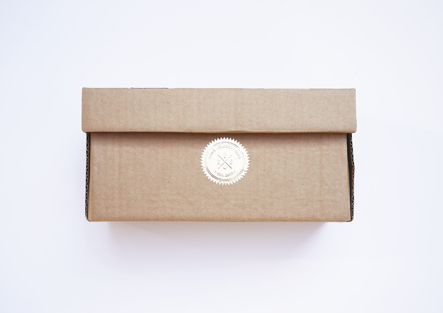
COME CLOSER CLUB
year
2014
client
BASF Coatings
industry
Automotive
services
Concept, Event Invitation
scope
Ideation, Concept, Typography, Production
CLIENT
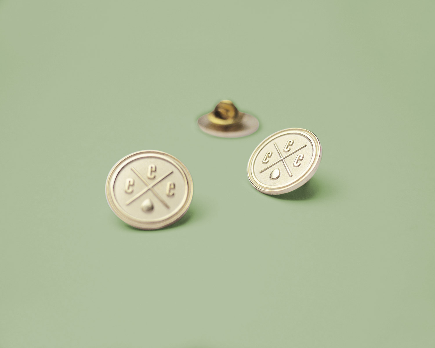
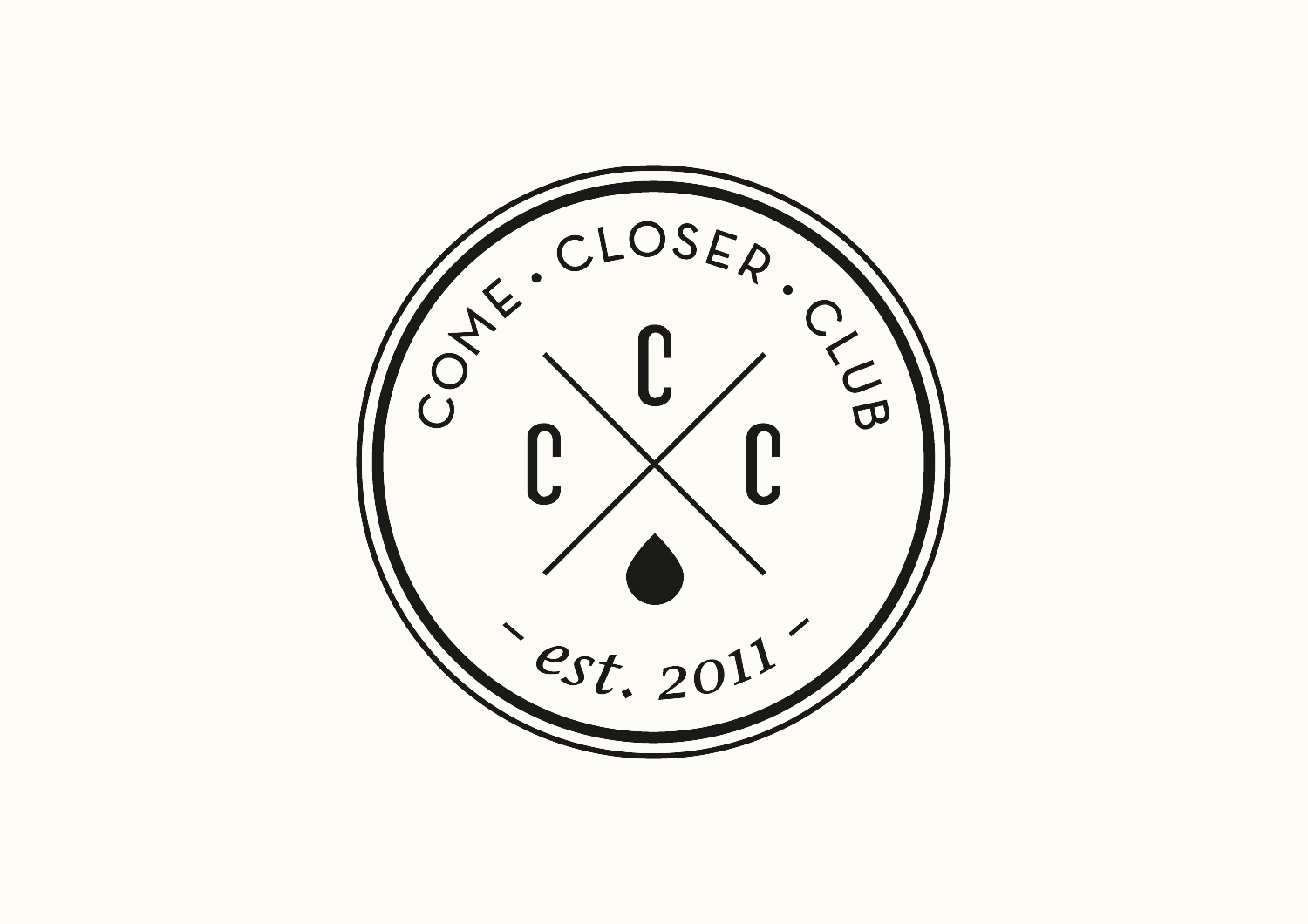
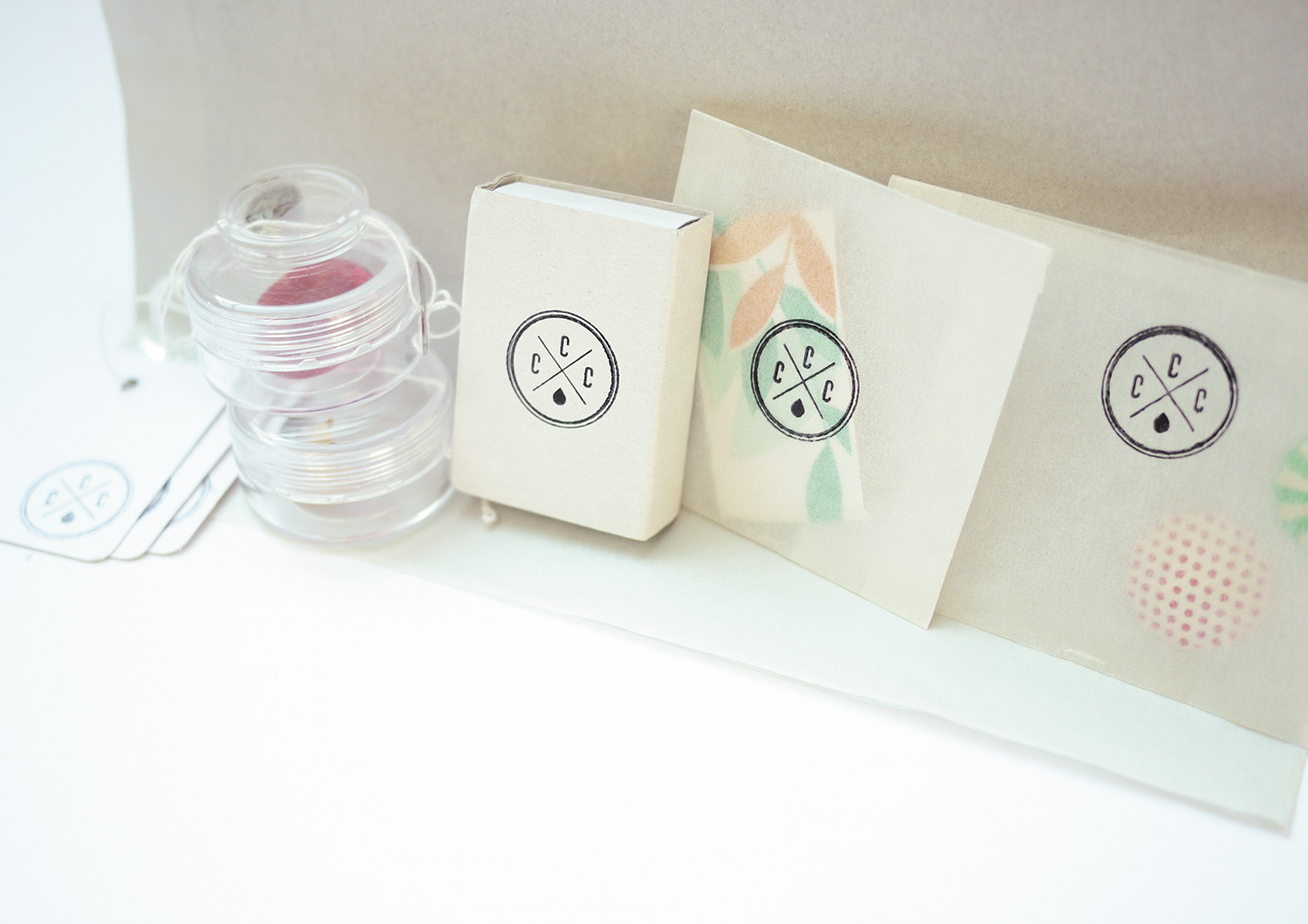
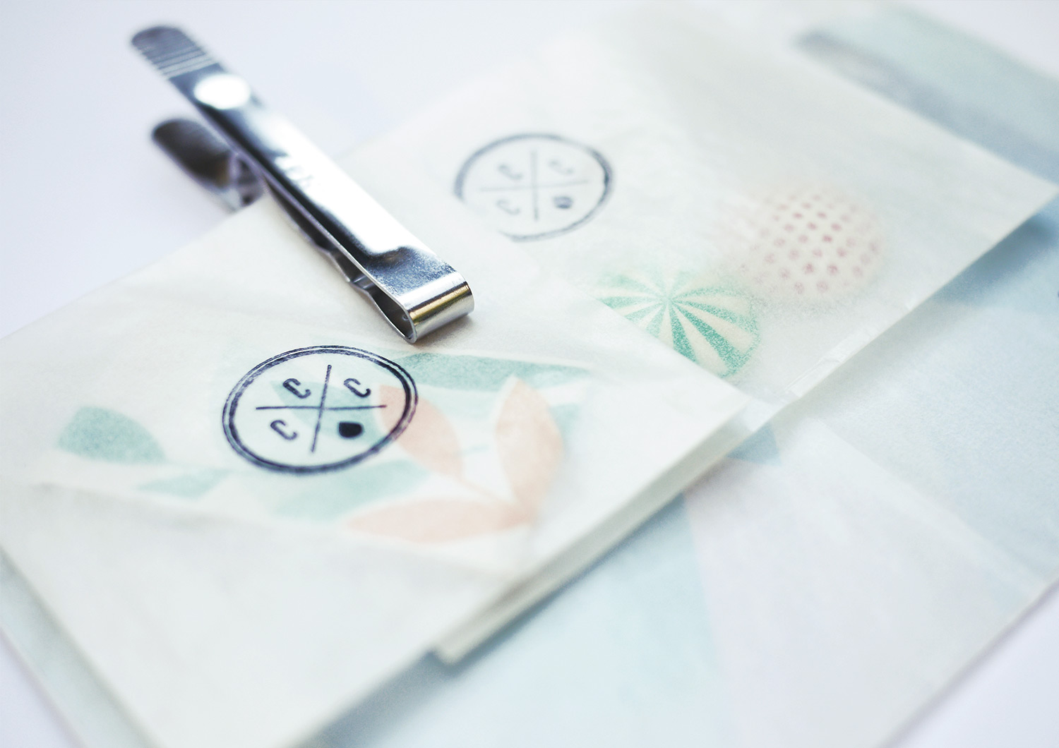
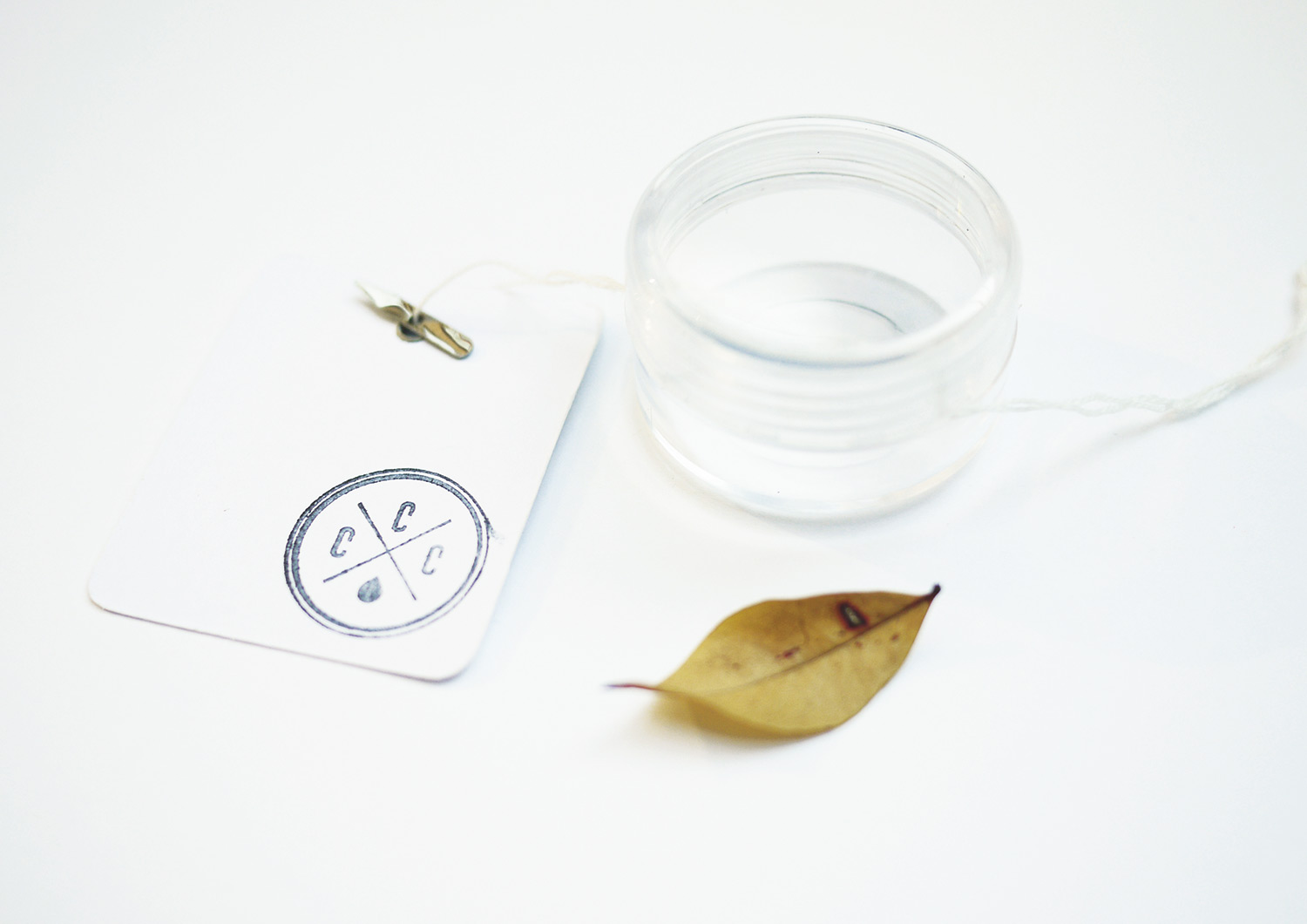
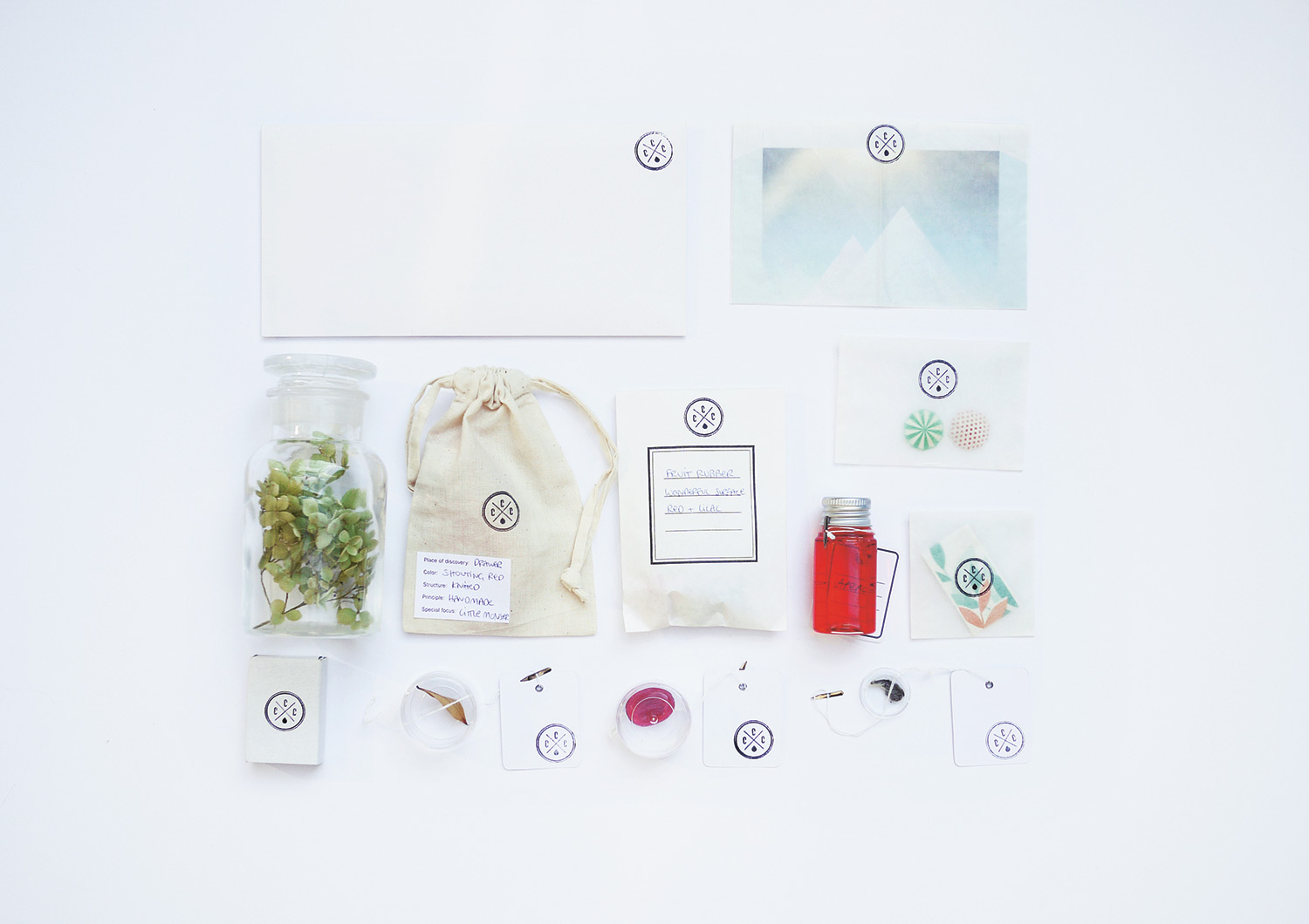
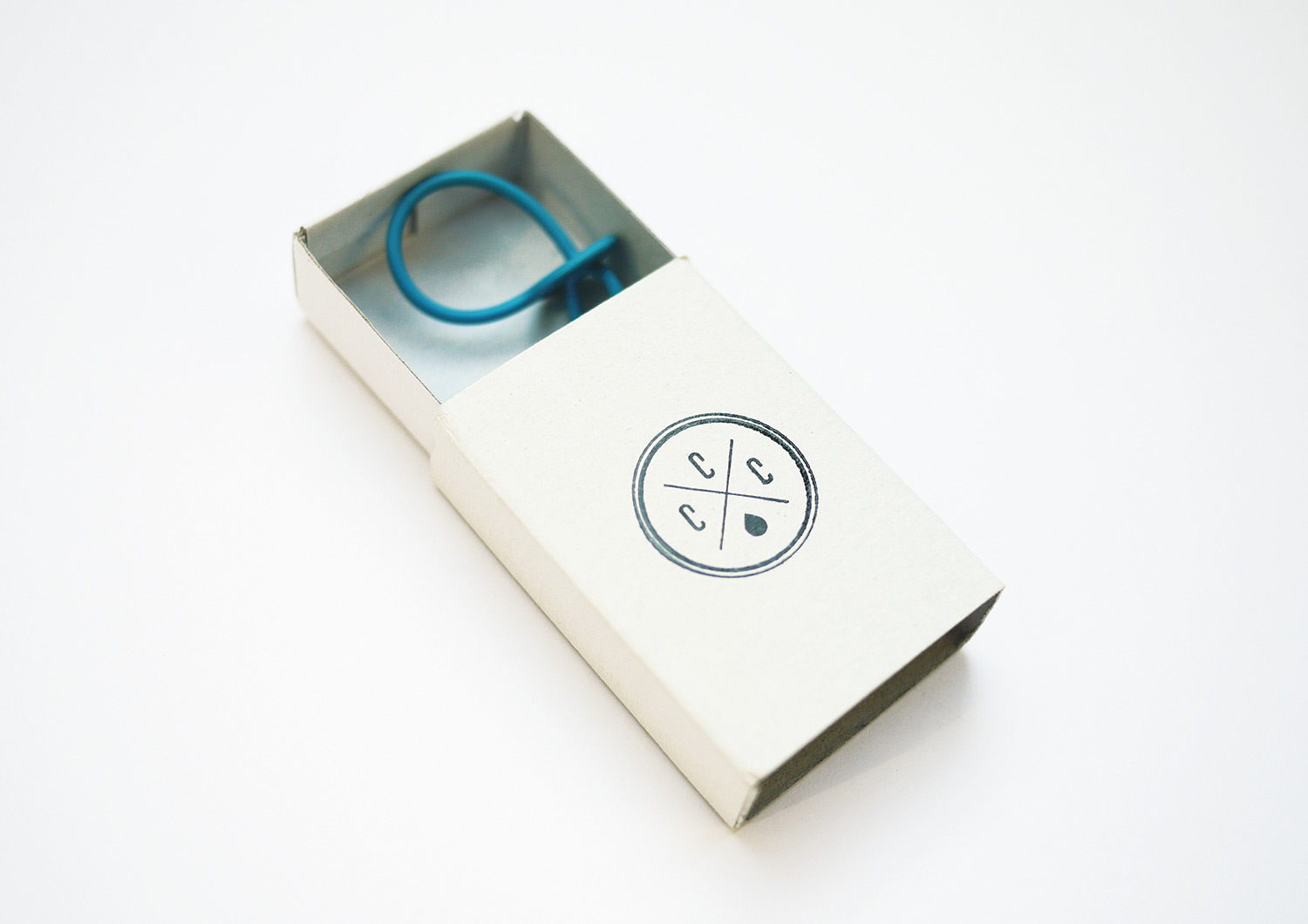
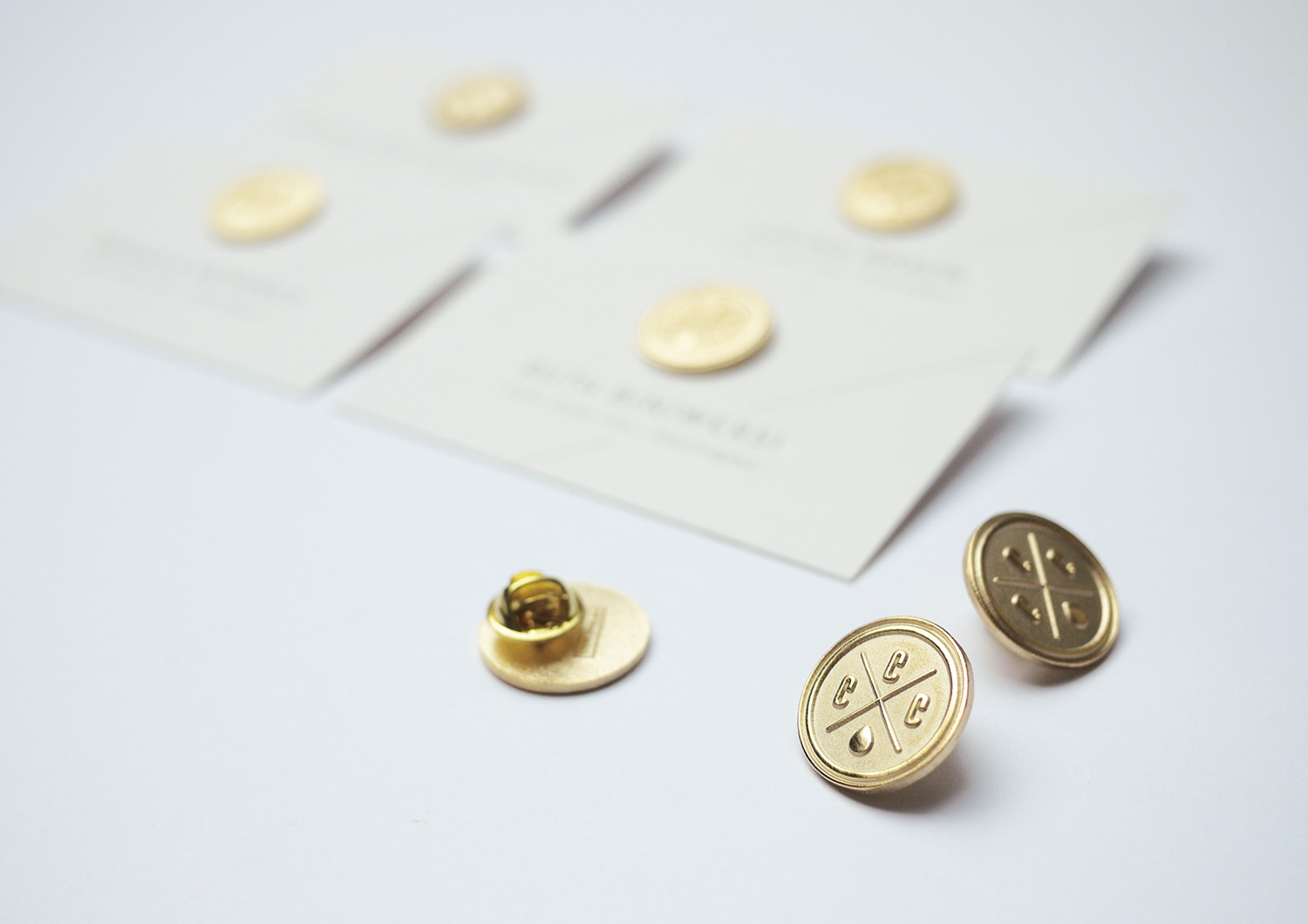
Gaudium Coloribus! Who learned Latin in school? No one! It means: celebrate the colors! Our clients asked us for an entertaining firework display for this special edition of COME CLOSER. So we invented the super exclusive COME CLOSER CLUB (CCC) for premium BASF Coatings clients. They got the finest lettering on the most expensive papers.
challenge
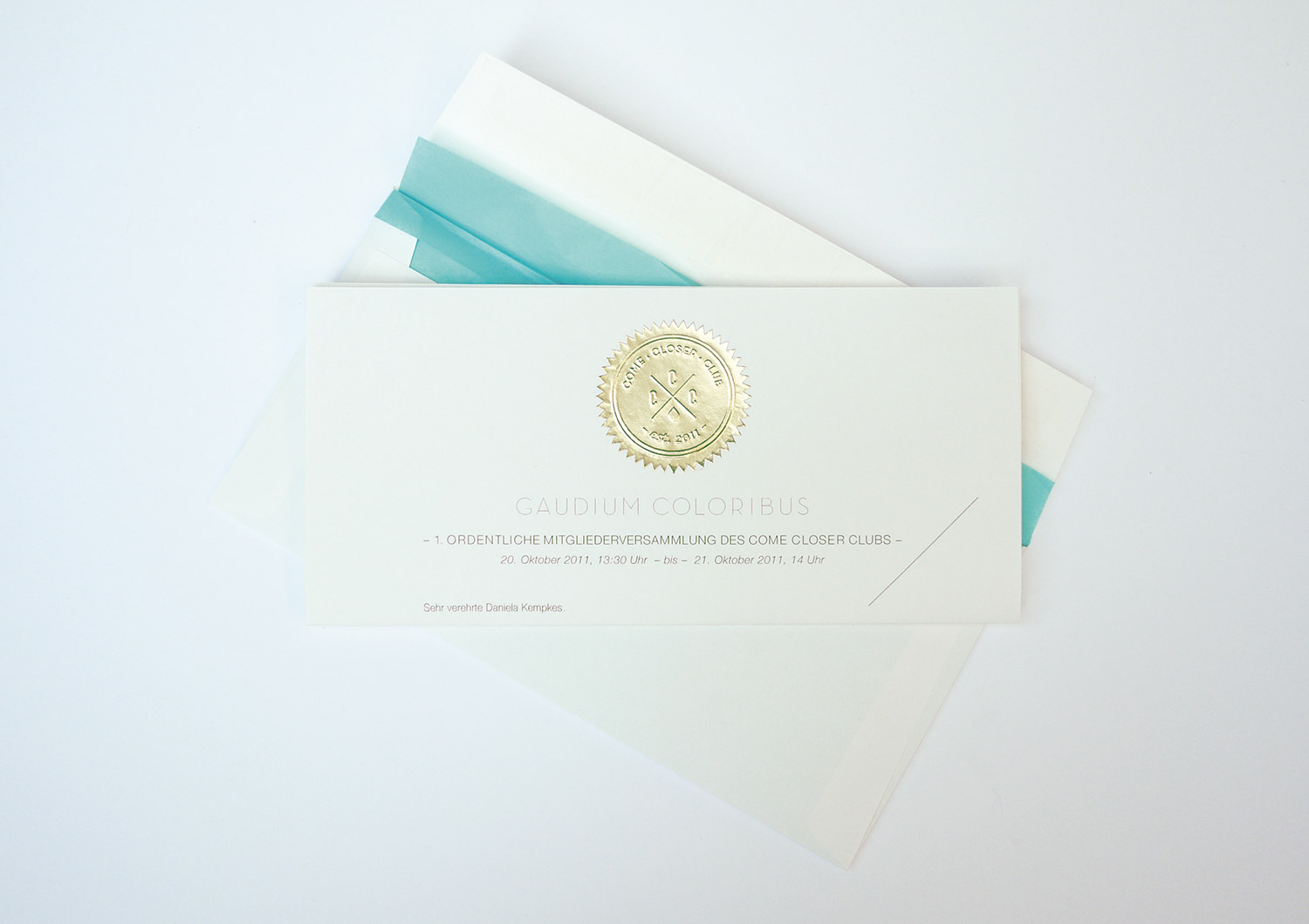
APPROACH
Each attendant received a box via mail with small containers for collecting radiating objects inspired by color. Some shiny chewing gum from last night? A glazed strand of hair? Why not – everything goes if it’s colorful enough. One stylistic highlight was the engraved CCC lapel pin, proudly worn by workshop participants. As far as what we heard, a total success.
Want to know more?
Let’s talk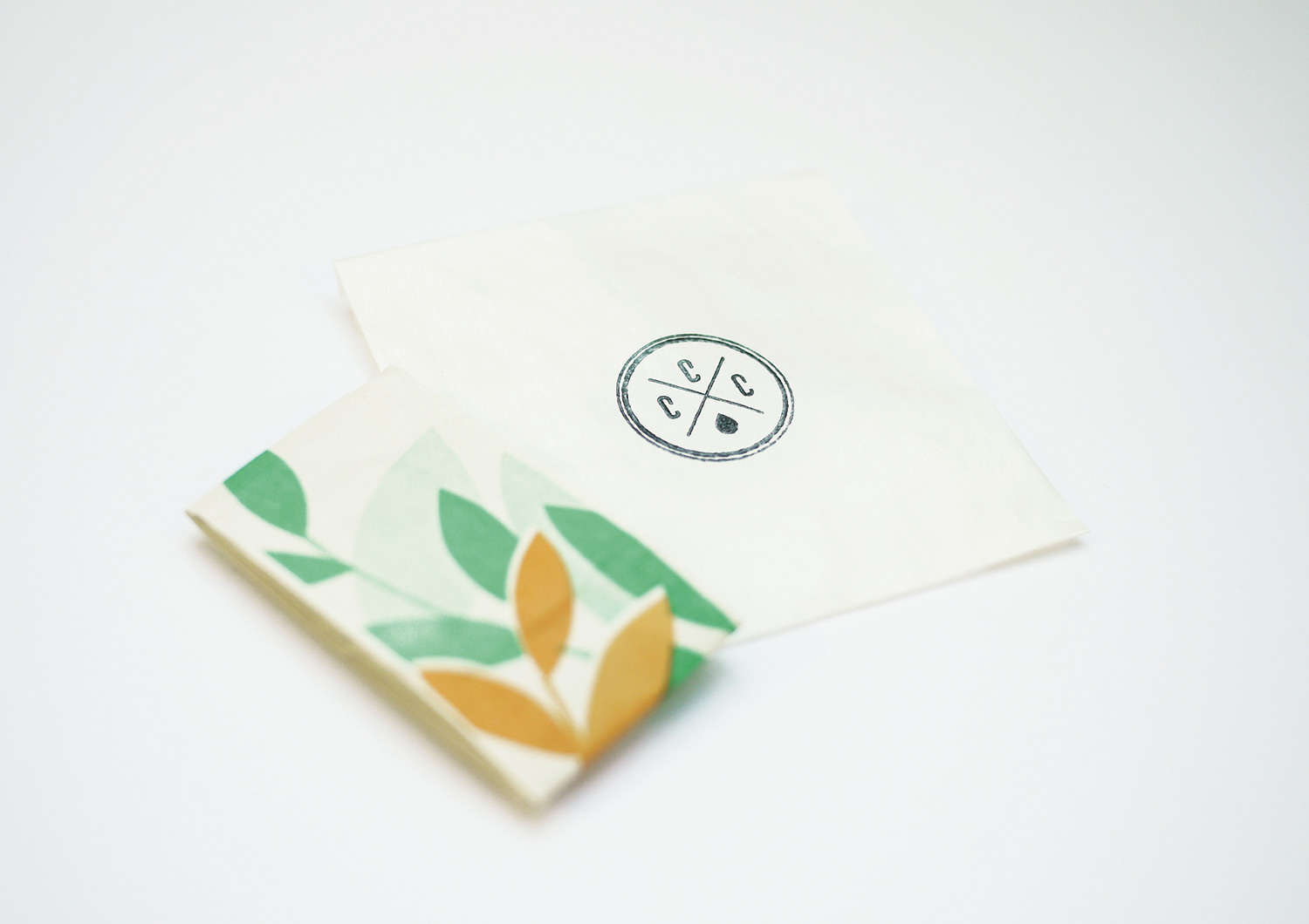
WEIMAR CLASSIC FOUNDATION
year
2014
client
Klassikstiftung Weimar
industry
Museum, Culture
services
Storyboard, Comic, Creative Direction
scope
Style, Concept, Illustration, Collages, Production
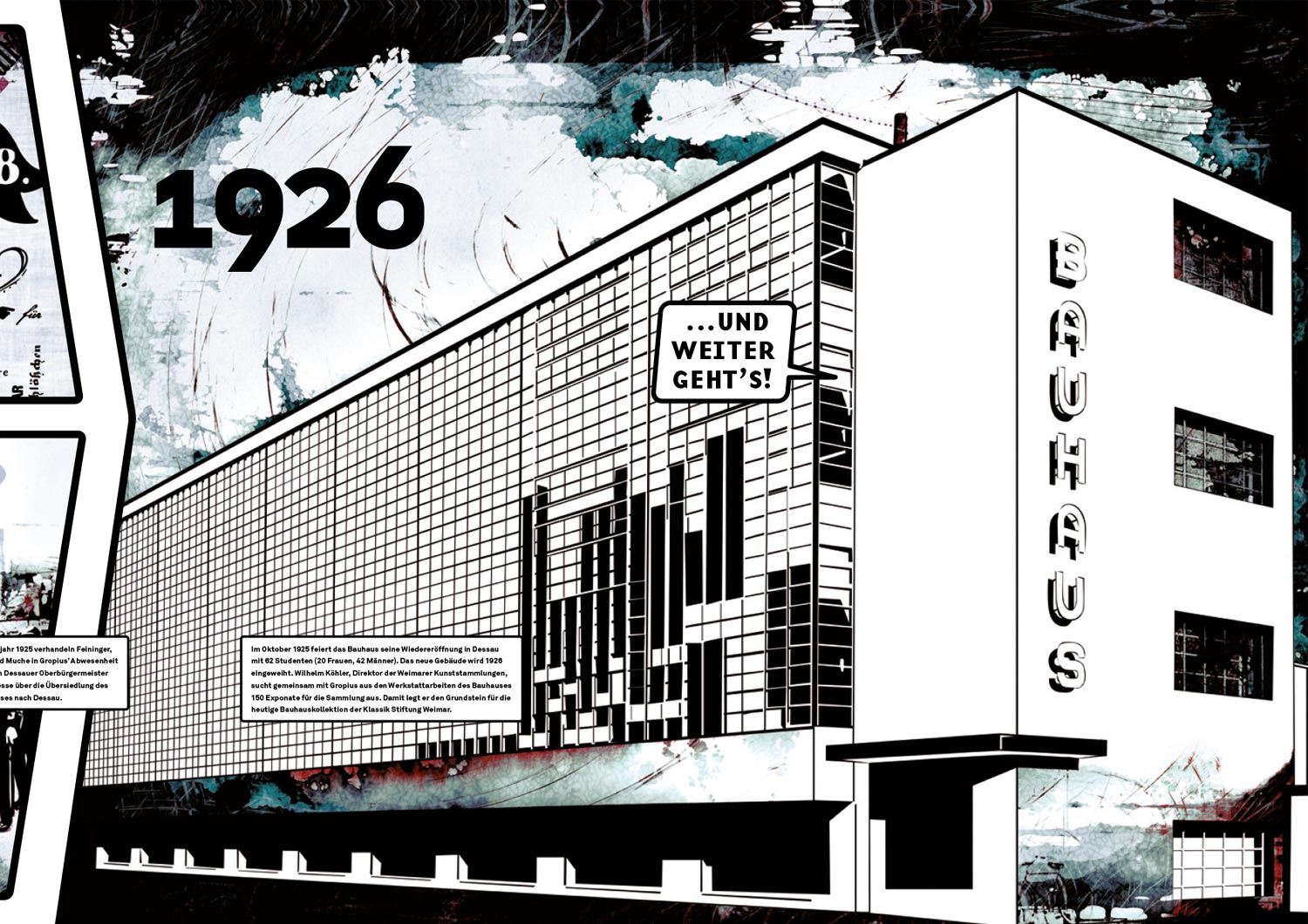
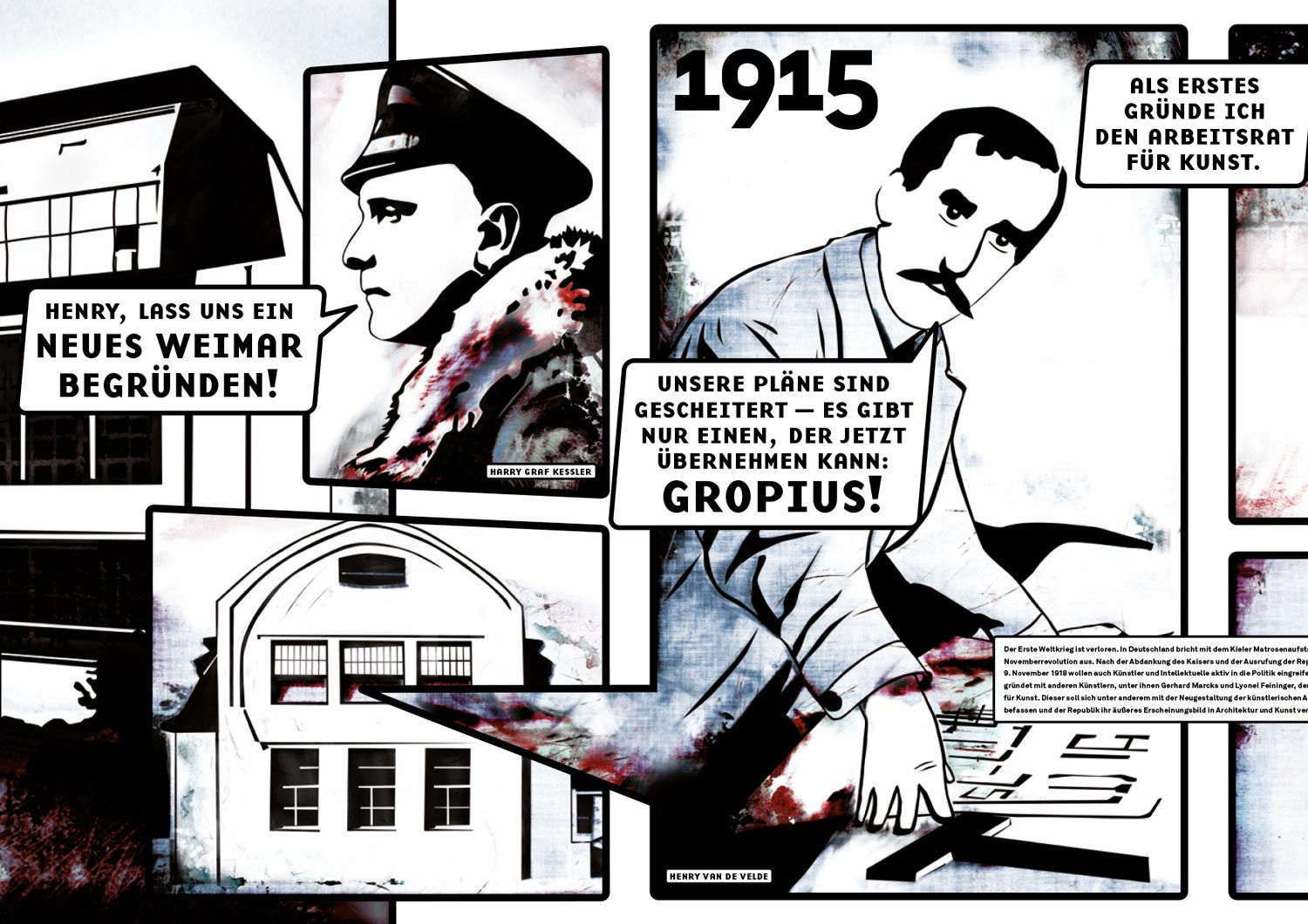
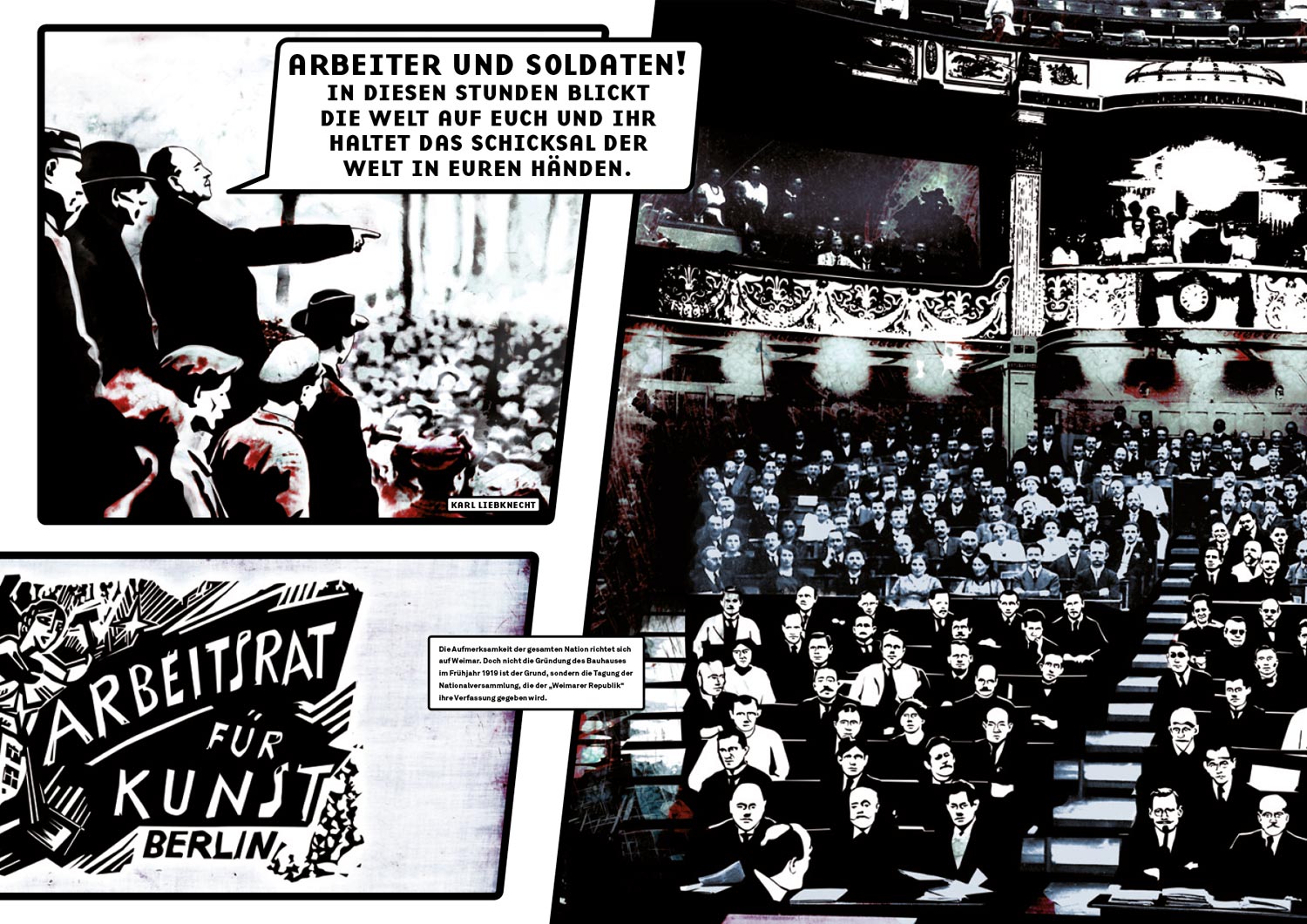
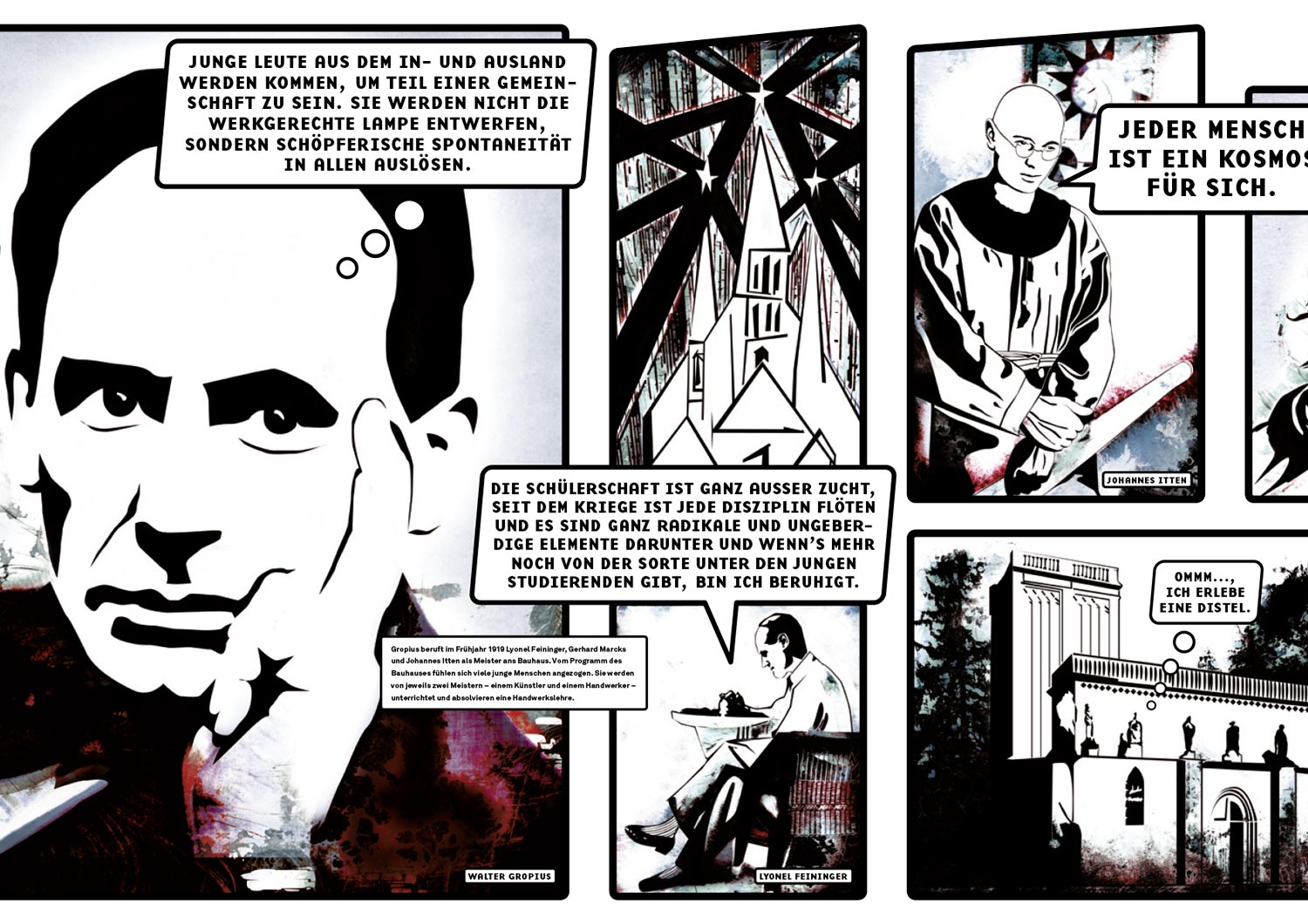
CLIENT
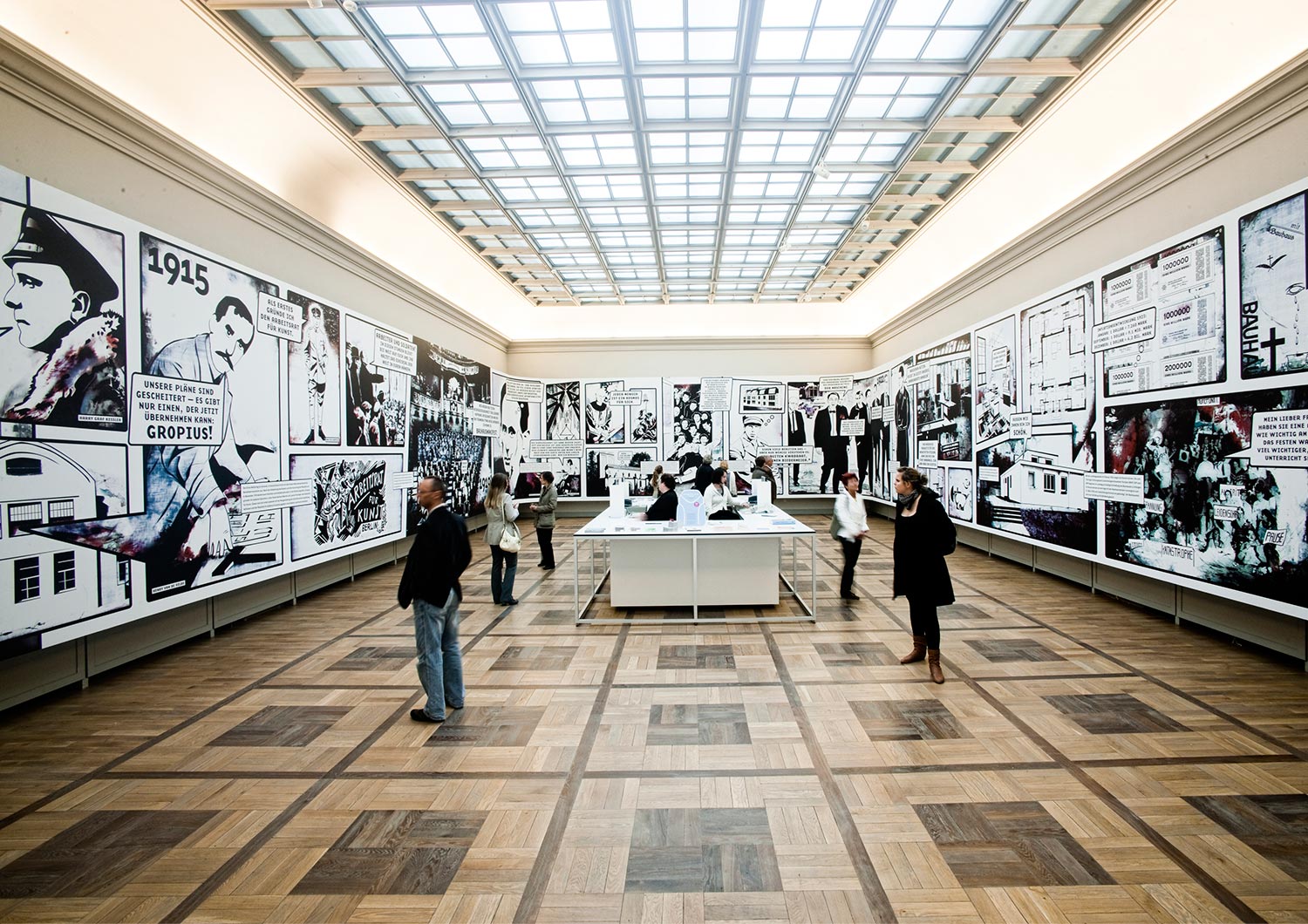
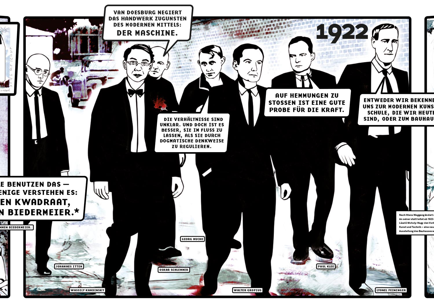
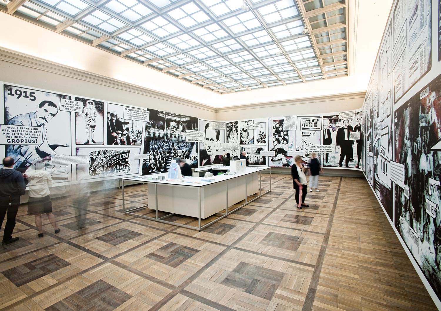
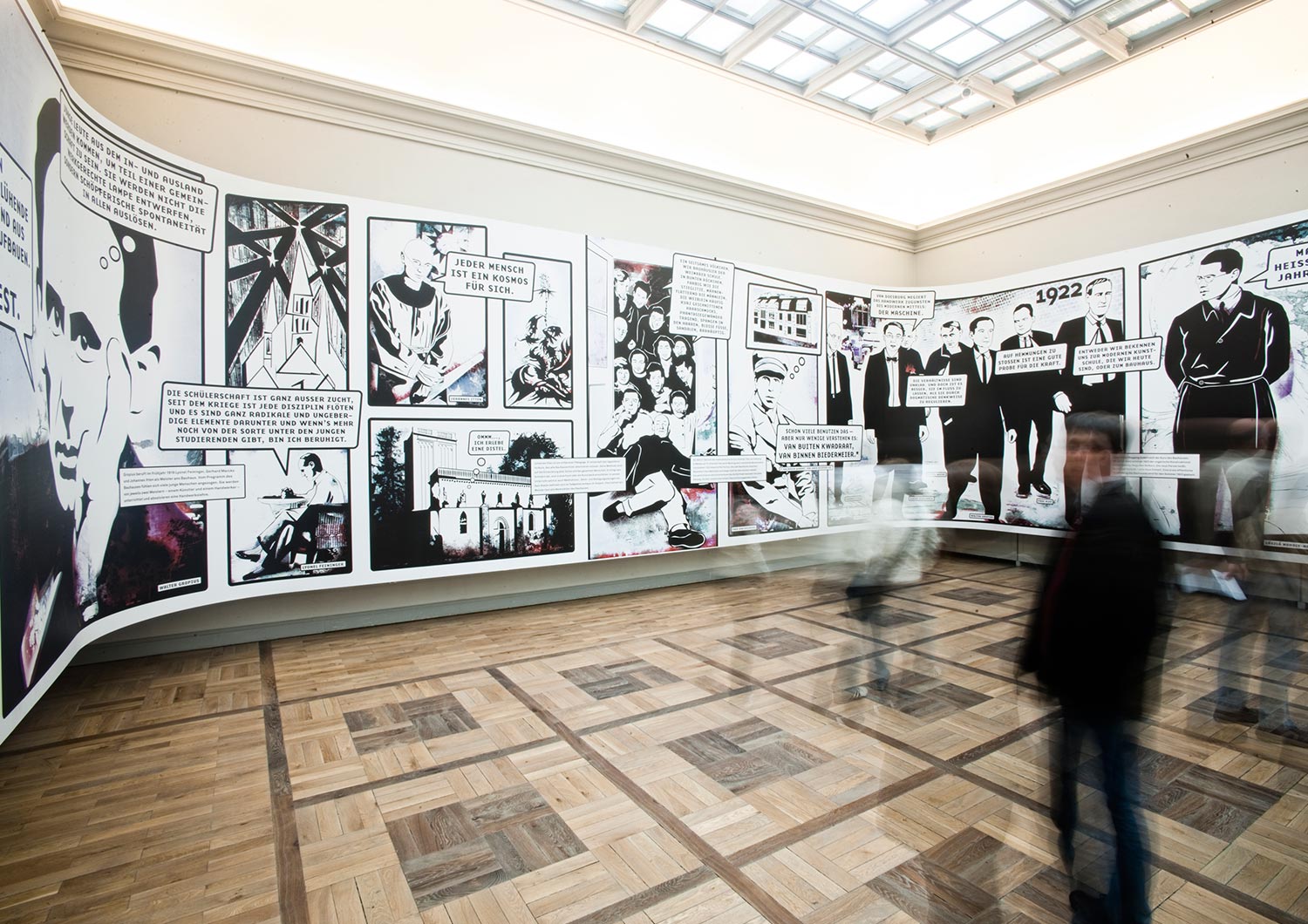
In collaboration with the wonderful architect and designer Meyer-Voggenreiter, we designed a giant comic installation for the 90th anniversary of the founding of the Bauhaus movement in Weimar. It’s called BAUHAUS PANORAMA. The exhibition “Bauhaus comes from Weimar” chronicled the early years of the legendary design school. And we were part of it.
challenge
We’d never had a project where we needed 2 laptops each to render the MEGADATA print file. 50m x 3.5m (175 square meters)! Print files! Hallelujah! Alarm clocks rang mercilessly at 3:30 a.m. as a unfriendly reminder to start the next rendering. Phew. But in the end when we stood nicely combed and ready in front of our super-sized comic creation in Weimar, all the pain was forgotten and we felt like superheroes.
Do you need what you see?
We should talk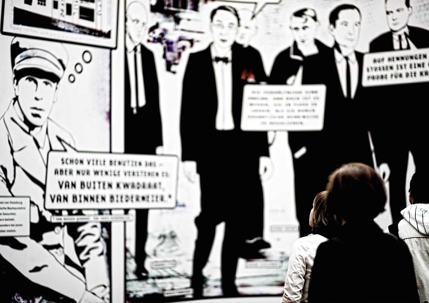
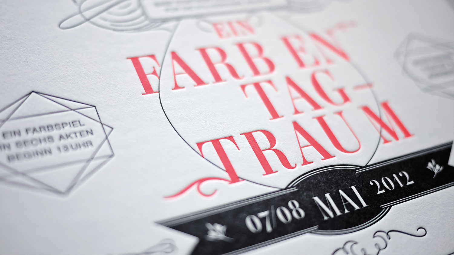
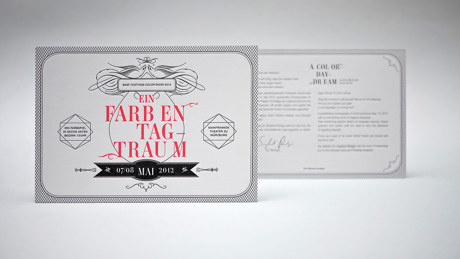
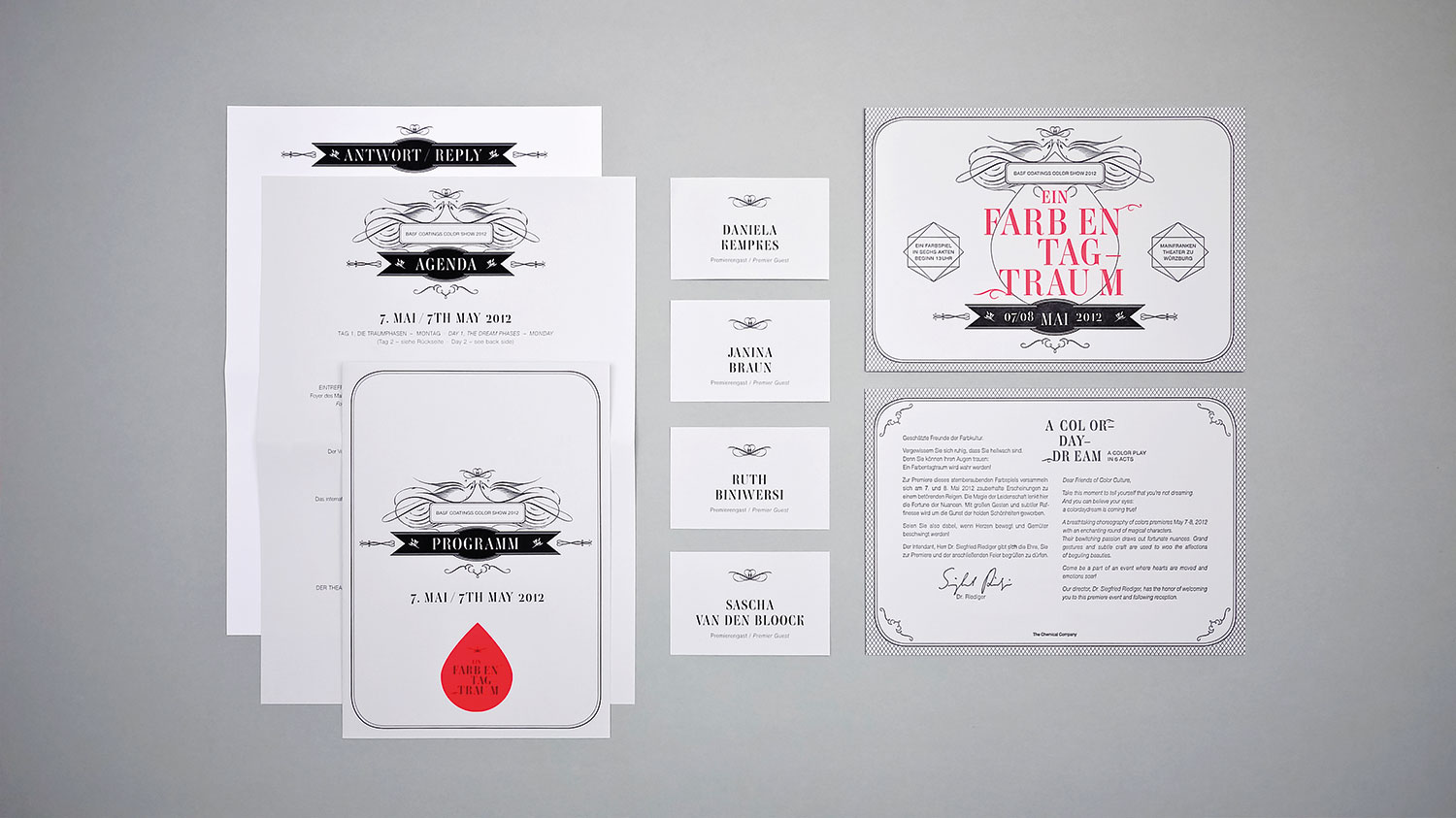
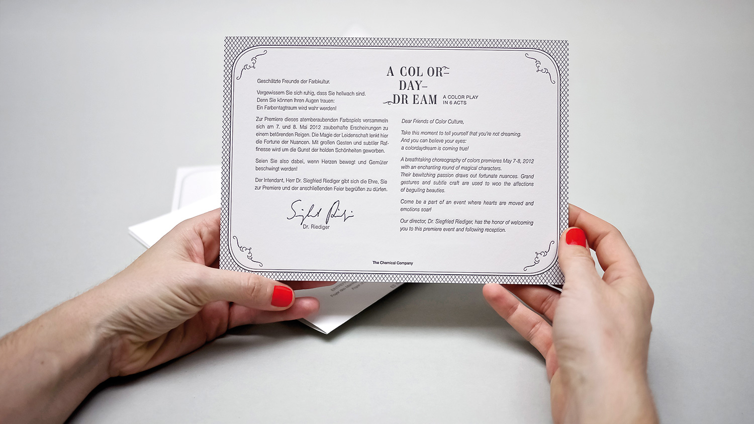
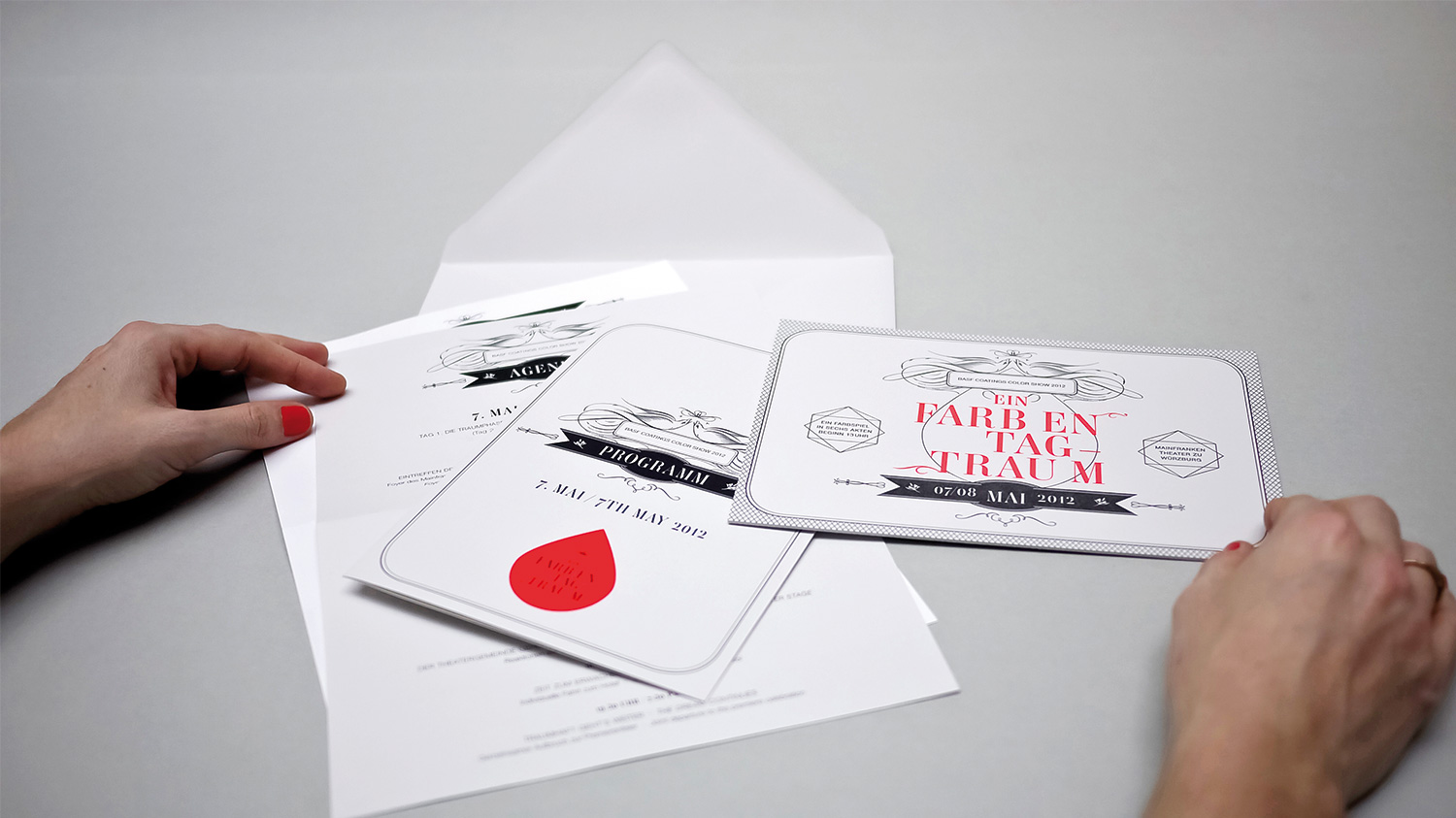
A COLOR DAYDREAM INVITATION
year
2014
client
BASF Coatings
industry
Automotive
services
Invitation Set, Concept
scope
Ideation, Typography, Paper Selection, Production
CLIENT
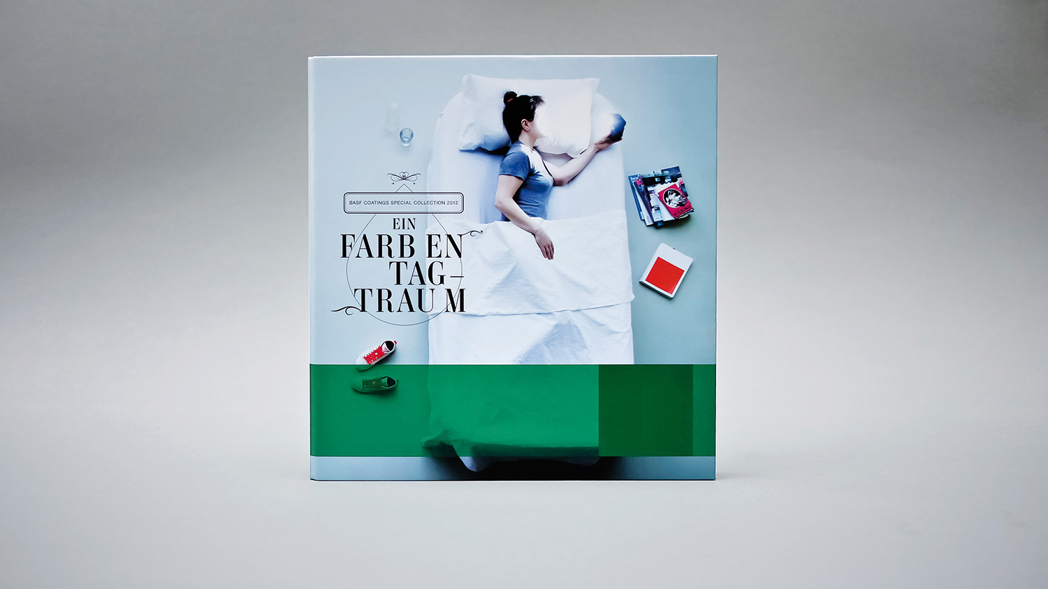
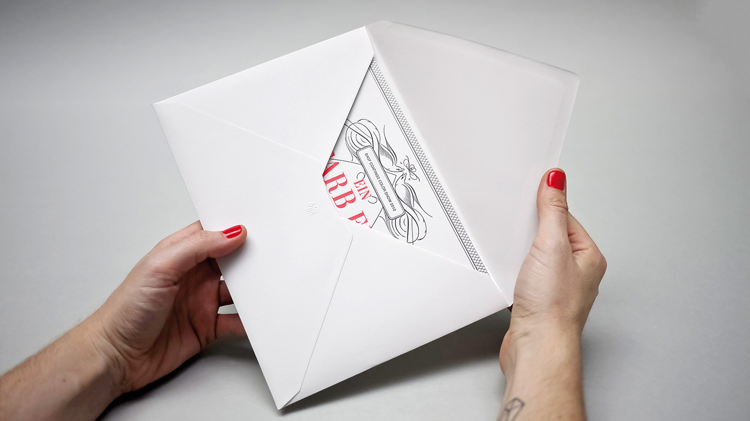
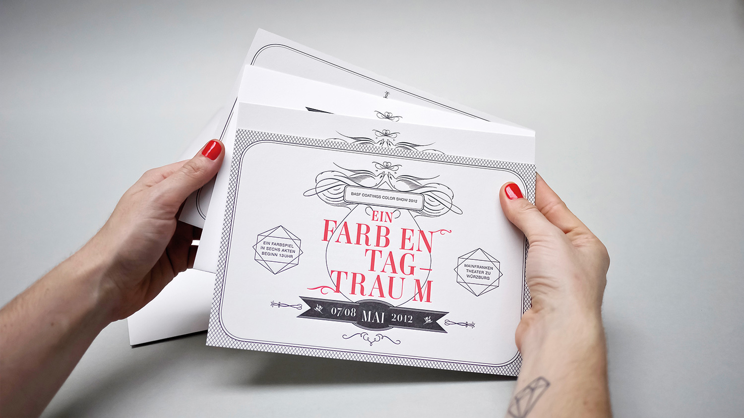
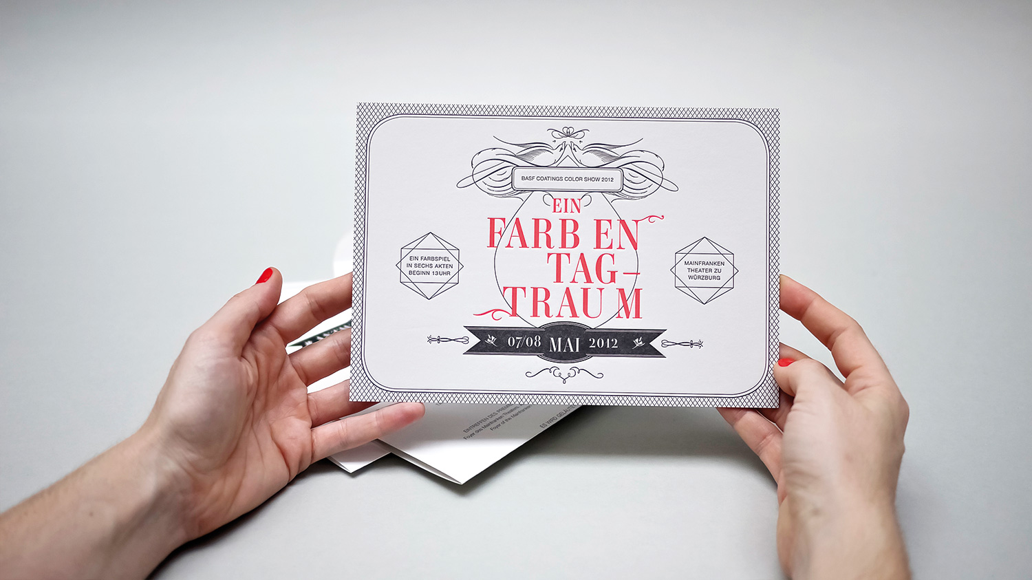
After the explosive success of WIDE AWAKE’s color dynamite in the spring, we joined with BASF Coatings to develop a follow-up special collection loosely based on Shakespeare’s notoriously enchanting, “A Midsummer Night’s Dream.” We started modifying our WIDE AWAKE cover by turning the perspective: we made the vertical model on the cover now lay down. We did a bird’s eye view from a 3-meter-high balcony – to expand on the concept of sleeping, because the project was called A COLOR DAYDREAM after all.
challenge
How beautiful! How cozy! Even the accompanying invitations were a sight to see: We produced the invitations in letterpress, used only 3 colors and printed on super-heavy 900-gram paper. It was more a board than an invitation, but oh so stunning! For dessert there was a neon-coloured freeform sticker on top – a real daydream of colors.
Do you like what you see?
You bet I do!
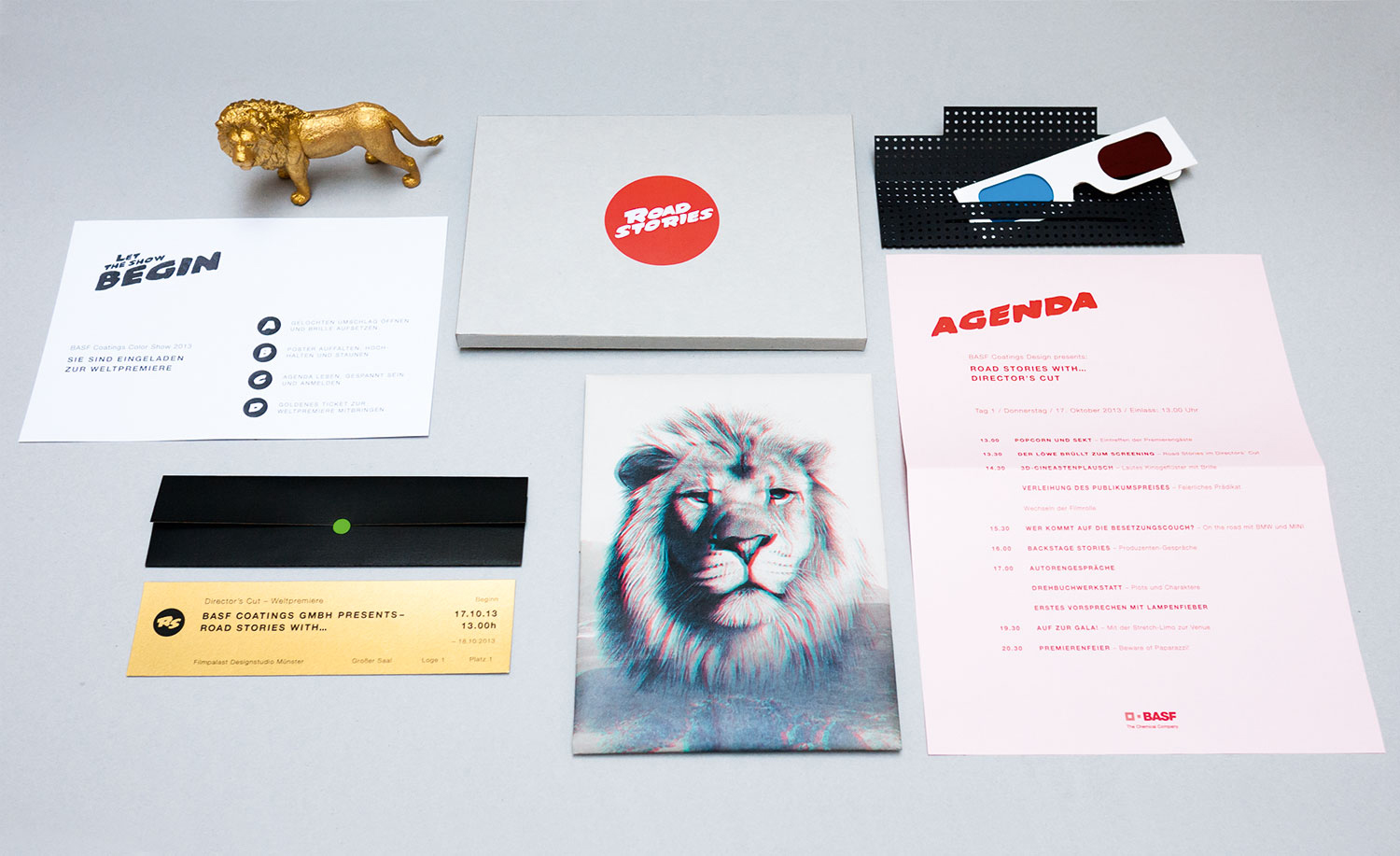
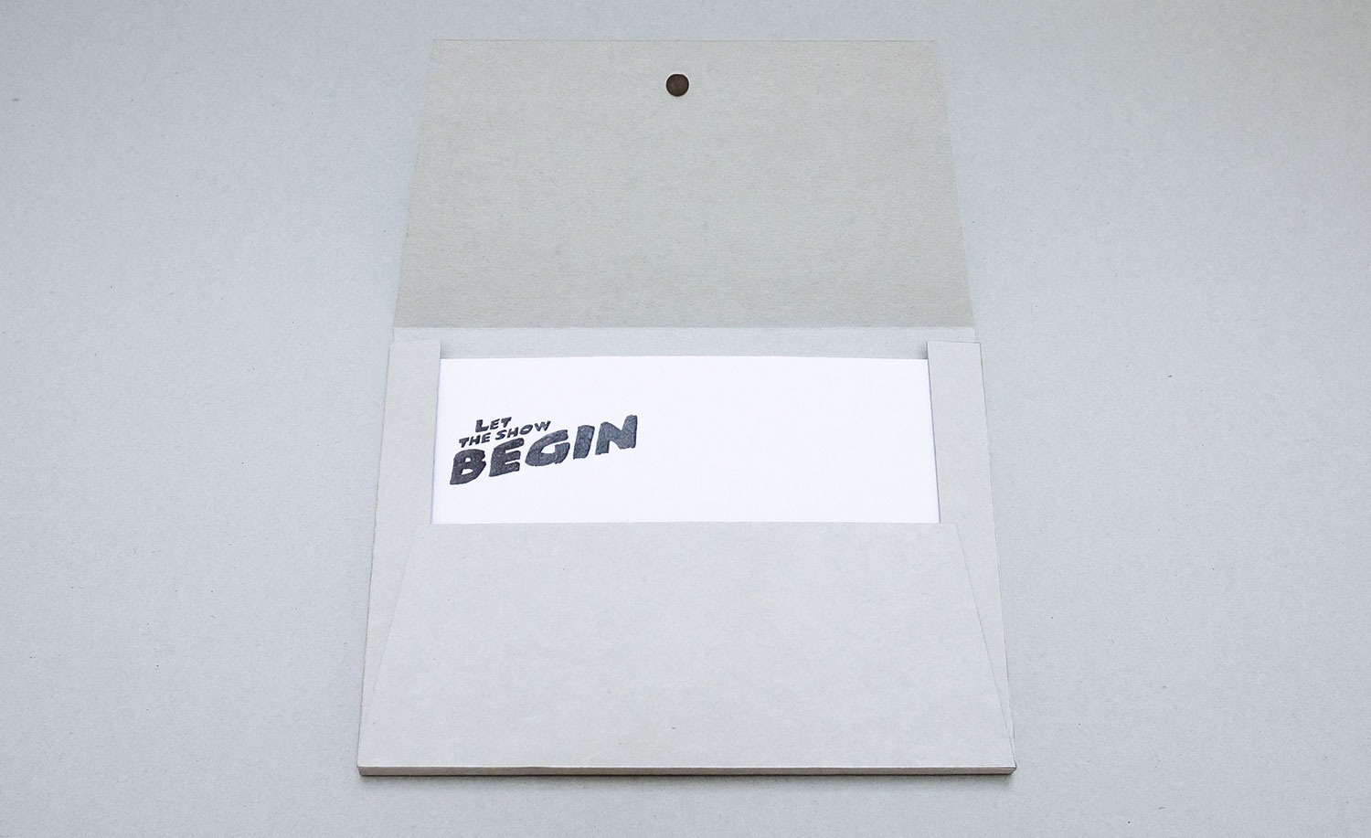
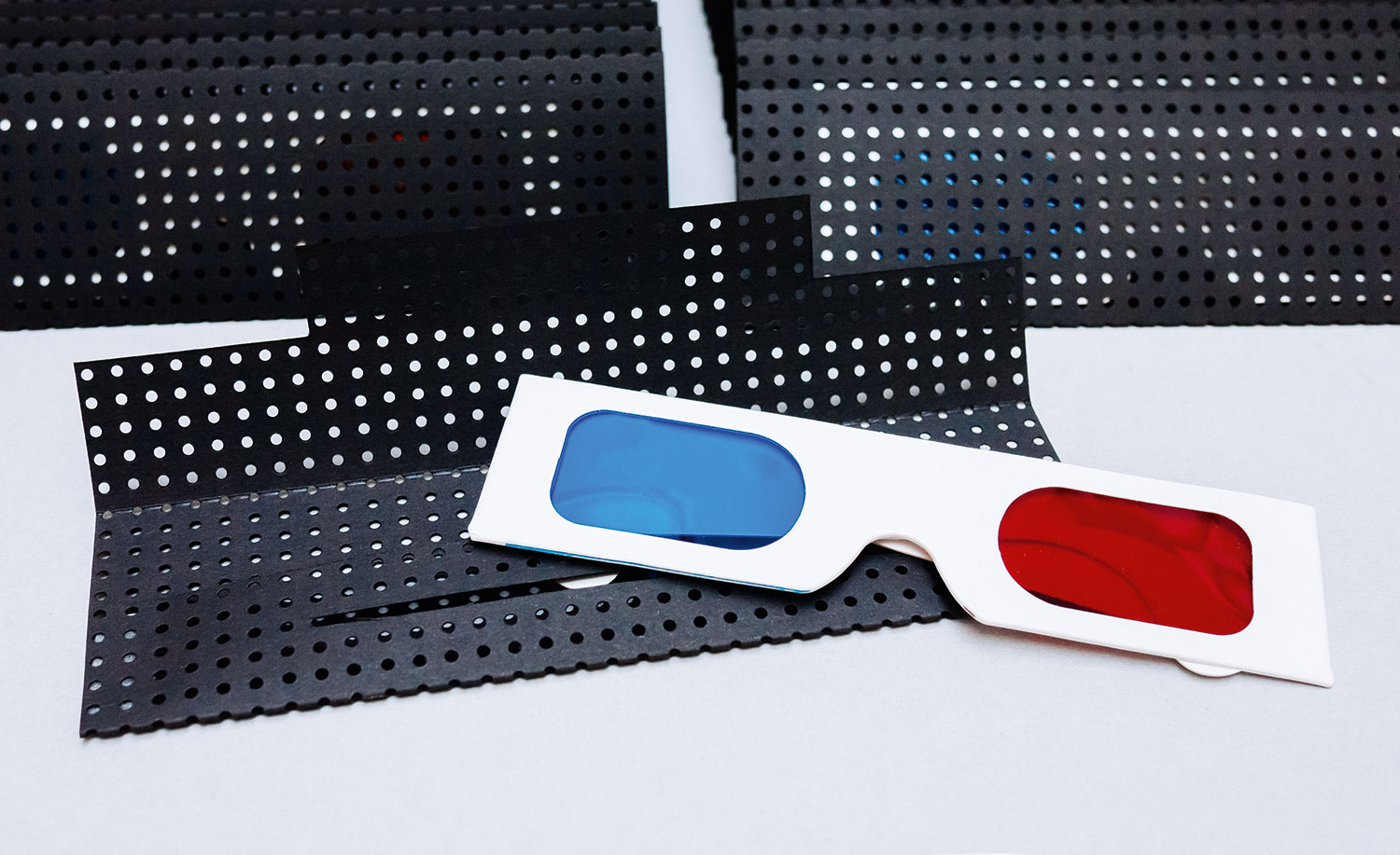
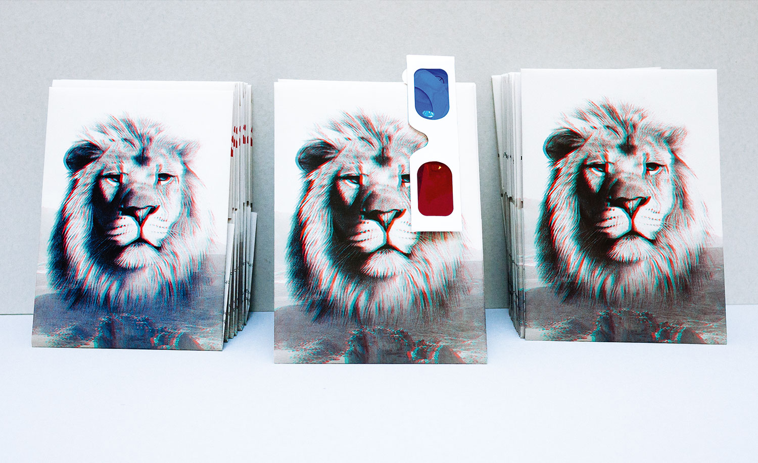
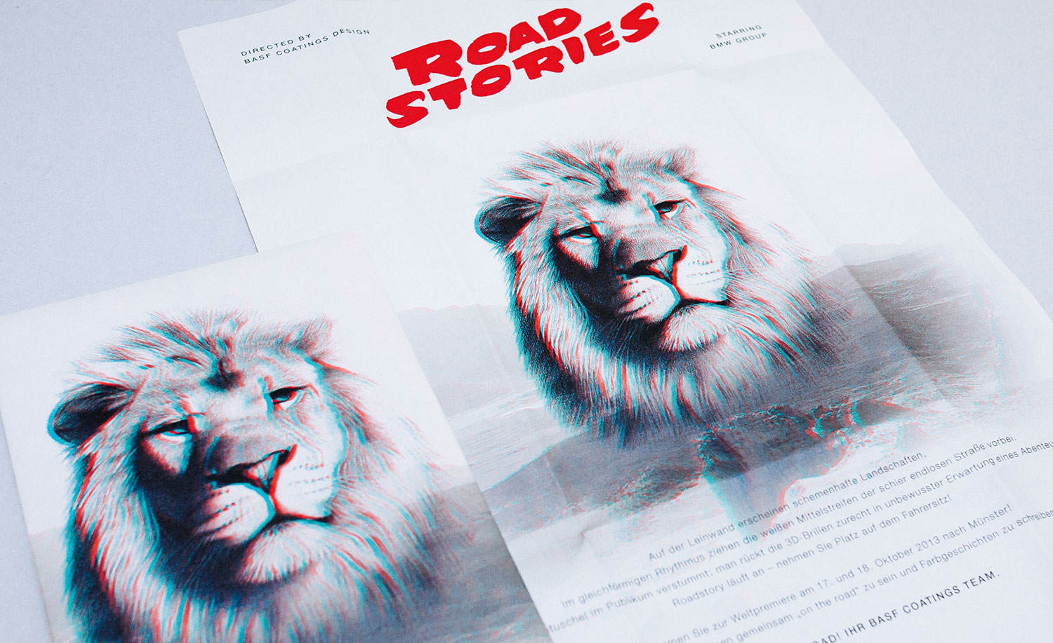
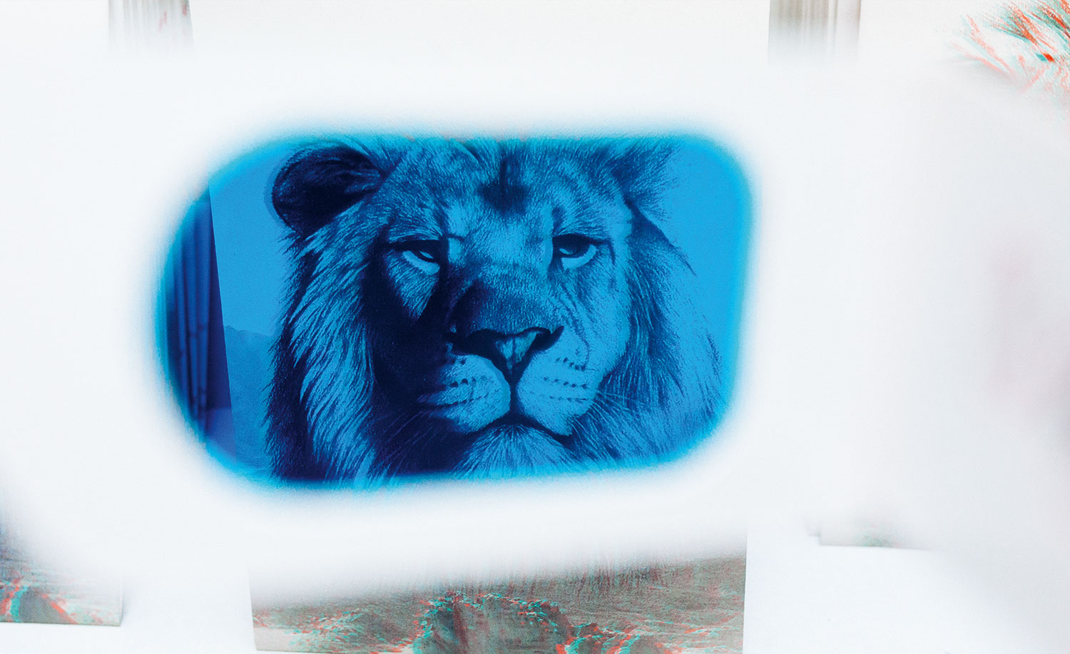
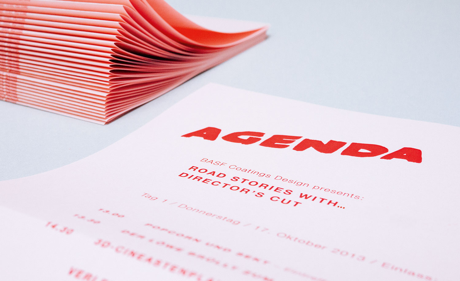
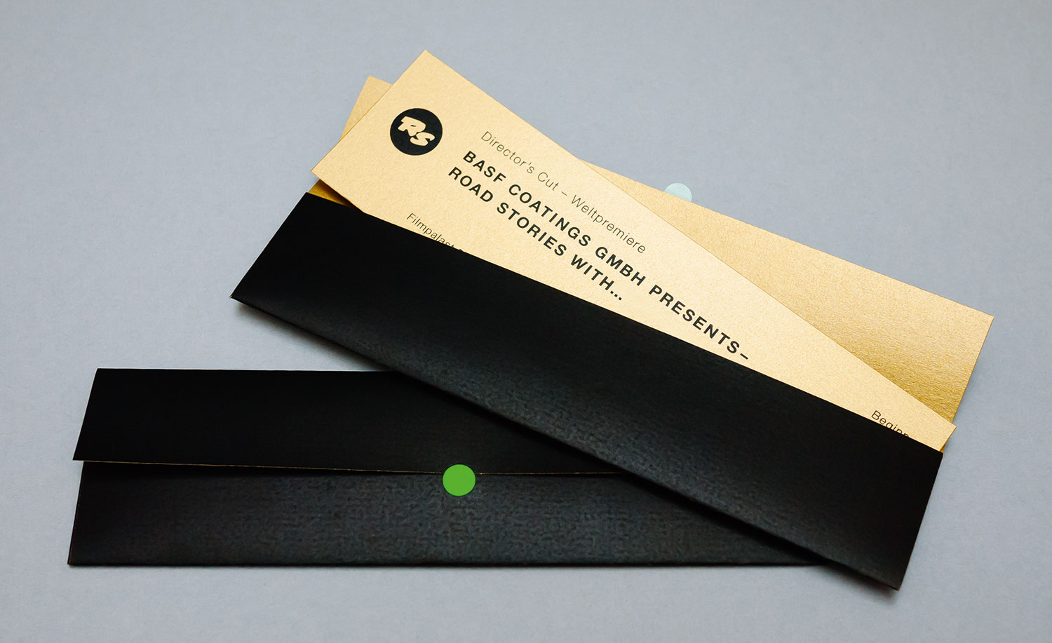
ROAD STORIES INVITATION PART 2
year
2014
client
BASF Coatings
industry
Automotive
services
Invitation-Set, Concept
scope
Ideation, Typography, Paper selection, Story, Production
CLIENT
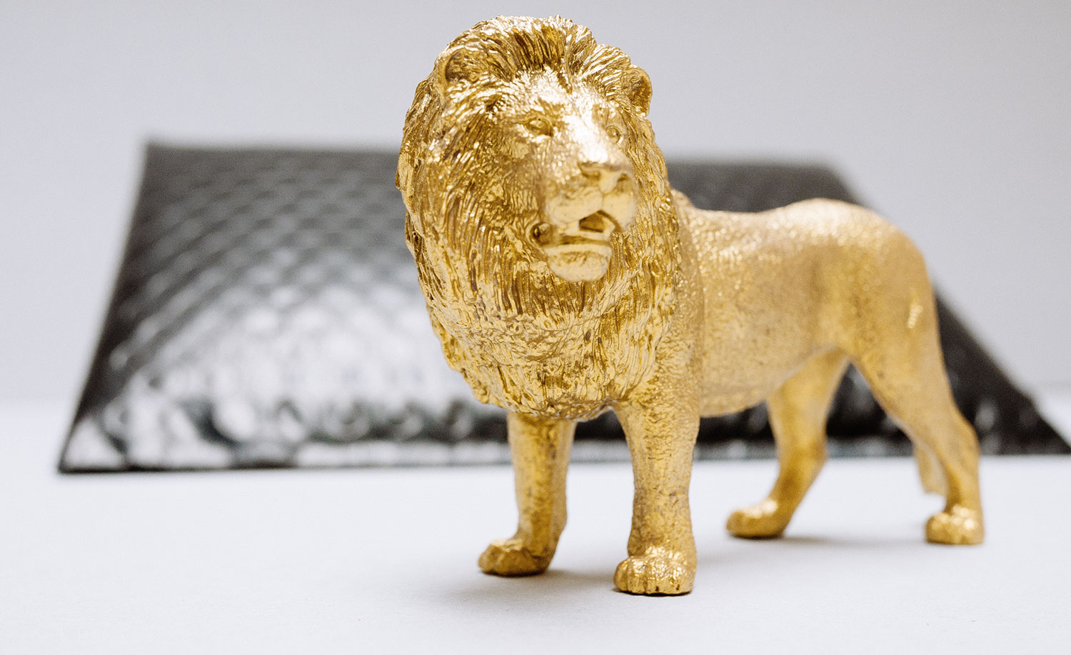
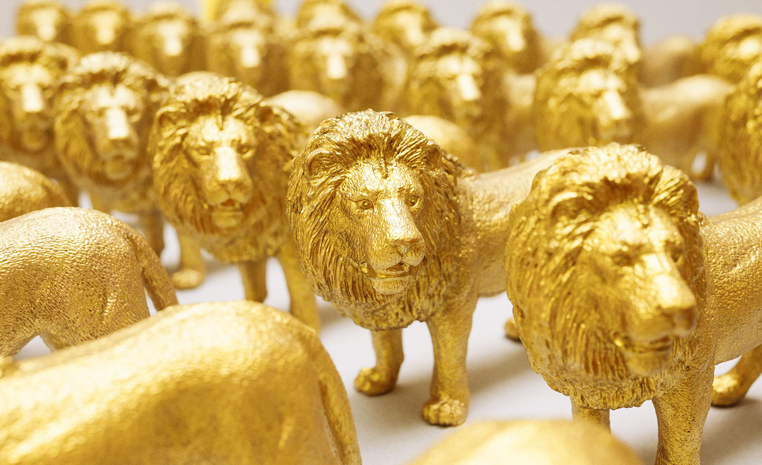
We arranged a unique invitation-set for this event: colored glasses, a frightening lion poster, a pink-colored agenda and a golden ticket for the befitting welcome of the high-ranking guests. And at the end of the workshop all attendees received what? Roar! A hand-painted Golden Lion.
challenge
Katy Perry borrowed our idea and called her new single ROAR. But we all know: Every copy makes the original stronger.
What ya think?
Looking good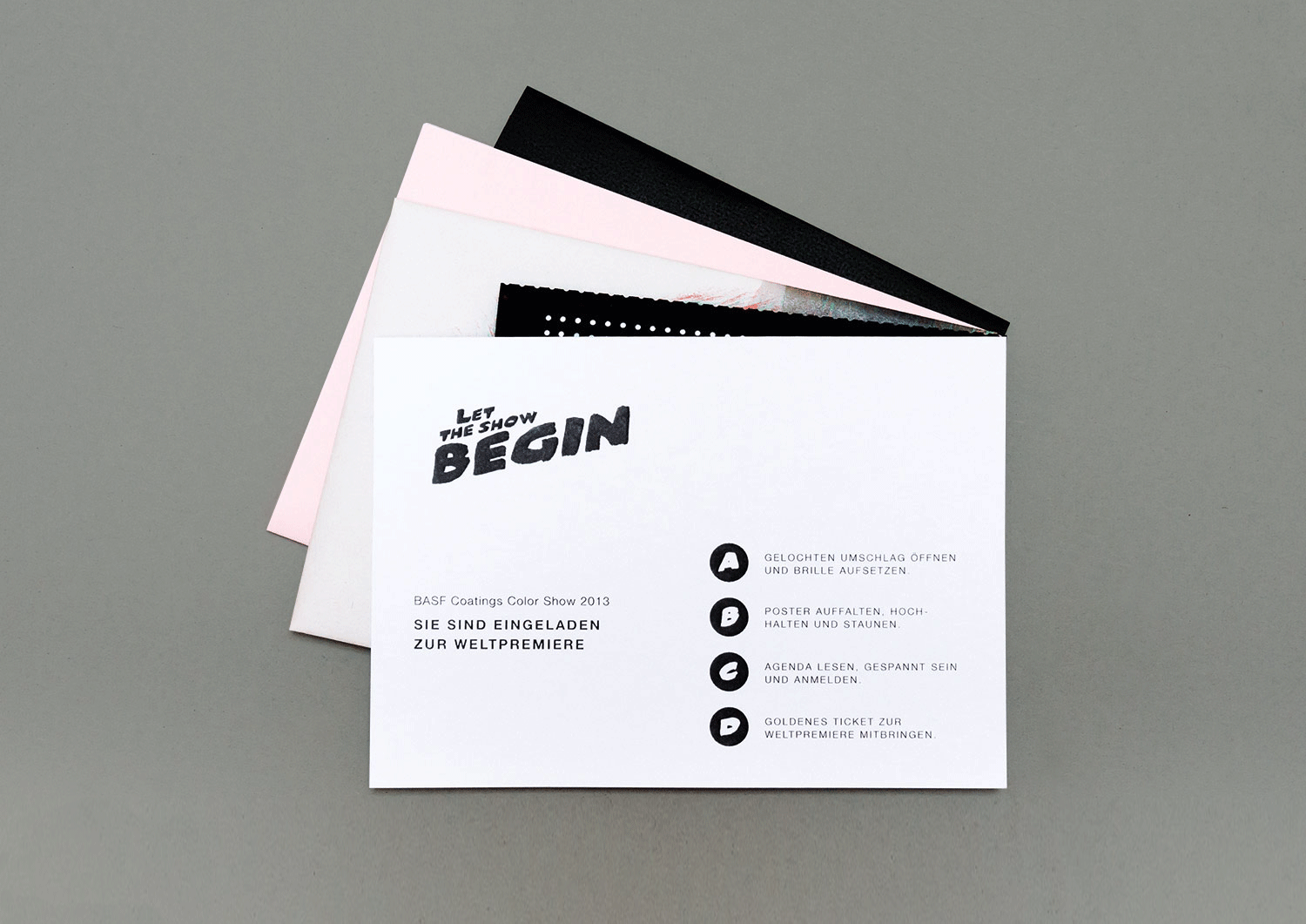
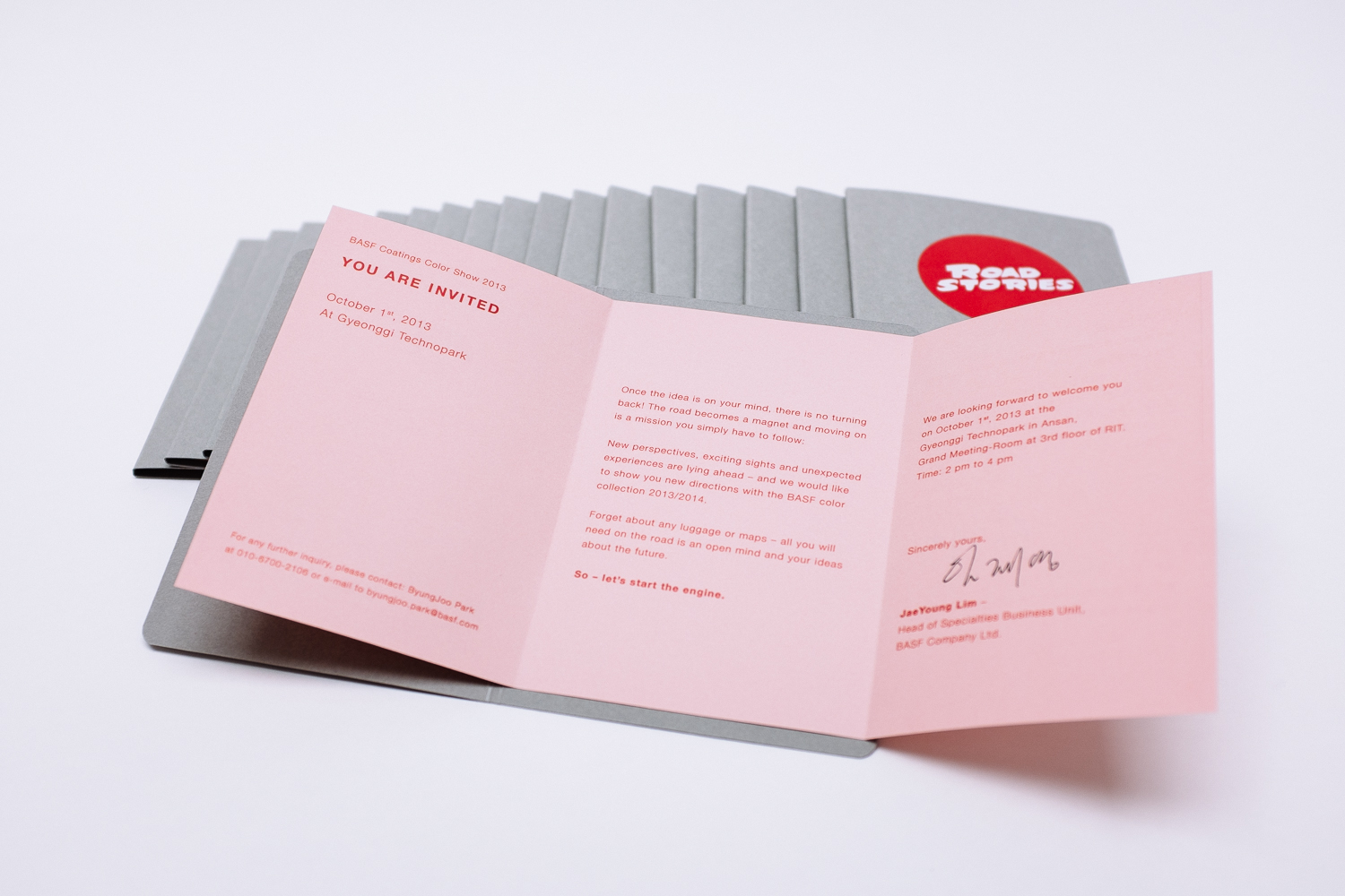
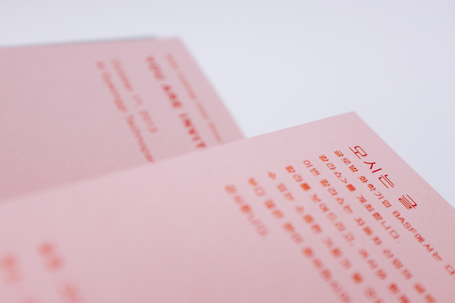
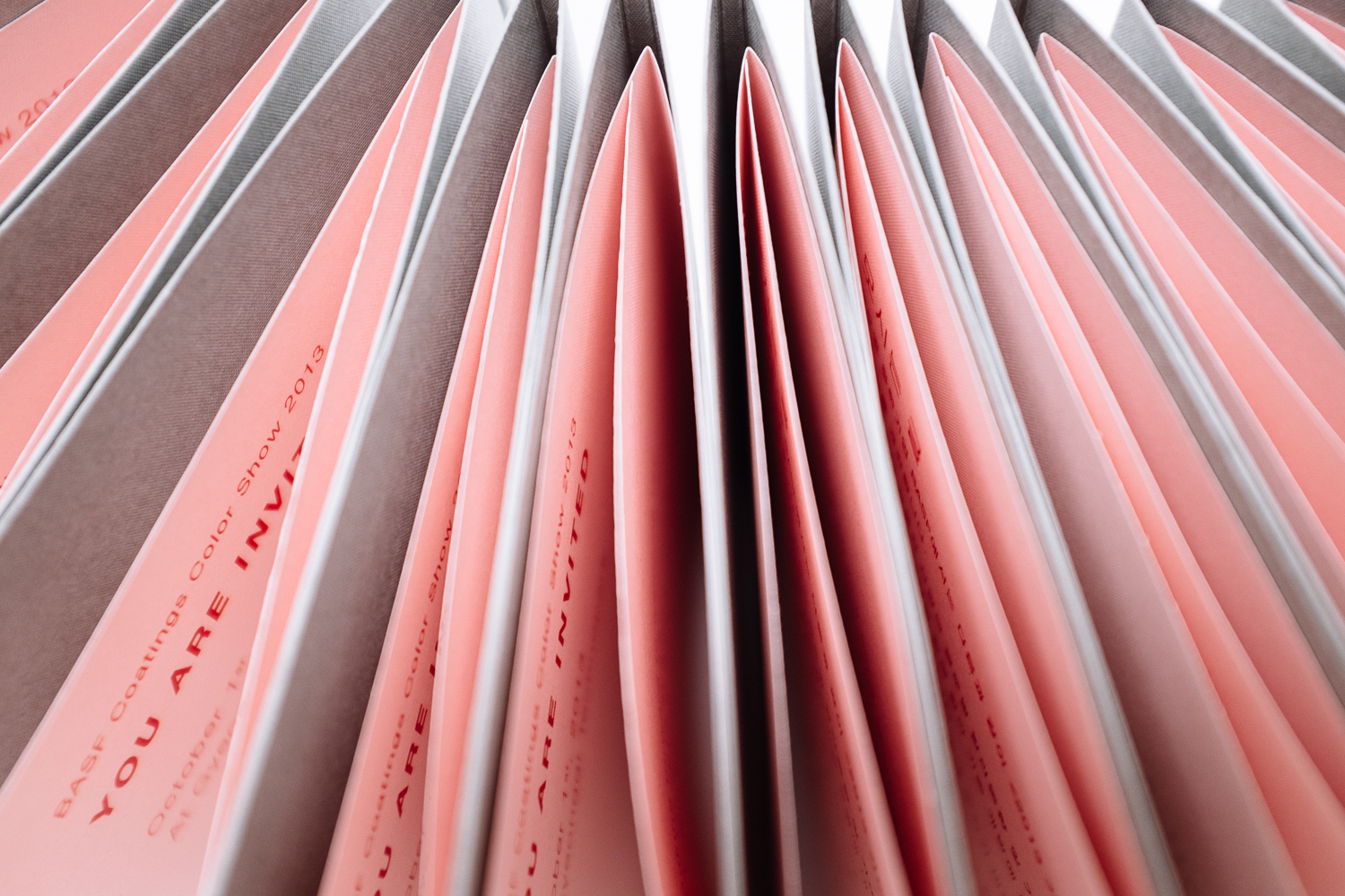
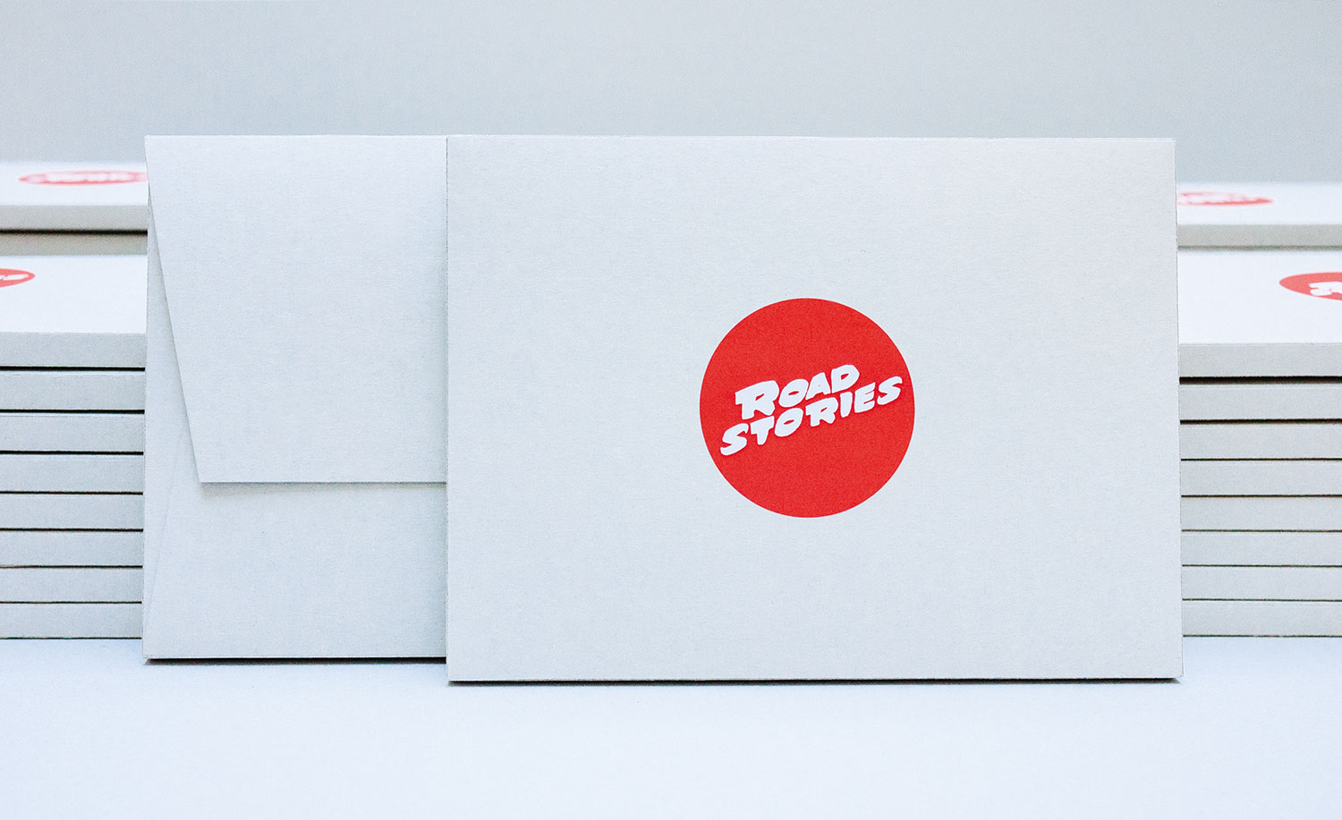
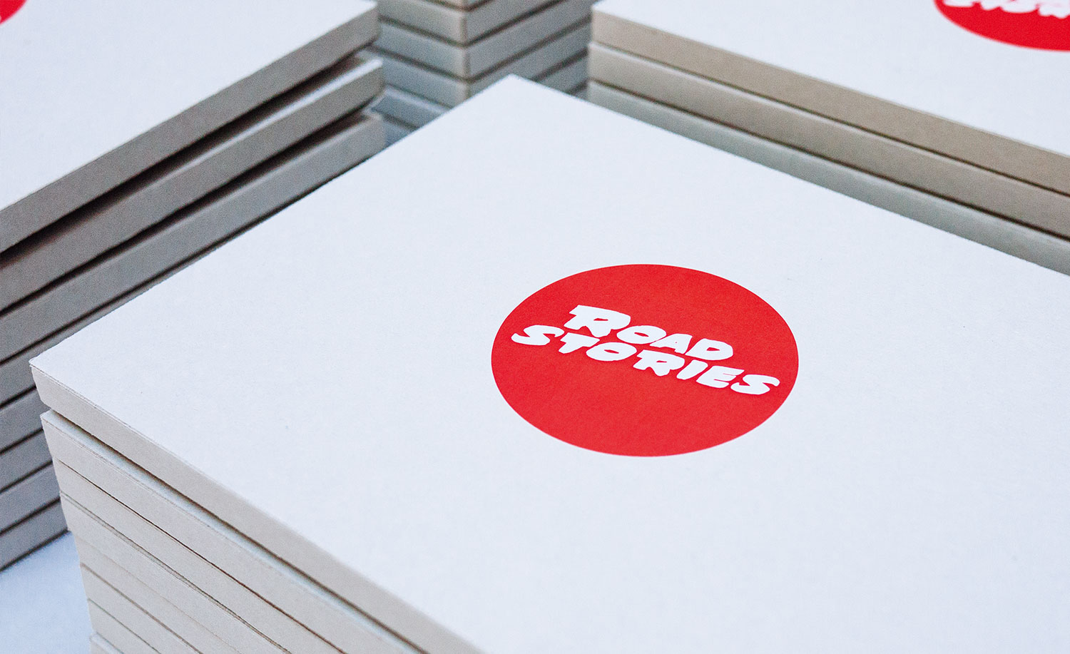
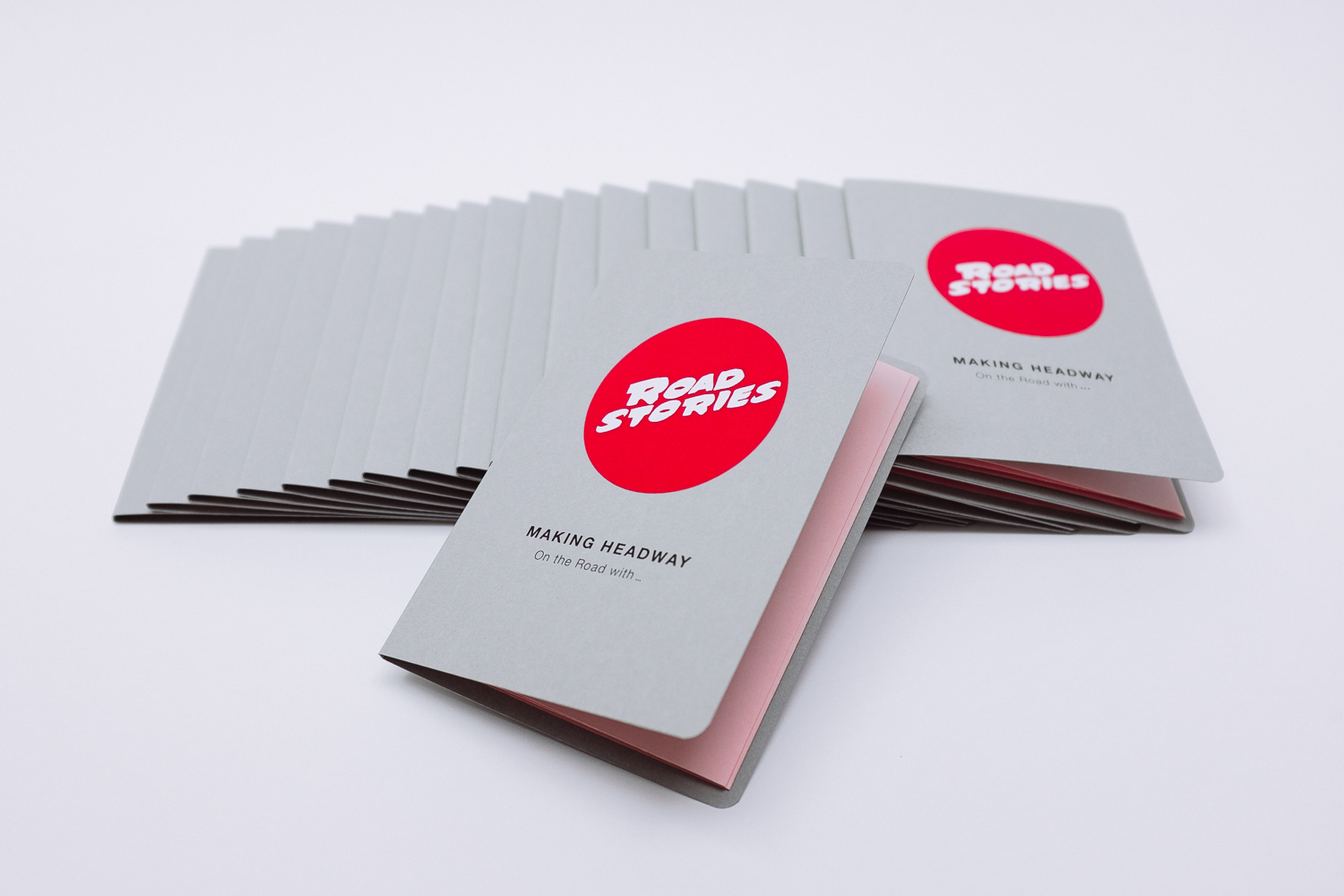
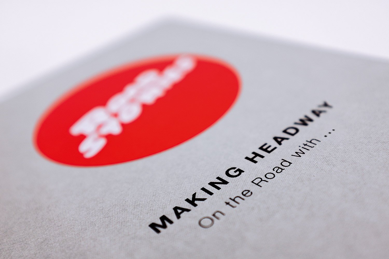
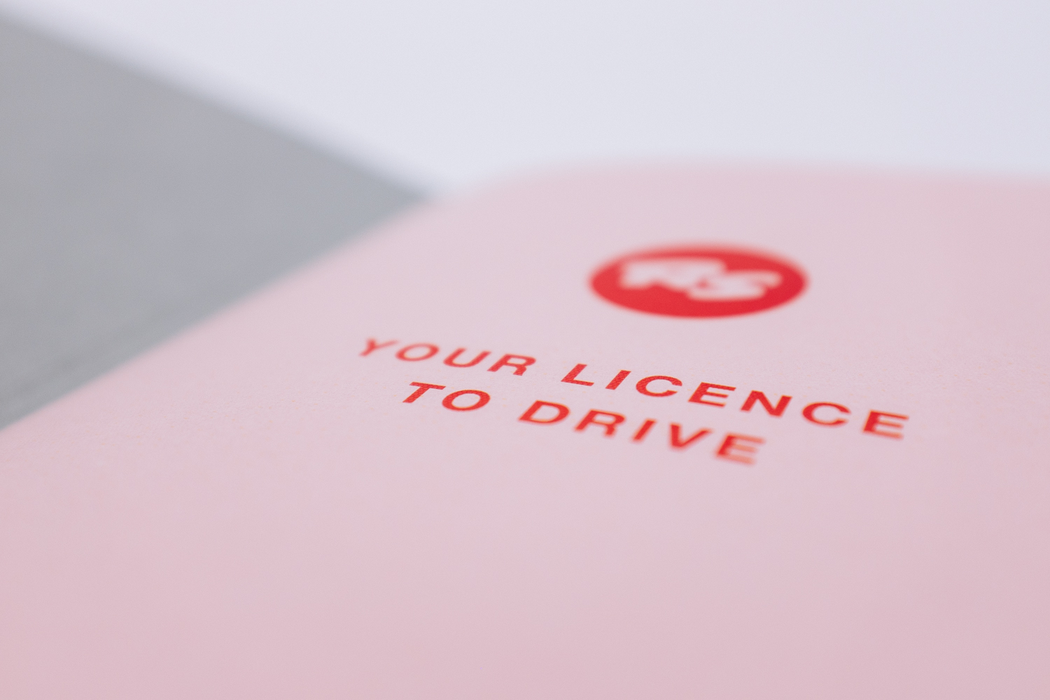
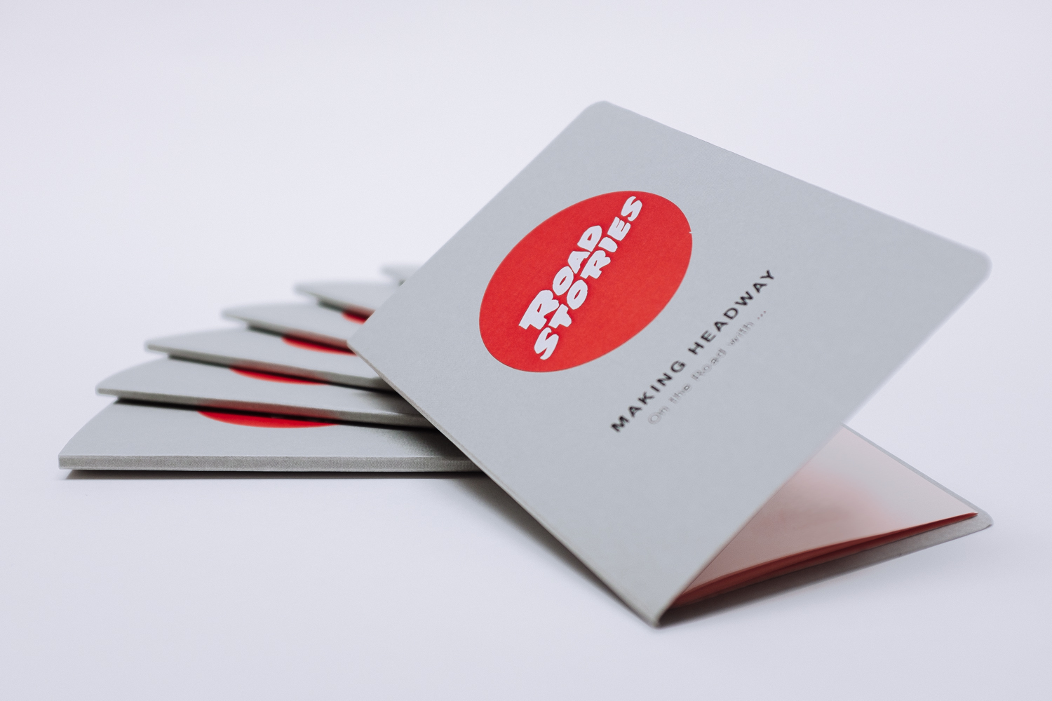
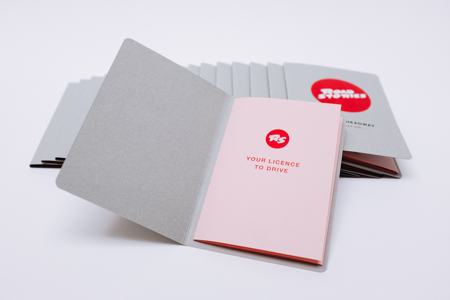
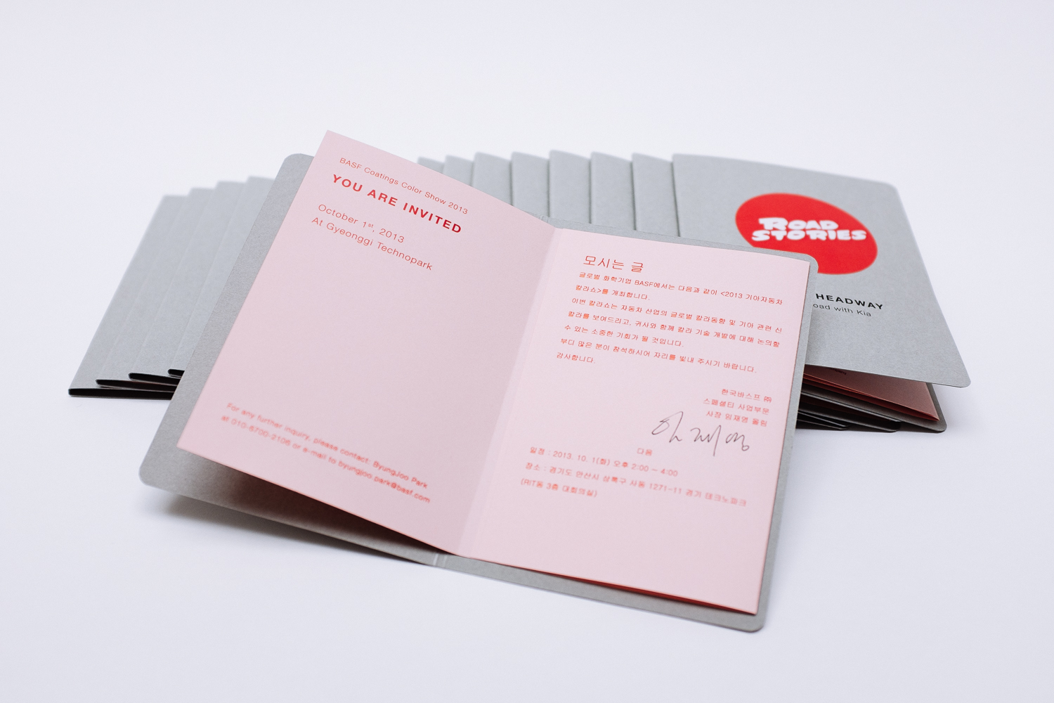
ROAD STORIES INVITATION PART 1
year
2014
client
BASF Coatings
industry
Automotive
services
Invitation, Folding
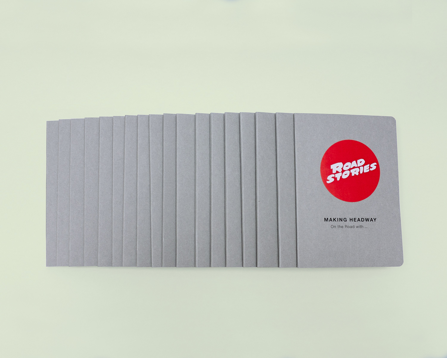
scope
Ideation, Concept, Typography, Production
CLIENT
What to design for an asian clientele, that already has everything? Maybe a driver’s licence, which allows the guests to take part in this color-race named ROAD STORIES? Bingo!
challenge
The Korean presentation of the trend book MAKING HEADWAY took place on the southern peninsula in autumn. We kept with our studio ethos and created every single invitation by hand. The envelopes, the insides, the rounded edges, the stickers.
What do you think?
I like it!