NEXIBLE
year
2017
client
Nexible
industry
InsureTec
services
Digital Branding
scope
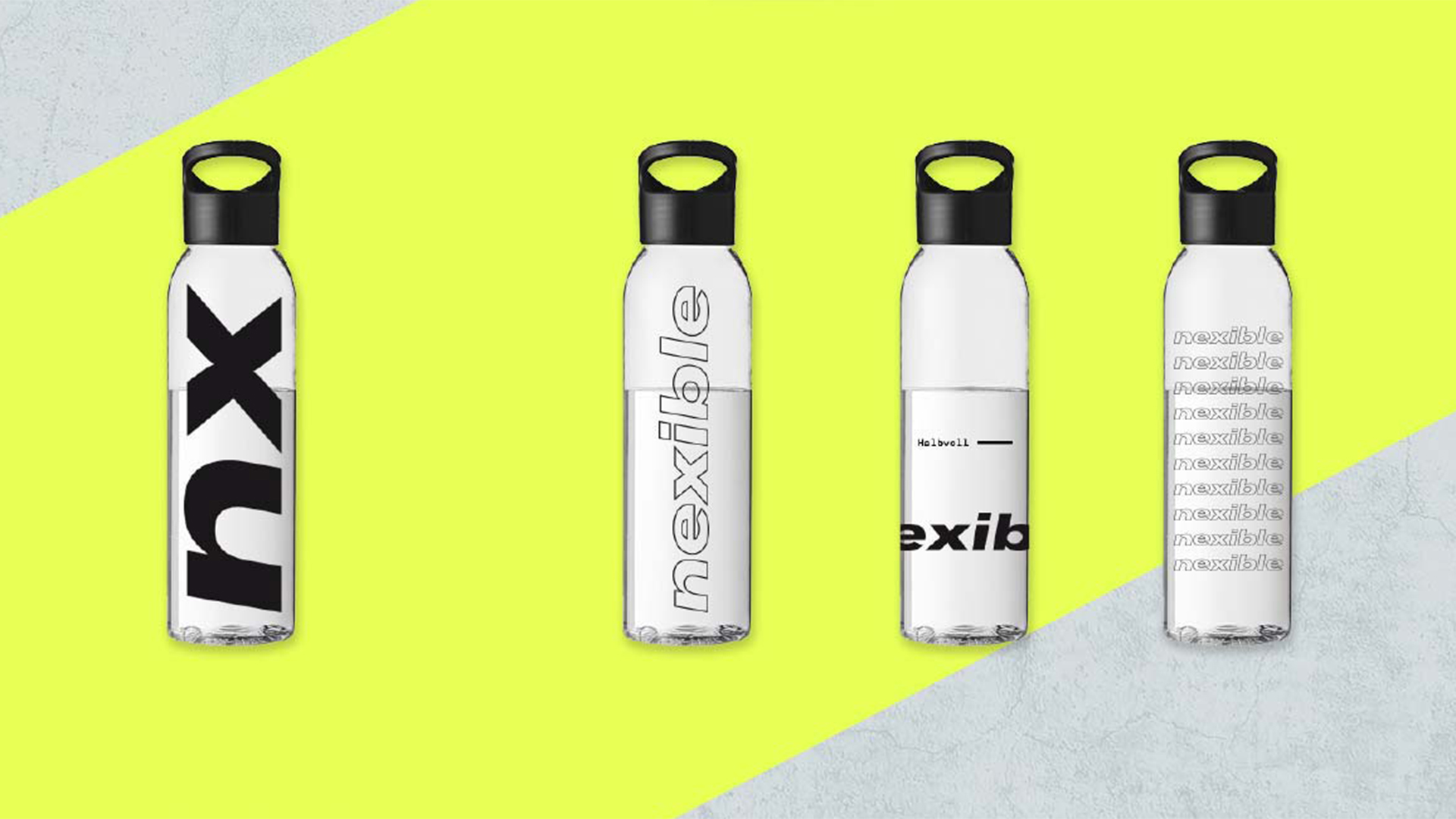
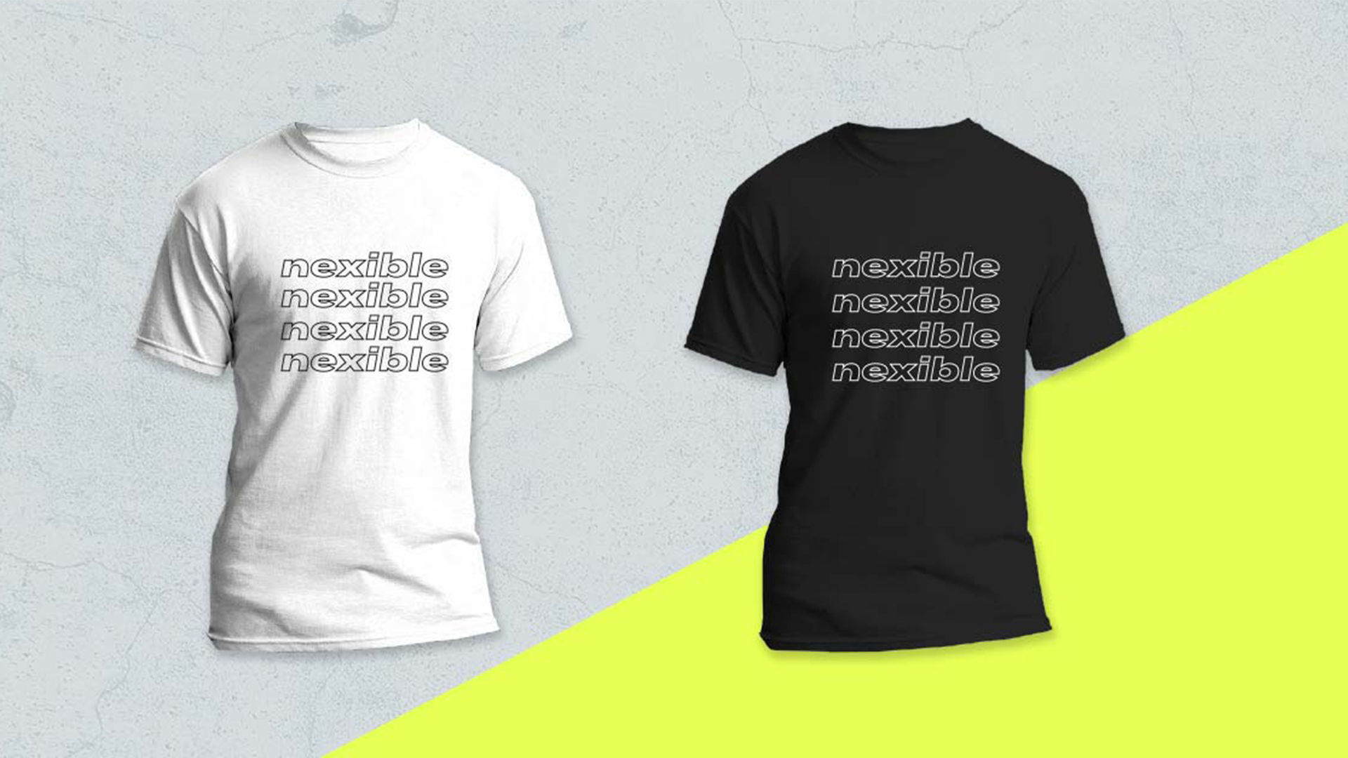
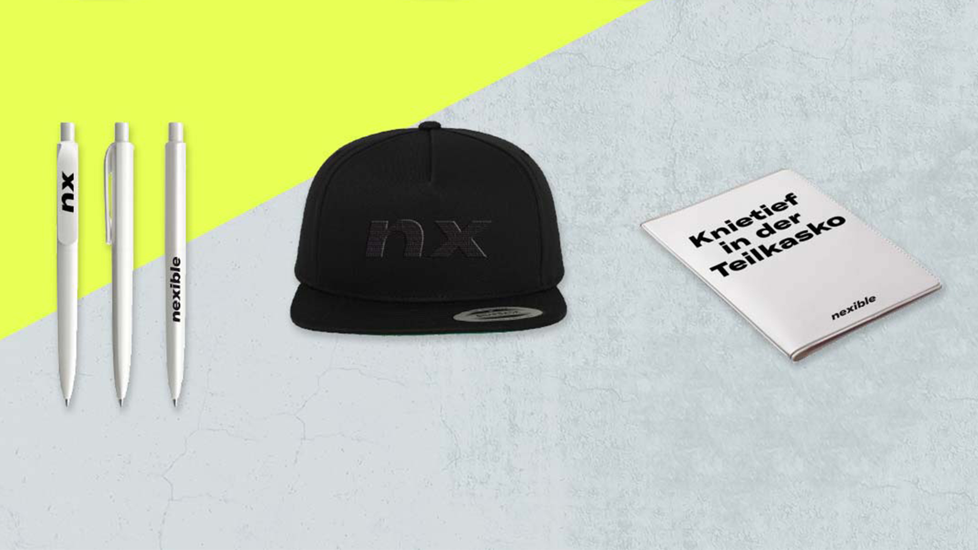
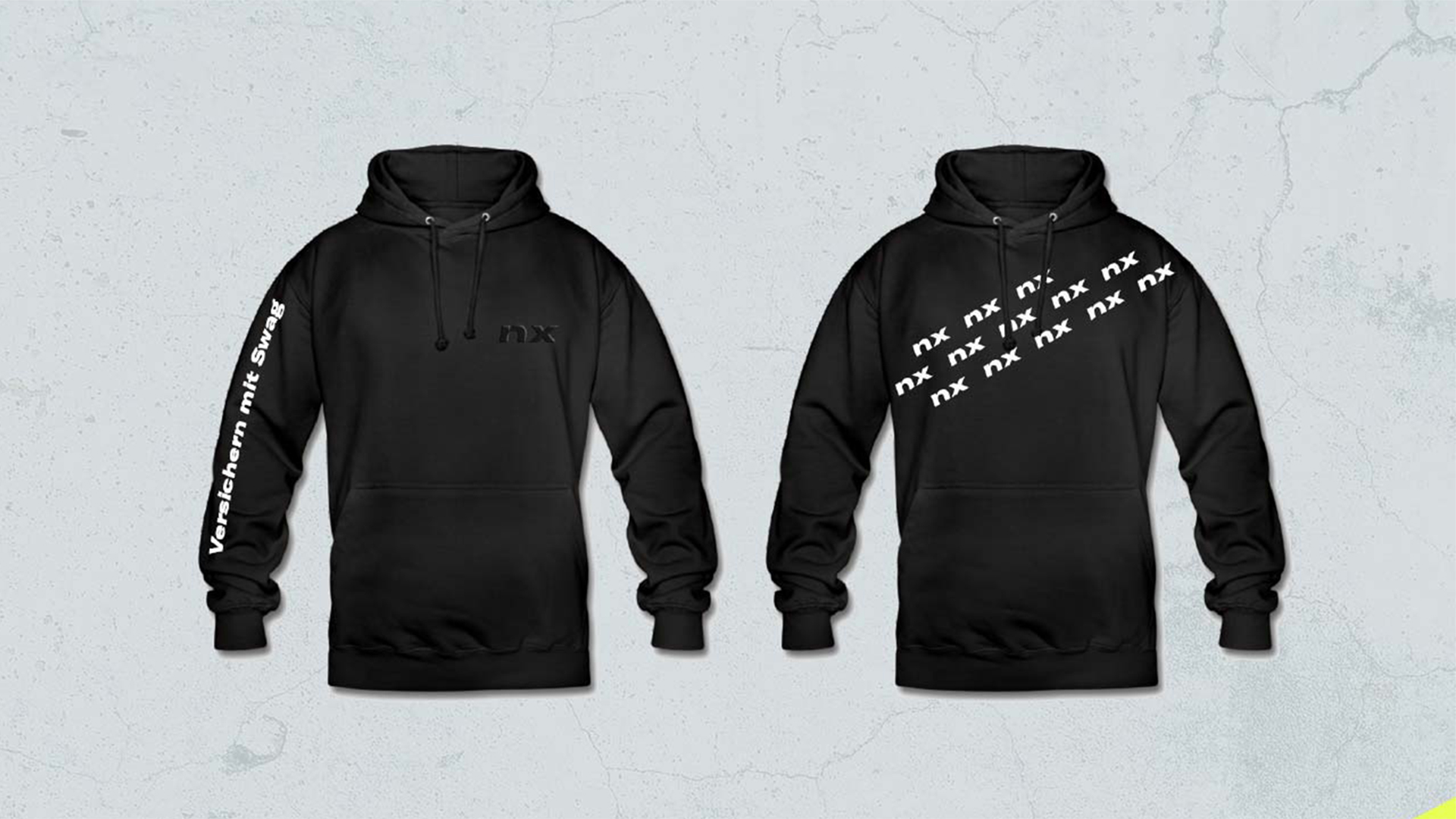
Ideation, Design Direction, Concept, Visual Language, Logo Development, Screen Design, Copy Text, Imagery Concept, Design System, Merchandising.
CLIENT
Nexible is next. At least that was the briefing in a nutshell. As an ERGO Digital brand, nexible rolls up the insurance field from the rear. Everything simple, everything transparent and absolutely certain with much less bureaucratic.
challenge
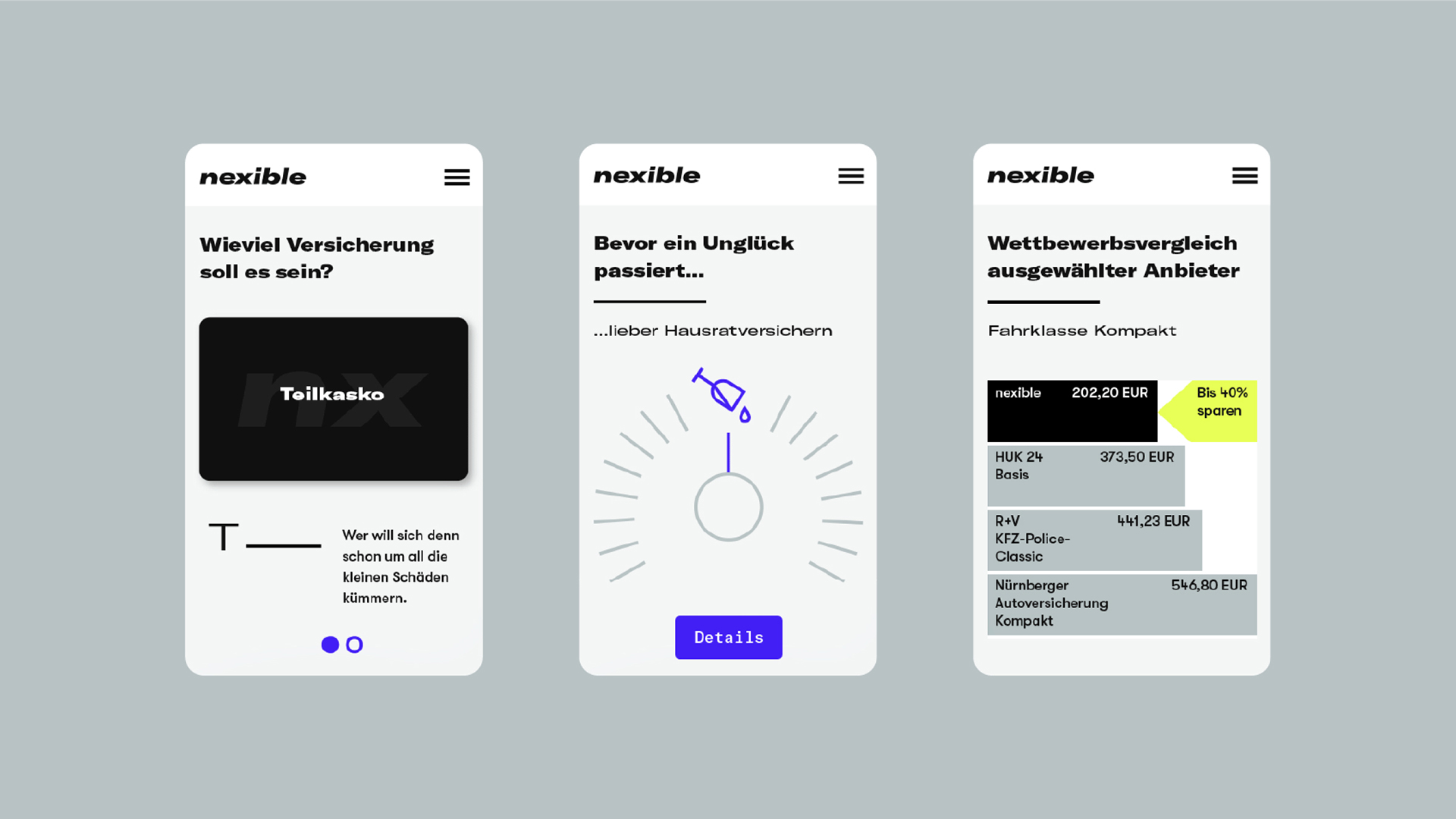
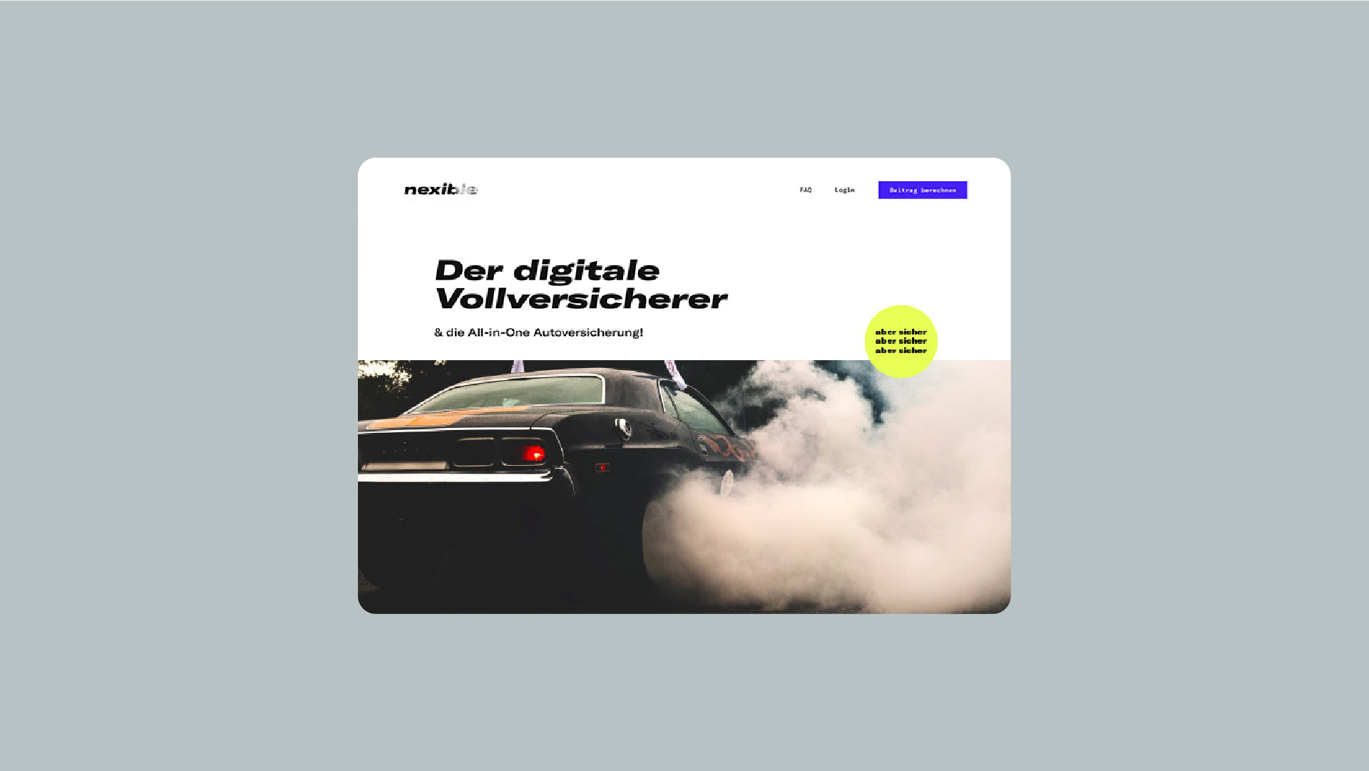
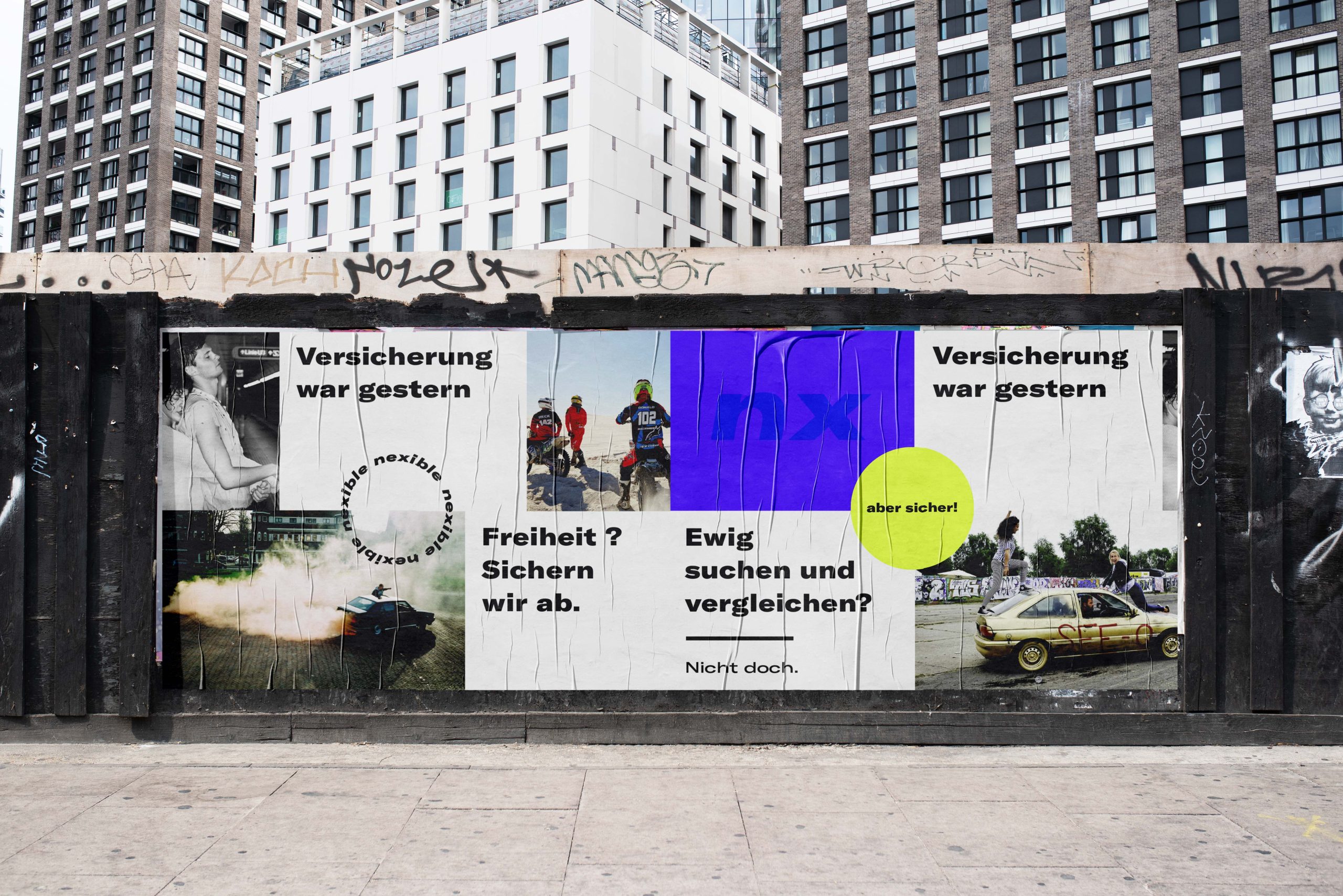
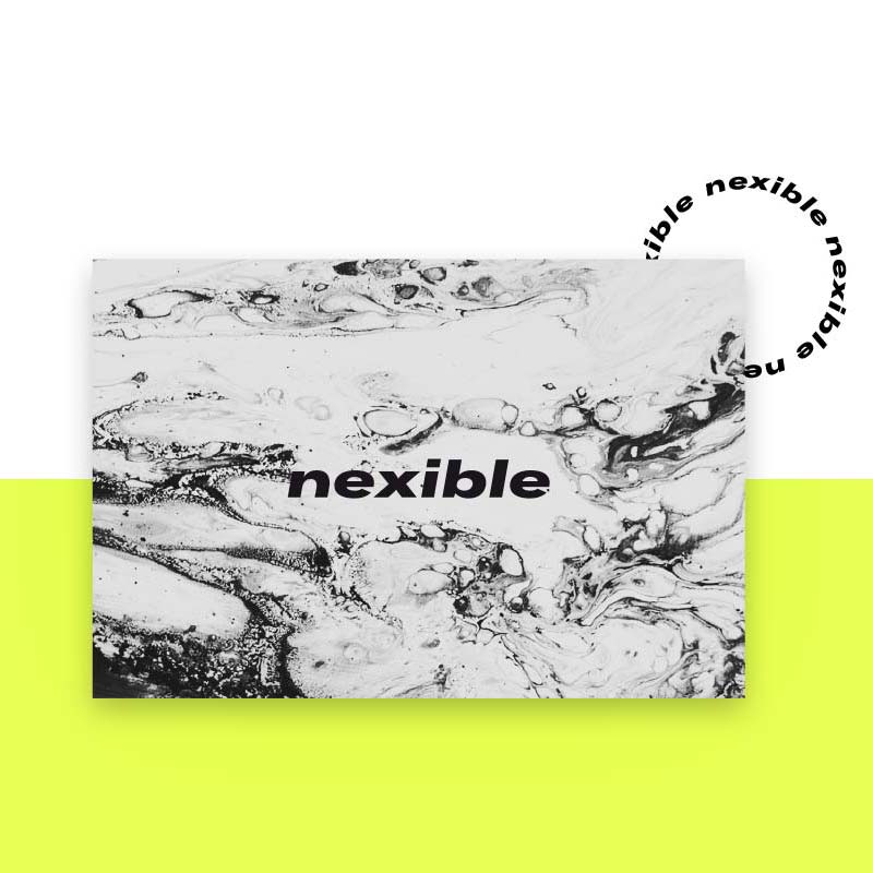
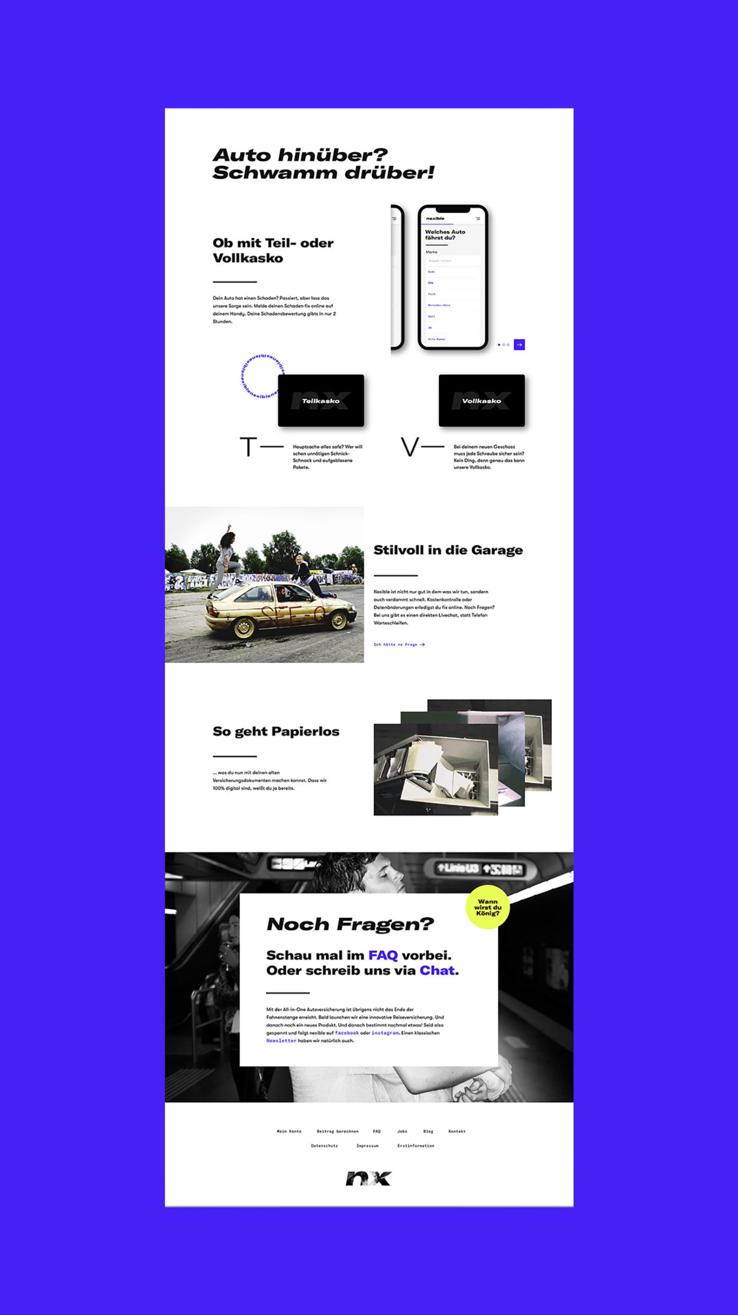
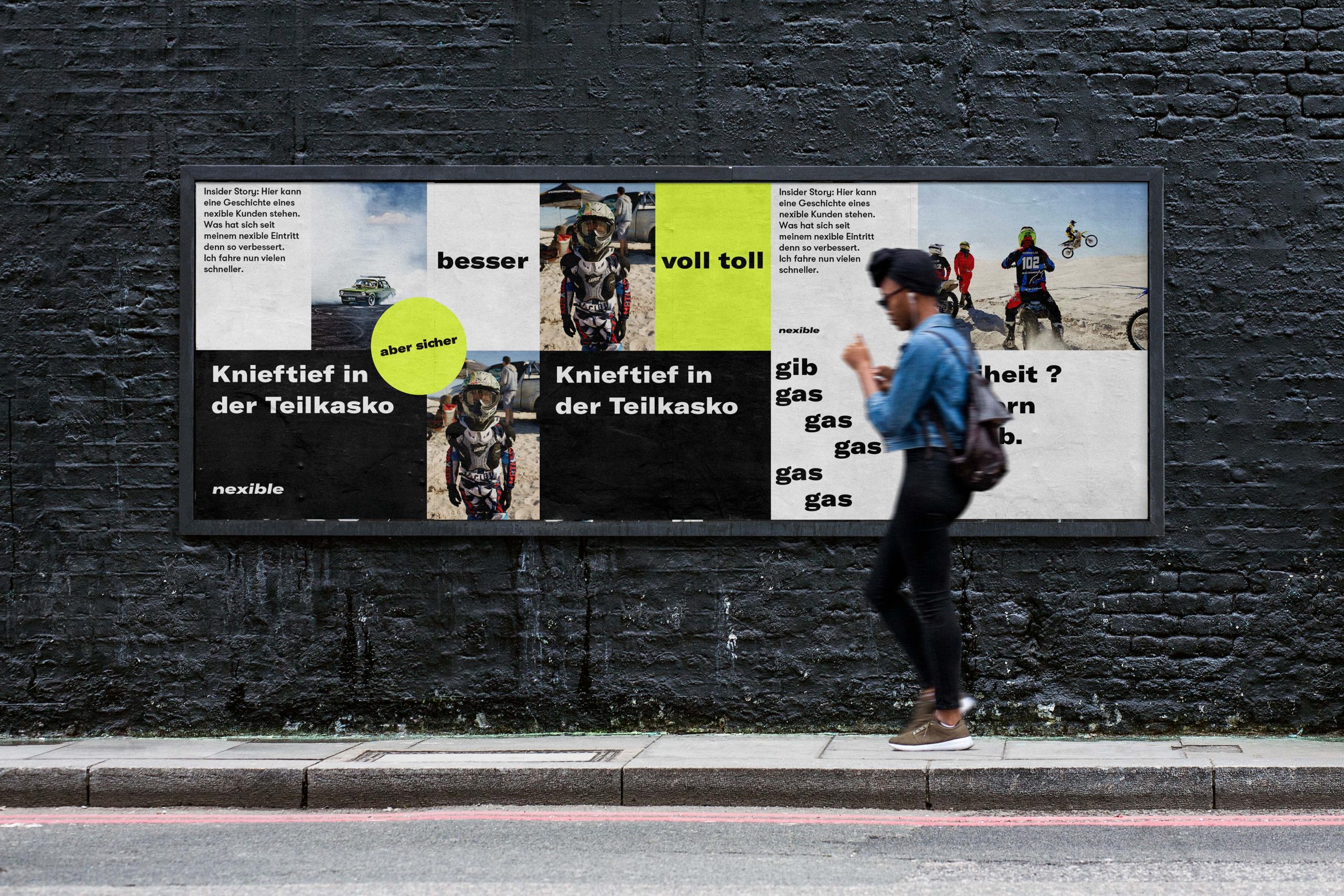
ONOGRIT developed a visual appearance that can be used as a flexible design system across all media. To the standard criteria of a modular design principle two essential ingredients were added: Swag and Slang. With the right typography, colour and visual language, a corporate design was created that presents itself fresh and self-confident.

APPROACH
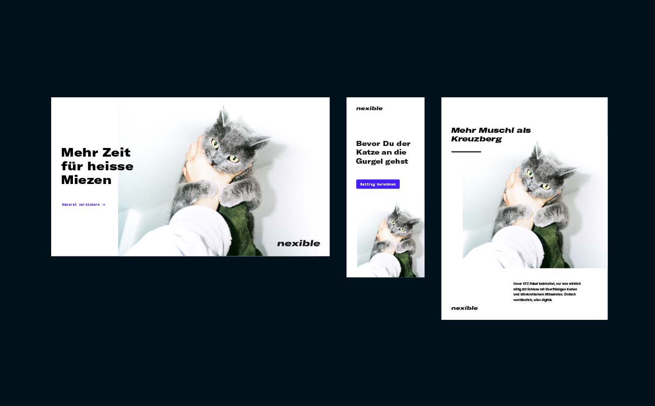
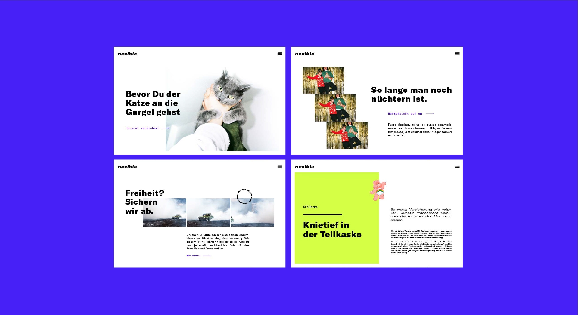
The branding speaks the same language across all channels to create a consistent brand experience. Users not only enjoy smooth processes, but also the scattered silly moments. The focus is always on the information itself, except that it does not always take itself too seriously. More pussy than Kreuzberg in fact.

logo & colors
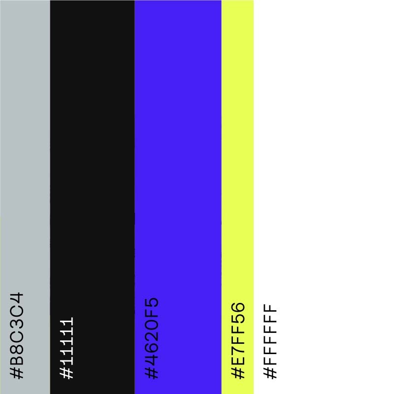
Nexible is next. At least that was the briefing in a nutshell. As an ERGO Digital brand, nexible rolls up the insurance field from the rear. Everything simple, everything transparent and absolutely certain with much less bureaucratic.
DO YOU
LIKE WHAT
YOU SEE?

icons
Nexible is next. At least that was
the briefing in a nutshell. As an ERGO Digital brand, nexible rolls
up the insurance field from the
rear. Everything simple, everything transparent and absolutely certain with much less bureaucratic.
Kind Words
“From the first moment we got to work I realised that the Onogrit team was always going to give us something more than expected, taking Nexible to the next level” — Patrick Müller, CEO Nexible
Team
Friends in Crime: dayy
Creative Direction: ONOGRIT
Realisation: dayy
Credits
Photographs used in layout: ©Maeve Stam and Dave Kennedy represented by Christa Klubert
